| Image |
Comment |
| 11/18/2004 12:31:50 PM |
Black & White... and Violettby apboltComment: I had to laugh about this first. Then I realized that in the left is a tombstone. I like how the picture suggested two opposite feelings to me in but a second. But that's about all there is to it. The shadow is annoying, because it divides the word Violett in two parts. Nice idea, though. |
 Photographer found comment helpful. Photographer found comment helpful. |
| 11/18/2004 12:29:04 PM |
Dominanceby KoriyamaComment: Now this one took me quite some time to judge.
I feel the figures should be more to the left, but I can't tell why. Strange. I'm glad you didn't use a chess board as surface. It would have distracted from the figures. The title fits perfectly, and the feeling of dominance is striking.
I just don't know what to make of the figures in the back. I don't see how they would add to the athmosphere, but they're good to fill the otherwise empty space.
Very nice, 9. |
| Photographer found comment helpful. |
| 11/18/2004 12:22:53 PM |
|
| Photographer found comment helpful. |
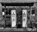
| 11/18/2004 12:18:57 PM |
Need Gas? Eat Beans!by GringoComment: This one's funny. Thanks. I like how many texture's are in there, without the image confusing the eye. I don't know whether you'd have got the permission to do so, but you might have put one of the pipes on the ground. Would have made the impression of decline even stronger. |
| Photographer found comment helpful. |
| 11/18/2004 12:15:05 PM |
Self Portraitby mecfcostaComment: The noise removal made the otherwise interesting structure on the skin disappear. A pity. I'd have placed the hand a bit lower, showing but the fingers. Nice idea not to show the eyes. The wather has to imagine your face. |
| Photographer found comment helpful. |
| 11/18/2004 12:12:35 PM |
Retiredby tfaustComment: Nice textures! But I don't get the title. The rope is still useful, isn't it? |
| Photographer found comment helpful. |
| 11/18/2004 12:11:30 PM |
Charlieby WarbyComment: That 'Waring' text is annoying. Did you think about leaving the right hand in the image? |
| Photographer found comment helpful. |
| 11/18/2004 12:04:30 PM |
Fireworks from the Seaby sfabioComment: Fireworks are meant to be colourful, aren't they? I'd have cropped off 25% at both sides, so only the sea at the bottom would be left. |
| 11/17/2004 11:24:32 AM |
Vegas Dreamin'by snsComment: Now this looks interesting. Yet there are just too many dices. |
| 11/17/2004 11:21:27 AM |
|
| Photographer found comment helpful. |
Home -
Challenges -
Community -
League -
Photos -
Cameras -
Lenses -
Learn -
Help -
Terms of Use -
Privacy -
Top ^
DPChallenge, and website content and design, Copyright © 2001-2025 Challenging Technologies, LLC.
All digital photo copyrights belong to the photographers and may not be used without permission.
Current Server Time: 09/04/2025 08:48:33 PM EDT.