| Image |
Comment |
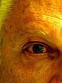
| 08/05/2002 03:34:00 AM |
getting oldby melloComment: You should have saved this photo for this weeks challenge :) |
| 08/05/2002 03:46:00 AM |
RusticMeby focusComment: i think this would look better without the very prominant orange/yellow colour, and if it was in focus a tad bit more. |
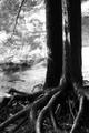
| 08/10/2002 07:25:00 PM |
perseveranceby oniComment: this is the kinda shot that i was gonna take but I decided not to. really nice photo, the roots are great. I think the background might be a little bright, but I'll give it a 9. -Konador |
| 08/05/2002 04:38:00 AM |
|
| 07/29/2002 04:43:00 AM |
In memory of those who perishedby arnitComment: This is by far the best photo I have seen in this challenge, and I'm giving it a 9. The idea is great and the way the roses have been painted so well is also great. It is a really good photo aswell. I love the way you have left so much space at the top of the photo. Very very nice photo indeed. I would give it a 10, if there wasnt such a bright glare on the right hand rose over the flag. |
| 07/29/2002 04:48:00 AM |
CRASHby MartinComment: nice idea, but I think you could have found a more interesting angle, possibly without the car in front being in view, |
| 07/29/2002 12:53:00 PM |
Wall Street Stressby psychephylaxComment: This is really good. I like the dull lighting a lot, and the contrast between the coins, n ashtray against the newspapers is very good. |
 Photographer found comment helpful. Photographer found comment helpful. |
| 07/29/2002 04:41:00 AM |
No Time & Fast Changing Technologyby spillerComment: 7:- It is a well set up photograph that shows the topic matter in a fairly good way. I think however that the photo it a bit blurred, where the camera has been moved or something, and it has tried to be sharpened in photoshop, although that adds a horrible grain to the photo. |
| Photographer found comment helpful. |
| 07/29/2002 04:45:00 AM |
Corporations Makin' a Killingby rdesaiComment: Very nice idea, executed very well. I think it would perhaps look better of there wasnt blood actually on the nail, because really there would be no blood there, it would just be oozing out the money. I think also that if you wanted a black background that it should actually be BLACK, not this dark grey colour. You just needed to take the brightness down a little bit in photoshop. Overall I gave this 7. |
| 07/22/2002 12:26:00 PM |
Alohaby hokieComment: it has nice textures but i think it might look better with a black sheet in the background. it would make the main focal point of the image stand out more. |
Home -
Challenges -
Community -
League -
Photos -
Cameras -
Lenses -
Learn -
Help -
Terms of Use -
Privacy -
Top ^
DPChallenge, and website content and design, Copyright © 2001-2025 Challenging Technologies, LLC.
All digital photo copyrights belong to the photographers and may not be used without permission.
Current Server Time: 09/01/2025 04:51:18 AM EDT.