| Image |
Comment |
| 08/14/2002 02:32:00 PM |
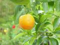
New Bornby mardocheeComment: oooh... finally one I like, lovely colors, lovely composition, I like the peekaboo lemon on the right and the splotches of unfocused red. Too bad the lemon has a scar. |
| 08/06/2002 01:27:00 PM |
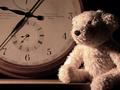
I'm sure we'll play again one day.by ninaullerComment: Oooh, nice. Have you noticed that people always feel compelled to critisize rather than compliment? Like I haven't looked critically if I can't find something wrong. I like the subject, the arrangement, the shadows on the clock. The only things I don't like are the brightest part of the bear doesn't make it look "old", maybe could have been softer, Abd the way his foot is cropped out of the photo makes that foot look mis shapen. |
| 08/07/2002 11:10:00 AM |
grandma's junkby amnonComment: Geesh, it almost looks human, the chair does. A lot I don't like here, slightly of center, washed outfunny shadows. But the thing looks so alive that it's creepy. I'd give it a 2 for the photo but bump to a seven for grama's ghost, |
| 08/06/2002 01:30:00 PM |
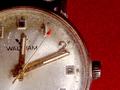
Time of Death: 12:11by rdesaiComment: Like the clocks all stop when someone dies? or was the watch worn in a accident. Very nice The watch is great and the red tip on the second hand is striking, I think the texture of the red is distracting however |
| 08/07/2002 11:02:00 AM |
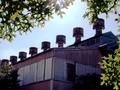
Remnantby KarenBComment: I like this one - What the heck are the chimneys? I think I need a history lesson. I like to composition and all the light, sky, sky reflected in windows, light through the leaves. Only thing I don't like is how dark the bushes ae in the front. I know it couldn't be helped - maybe a friend could have pulled them down out of the way. |
 Photographer found comment helpful. Photographer found comment helpful. |
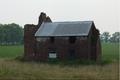
| 08/06/2002 01:24:00 PM |
Old Brickby estamperComment: Cool old house but not a great photo - back lighting doesn't work. Slightly end-on angle doesn;t work for me, either exagerate the angle or straighten it. maybe something else could have been in the dead center? Like maybe the white boarded window? |
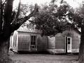
| 08/07/2002 11:07:00 AM |
Decayby FrooberComment: Compostion is a little off, makes it look unbalanced. I like the way the trees fuse together, could havve uses that better, and what is supposed to be the eyecatcher here? I would have used to half open door becasue the white makes such a nice contrast but it is too far off to the right. |
| Photographer found comment helpful. |
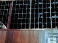
| 08/06/2002 01:21:00 PM |
Warehouse # 6by tonythemonkComment: Almost nice...it bugs me when things aren't straight at the top.. and I think the other windo on the right is distracting. The colors are wonderful and the warehouse sign is great. There is an interesting shape in the least broken of windows but to me that shape would be stronger if it was offset a bit more - maybe it;s not n thirds?. |
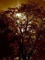
| 08/06/2002 01:33:00 PM |
Sun - antique lamp of the new milleniumby psychephylaxComment: ummm, nope, not much appeals to me, arrangement is uninteresting - too dark - I don't like the color, the sun has too many bright spots and the "jesus light" is chopped off, the cloud in the right corner is distracting, sorry.. I like some of the tree in the top right, maybe you could experiment with recropping and get a better photo. |
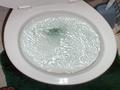
| 07/29/2002 05:17:00 PM |
GOING DOWN !!!!!!!!by freetimeComment: Good idea, not a good photo, Stuff on the floor is distracting and cluttered looking. distortion of toilet bowl shape is unpleasant to look at. Hinges on the lid are not evenly cropped. Could use somebetter editing |
Home -
Challenges -
Community -
League -
Photos -
Cameras -
Lenses -
Learn -
Help -
Terms of Use -
Privacy -
Top ^
DPChallenge, and website content and design, Copyright © 2001-2025 Challenging Technologies, LLC.
All digital photo copyrights belong to the photographers and may not be used without permission.
Current Server Time: 07/17/2025 07:53:05 PM EDT.