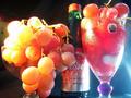
DPChallenge: A Digital Photography Contest You are not logged in. (log in or register
 
Browse Settings
Currently viewing:
Registered Useremorgan49

Show comments:

Per page:

Order:

Comments:


Comments Made by emorgan49
Pages:   ... [243] [244] [245] [246] [247] [248] [249] ... [252]
Showing 2451 - 2460 of ~2518
Image Comment
Freckled Chiquita
09/10/2002 03:52:00 PM
a lone nut
09/10/2002 03:55:00 PM
a lone nut
by SatelliteSpeck

Comment:
Ooooh nice, move him over to the left a little, he is sooo close to center that he migt a s well be. looks croweded on the right. forget te nut, the ligt and shadows on the spot on the rug are delightful. Maybe i's like it better with a real nut, this one is a carving, right? oh never mind I like the carving alright. Light is terific over all face to background is slick, colors are jsut right,
Grapeteaser
11/25/2002 11:27:00 AM
Grapeteaser
by quarx

Comment:
There is a lot going on in this photo - way too much.

It is a great idea for the challenge and the title is perfect. I think the idea is worth reshooting to make a great photo (suppose the grapes are gone by now). The colors are great and the shapes are sensuously round - I especially like the round blob on the stem of the glass that matches the grapes.

However, the whole thing is just too busy! And unfortunately the thing that draws the eye is the screw cap on the wine bottle because it's color and focus are harsher. The rest of the photo has a lovely soft look. The cap balances the glas stem on the right and the big grapes on the left to make a visual triagle, but it's defests dominate the effect.


Obviously the lighting is a problem as many pointed out, too glaring on both sides. Pay careful attention to unwanted elements in the background, the spoon on the refrig is also distracting.

How about recropping the photo? the glass on the left isn't necessary, though it;s grapes are. the cooler blue background on the right is better than the black on the left. If you crop just to the right of that vertical stem I think it looks better. Can you get the base of the glass and the bottle back? They look cut short and the rounded shapes of both would have added to the compossition. Then take the cap off the bottle and scrape the label off the glass.

It really could have been a much better photo with a few changes. It is worth trying again. A photo is only as good as it's worst elements (sad to say). The lighting and the cropping decisiosn both spoil this one. I gave it a 4 - just below average.
Photographer found comment helpful.
Forbidden Fruit
09/10/2002 06:12:00 PM
Forbidden Fruit1st Place
by jmsetzler

Comment:
Oops I'm voting at work and THIS is where the boss walks in! Red faces all around. Great Terrific picture tough
Renaissance
09/10/2002 10:59:00 AM
Renaissance
by stephan

Comment:
Way to many inrelated elements (sorry, if this is a collection of some religious ceremonial significance)ad they crowd the boarders. Lose the sea shell, he doesn't belong and he;s too bright, leave the brightness off the the candle/ Try to make it look like the really is candle is the only light source which means fix the lighting on that nut or fig. ANd give the sculpture things room to breathe at the top. It doesn't contribute to the composition to have them cut off.
Photographer found comment helpful.
Fruit and Vegetable Harmony
09/16/2002 02:35:00 PM
Fruit and Vegetable Harmony
by BigSmiles

Comment:
Why was this under rated? It s a PERFECT picture right down to the seeds at the bottom of the glass- the lighting is soo nice.
Fruit and Vegetable Harmony
09/10/2002 06:15:00 PM
Fruit and Vegetable Harmony
by BigSmiles

Comment:
Oh for the bottom of the glass...oh well, 9 anyways
Still Life
09/10/2002 03:35:00 PM
Still Life
by lbstone

Comment:
Ewww - what is it? a reflextion? mold/ jello? slime/ remind me to come back and give a bwter critique...
Hooked on Kiwi
09/10/2002 05:04:00 PM
Hooked on Kiwi
by bamaster

Comment:
The hook is nice but not the kiwi. When the contest is done, beef up the green to a nice bright on and make te background less yuck brown/
Photographer found comment helpful.
Banana Warp
09/16/2002 02:28:00 PM
Banana Warp
by buktotruth

Comment:
Another under rated photo - The buzby Berkley of the fruit world should have been a ten!
Pages:   ... [243] [244] [245] [246] [247] [248] [249] ... [252]
Showing 2451 - 2460 of ~2518


Home - Challenges - Community - League - Photos - Cameras - Lenses - Learn - Help - Terms of Use - Privacy - Top ^
DPChallenge, and website content and design, Copyright © 2001-2025 Challenging Technologies, LLC.
All digital photo copyrights belong to the photographers and may not be used without permission.
Current Server Time: 07/17/2025 07:55:40 PM EDT.