|
|
|
Showing 2141 - 2150 of ~2518 |
| Image |
Comment |
| 12/20/2002 01:01:11 PM | Nature's Motionby skippyComment: I gave this picture a five and it looks like a lot of other people did too. I guess this is an example of a "not Quite" picture.
This is what I like: I like the water. I like the way you have exposed it to look so realistic. If the shutter speed had been faster it would have looked too stop motion and not given the impression of force and power that it does. There s some nice stoped motion in some of the sprays but not too much. If you had used a slower shuter speed, the water would have been blurred and lokked softer and you would have completely lost the senstion of power. I like the colors, I like the way it is almost a monochrome but it is a color photograph. I like the power of the water but I feel the power more in the upper background of the shot than in the middle. The focus is very nice. So all the camera work type elements of the picture are well done.
This is what I don't like. I can't get a handle on the scale here. Is that a branch and some rocks or is that a tree and some boulders. If it is a big log then there is more water force here than you show. Something that gives a clue to the scale would help. Like a tree or a little plant, a leaf?
The composition seems off to me too, One commenter mentioned that, There aren't any of the traditional textbook elements of design. No rule of thirds, no leading lines. There is not a pattern that leads my eyes, as the view, from one element to the next and back. There is the diagonal flow that takes me from the top left down and out of the picture, but nothing to bring me back. Actually I have several times just now tried to scroll up past the top of the picture. Something is missing and I guess I like the water at the top where it makes that wonderful dip better than the water at the forground. Does that log add anything to the image? It stands above the water so it is the only still thing in the picture and contrasts with the moving water. I wonder if the movement of the water would be better portrayed without the log.
Technicaly this is a nice photo but it needs something more to make it a dramatic one.
Rmemeber this is just one opinion form one amateur. |
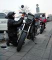
| 12/18/2002 03:43:34 PM | Roadside Repairs (Portrait of a friend)by AzrifelComment: I like this photo. I gave it a seven which seems to be the best it got. Looking over the coments it seems like people either didn't like the weather or didn't like motercycles. I'm not so fond of this gloomy weather either but it makes a great picture and certainly adds to the mood of the day and the roadside repair. He keeps his coat on and his helmet- it must have been raw and the metal looks cold. Nor am I much interested in motorcycles but do Love portraits and pictures that tell a story. This is a real story teller. He's riding with a group, or at least a partner, something has gone wrong, he has to fix t himself, there isn't a garage or a warm place. He looks toatlly intensly absorbed, maybe stubborn even? That face is central to the picture.
I do agree with the commenter who said it looks tilted and should be rotated a bit. But that will be my only negative comment.
I like the colors, almost a monochrome except for the red cycle, the yellow warning lights and the guys face. It emphasizes the three most important things. I like the conflicting diagonal lines of the sidewalk and the leaning bikes. I like the way the broken bike looks black and dirty while the red bike (whos riders is presumably in a warm pub) looks shiney new. I like the writing on the car, on his helmet and on the red bike make a triangle. The picture as a whole is self contained, the lines bring the viewer back to the central theme. Good use of the rule of thirds, his face is at one intersect and NOTHING is at the opposite intersect which makes the face the real focus.
I really like this picture, a lot can be read into it.
Comment from the critique club - remember this is only one amateurs opinion (mine). Message edited by author 2002-12-20 16:35:18. |  Photographer found comment helpful. Photographer found comment helpful. |
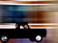
| 12/17/2002 03:53:29 PM | Motion and motion stopper.by wingyComment: This is an interesting photograph and the more I look at it the more I like it. I even like the things I initially didn't like. Here is what I like:
The format (is that the word for the size ratio?) is very effective, the oblong being drawn out feels like the doplar effect where the image is actually being dragged/stretched out by the train.
The sepia color works well. It is night and night should be monochrome. ANy color, like a red light or green grass, would have been distracting to the image. I like the sepia better than B+W - it makes the scene a bit unreal.
I love the gradation of light from too dark on one side and too light (overexposed) on the other. It adds alot to the sense of motion - To me is is going from the dark into the light. Same for you? I definately FEEL the motion and I disagree with the commenters who thought it looked like a wall. Although they did get the sense of MASS that the motion carries with it. It feels powerful, like you better get out of the way.
I like the RR crossing sign and its eerie shadow. It never occurred to me that the shadow as well as the sign would be static in relation to the moving train and this is very well done. The sign itself almost looks like a person with those two big lights being the eyes and this person says STOP and holds out his arm. But the train can't stop. But the shadow is such a distortion of the sign that it looks like a gallows, or cross or something sinister. The two lights have become dangling arms.
This is a visually compelling image and there is something dark and disturbing about it too. The dynamic force of that train in the dark is sort of creepy and dangerous.
I can't think of anything that you should change because that would change the feeling behind the image. I think if people looked carefully at why they scored it low they would find that they were disturbed by the image. Good job.
from the critique club - remember that I am just an amateur and this is only one persons opinion (mine). | | Photographer found comment helpful. |
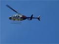
| 12/17/2002 01:59:03 PM | Chopperby MiekaComment: This is a techically perfect picture. Perfect cloudless blue sky. Perfectly focused moving helicopter. Two contrasting motions. The larger blade caught at one rotation speed and the tail blade caught at another. Composition uses the rule of thirds and diagonal leading lines. the helicoter is traveling off the view to the left and the diagonal line of the stopped motion blade leads the viewers eye back into the picture. The red diagonal stripes on the chopper go in the opposite direction from that main diagonala blade.
The colors are nice. All red, white and blue. Dark against the blue sky. Is it a hair underexposed? Maybe. I like the glint of sunlight on the driver.
But overall it leaves me wondering WHY? Why am I supposed to look at this picture? Does it tell a story? Is it just supposed to be pretty? Is it a guy thing that I don't get the same way I don't know every make and model of cars? It just seems boring to me, though exceptionally well done. I gave it a five and so did everyone else, apparently it wasn't just me.
From the critique club - just one amateurs opinion. | | Photographer found comment helpful. |
| 12/17/2002 12:19:48 PM | Truckingby LobsterClawsComment: Aw rats - I thought this was oneof the best pictures of the week. How did it get down here? I gave it a 9 and I didn't give any tens this week. |
| 12/16/2002 03:09:28 PM | Planetby janfriesComment: Belated greetings from the critique club-
I don't know what I can add to the other comments on your picture, though they were a bit contradictory (crop closer, crop wider). I think this is a Could Have Been Better picture and I suppose that is what frustrated the viewers.
It is a great image, very bizzare looking and very much looking like a dynamic electric earth (which I see it was). It does look like a planet beseiged by storms, the veins of lightnening at the core seem to move even. The separation of green pn one end, blue on the other woth all the variations between sets up a nice contrast. I especially like that it seems to have a diagonal axis and you have tilted it towards the center of the picture along that axis. Makes a nice composition. I can't decide which I like better regarding the cropping. I think the close up crop makes the planet look more alive and swirly, where more of the black expanse of the universe around the planet might have made it look more like a planet out in space. Did you try it both ways.
Obviously you lost points for focus, out of focus seems to be an unforgivable sin here. How do you focus on a round object? It looks to me like you have focused on the lightening which is actually inside, right? So the surface is out of focus. But when I look at it as a planet I think the lightening is also on the surface and I find the out of focus mountains and edges disturbing. Could a deeper DOF have helped? I know you were outside at night and may have been limited to a wider aperature but maybe a narrow one and a longer exposure would have helped the focus......no wait....you needed the fast shutter speed for the crisp lightening. Obviously I know less than you do.
Overall I thought it was an interesting picture, thought provoking (is OUR plantet about to explode?) and I gave it a six (fell into the out of focus trap myself). | | Photographer found comment helpful. |
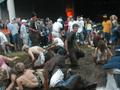
| 12/16/2002 01:04:15 PM | MUD SLIDEby SunChildComment: PS - the review was from the critique club - only the opinion of one amateur |
| 12/16/2002 01:02:51 PM | MUD SLIDEby SunChildComment: Hmmm- I liked this picture better than most people did because I see I gave it a six. Yep there is a lot of motion. Did one commenter actually say there was a lack of motion? ANd did another say there should be some still and some motion. I see both. Also the YOUTH of the picture is a strong point - everyone is young.
This is a perfect case of a "not quite" picture. It could have been much better but then it is a candid shot and you can't exactly ask the guy on the right in the blue coat to move over. It is out of focus, which seems to be an unforgivable sin here. The composition is very very interesting but has a few distracting elements. The action is great, The tangle mess of kids, shoes, arms in the middle of the mud forms compact ball from which one guy is beginning to untangle. I like that the one girl is offset a bit. So you have the center messy ball and then a rather tidy semi circle of up right onlookers who are all clean. There are little bits of interesting people, like the rasta hat or the guy in the muscleshirt and the wild hair behind him. so that the viewers eye travels around the semicircle looking at each onlooker individually. This is really a nice composition, probably textbook.
On the negative side there are a few things that just stick out as distractions. The guy in the white shirt and hat in the middle, and that orange blob, whatever it is. I actually like the lower corners being filed with stuff, it closes up the circular composition. You lost all your points for the focus, was it dark as well as active? There isn't really a way to fix up the photo. I can't see any better way to crop it. I like it messy and out of focus and disorganized - like the moment was. | | Photographer found comment helpful. |
| 12/13/2002 10:15:11 PM | Yellow & Green Make Blueby taylorbehneComment: I like this image. I like all the post processing and the saturated colors. I gave it a 7 originally.
Compositionally it is perfectly balanced- The three colored papers, red, yellow, blue are mirrored by a different red, yellow blue, separated by the grey and brought back together by the screwdriver. All the diagonal lines make interesting patterns and lead the viewers eye around and around the picture. There aren't too many lines leading out of the picture because just as many lead back in. Without doing the reule of thirds thing you have balanced three compositon items in a pleasing upper right to lower left diagonal. Really, it is a textbook composition masterpiece.
I also love the textures in the picture. The colored things could be paper or felt or even sand paper. They are rough or soft, I can't decide which. The grey is definatlely slippery smooth and the screwdriver handle is round and ridged. The roundness of the screwdriver contrasts with the straight lines of the paper stuff. Oh, it is all so balanced. Sorry to repeat myself.
Want some more balance/contrast ideas? How about transparent vs opaque- nicely done. ANd the only one shadow under the screwdriver? Interesting that the transparent object is the only one to cast a shadow.
Al I said, I like the "over" processed look that others disagreed with. I suppose I can see the point about the green speckles in the upper right and now that the challenge rules are off you can go clone those away. While you are at it, take out the few speckles on the grey in the middle. But please leave all the other color variations. Like on the maroon, I like that the shadow is greenish. And I like the yellow speckles on the red.
So why did I give it such a poor score? Where is the blade of the screwdriver? It just disappears like an Escher drawing and that bugs me. I like to know what I'm looking at. But that's just me. And maybe I thought "Why the screwdriver anyways?" Also the title confuses me. I keep looking at those terrific colors and wondering where I'm supposed to be seeing Blue from green and yellow.
This picture should really have done much better than it did. I hope you fix it up and keep it in your portfolio.
From the critique club - just one amateurs opinion. |
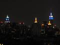
| 12/12/2002 10:21:31 AM | From downtown to midtown - New York is Blueby tomzinhoComment: Well in DPC lingo, I thought this picture was a WOW and I gave it an 8. I don't see why it ended up down here at dead center. I'm not sure I'm qualified to review the technical aspects of this picture, I have only just begun working on night shots. This is a beautiful city night shot and from my perspective it is perfect. I notice that some people wanted it lighter and some darker. I suspect that reflects their monitors and not your picture. From what I can see there is plenty of detail in the foregroud buildings while not making the background too light. Is it really 4:15 in the morning?
The blue lights, yellow lights and the red lights are lovely. The emphasis is clearly on the decorative tops of the buildings. I think this picture would have benefited from the new DPC rules about dimensions. While I personally like the grey buildings in the foreground, I miss something more in the middle to focus on. There is basicly nothing in the center of the picture, and nothing at any of the "rule of thirds" points. The blue towers are the eyecatchers but they seem too widely spaced to be comfortable to my eyes. I jump back and forth from one to the other, makes me feel wall eyed. With the restrictions off, a bit more could be included on each side to balance out the wide space in the middle.
I find NYC skylines to be emotionally powerful. This is a gorgeous sky line. I like the combination of older and newer buildings. I like that the older ones are more ornate and have more interesting lights on top. The newer buildings are either unlit or have the red headlight look. The windows on the left are so clear I feel like clicking zoom to see if I can see any one inside. You do give the impression of a city that never sleeps.
Would the trade center towers have been in this picture? Oh wait...maybe that is why there is nothing in the middle. Have I just been incredibly stupid?
One last thing the bugs me, a personal peeve. It doesn't seem quite straight. Is it? To me it all seems to lean a hair to the right.
From Critique Club | | Photographer found comment helpful. |
|
Showing 2141 - 2150 of ~2518 |
Home -
Challenges -
Community -
League -
Photos -
Cameras -
Lenses -
Learn -
Help -
Terms of Use -
Privacy -
Top ^
DPChallenge, and website content and design, Copyright © 2001-2025 Challenging Technologies, LLC.
All digital photo copyrights belong to the photographers and may not be used without permission.
Current Server Time: 07/21/2025 12:01:29 AM EDT.
|