|
|
|
Showing 1451 - 1460 of ~2517 |
| Image |
Comment |
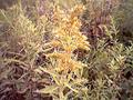
| 09/30/2003 12:43:19 PM | pollen......by undieyatchComment: more pixels please, I can hardly see what you are presenting - All I can see is that I like to colors but can't see any connection to the challenge- Doesn't goldenrod PREVENT us from resting, There are some excellent tutorials on resizing and uploading your picture. If you are still confused, ask in the forums. |
| 09/29/2003 03:47:15 PM | |
| 09/29/2003 12:02:50 PM | |
| 09/29/2003 12:00:20 PM | |
| 09/29/2003 11:52:01 AM | |  Photographer found comment helpful. Photographer found comment helpful. |
| 09/29/2003 11:51:13 AM | |
| 09/29/2003 11:47:15 AM | |
| 09/29/2003 11:44:50 AM | Sleepy Time Palby DebN2003Comment: THis picture is very similar to one entitled Lazy Dog. If you look at that picture you will see how yours fell short. This is really a bad picture and I gave it a 2. THe focus is offf, I'm not sure what, if anything is in focus. Sometimes the problem with focus is that the focal plane is not where you meant it to be (utofocus choses what it wants to focus on, not what you want). But when nothing is sharp the problem can be camera shake. It is surprisingly hard to hold a camera steady at the shutter speeds that digital cameras allow us to use. A tripod is hgihly recommended, especially in low light sitations like this indoor shot. Read the tutorial on the Rule of thirds - human nature, probably due to the biology of binocular vision, is drawn to the cross of the thirds lines. Notice what you have place at these points: an out of focus over exposed paw, the bit of couch under the dogs chhek, his ear and some fur on his back. Are those the most important visual items? Did you mean to emphasize them? To me, a dog lover, it is the eyes , face, and yes, those big paws, that I want my attention focused on when I look at a picture. I don't want three fourths of the image to be blurry body, and the cute face all the way to the left. maybe if you had cropped of the right side you would have had a better image. try it. Some post processing would have made a world of difference in making the darks truely dark and the lights less blown out. One thing you did right compositionally was that your leading lines, the stripes of the couch, the slant of the eyes and ears DO lead into the dogs face. Try it again, I bet this dog loves to pose like this. | | Photographer found comment helpful. |
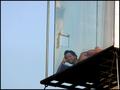
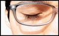
| 09/29/2003 11:30:33 AM | Peace in the glass frame (or eyelashes at rest)by denisprayComment: Something is wrong with the balance of this photo. I like the concept a lot and I almost like the execution. However the over exposed look doesn't work for me; The cropping feels awkward. The eyebrow is cut off, the weight of the photo is at the top, as is the center of focus. the view is too straight on. the nice shadow of the glasses is lost in the glare. The black border contributes to the unbalance, maybe a lighter blorder or no border would be better. The border seems to crowd the top by the eyebrow, seems to emphasize that the bottom is too light and seems to draw the eye to the guys hair which is similar in color but which shouldn'e be a focal point. Where is the point ehre the focus is sharpest? It should be the eyelashes but isn't quite. the glare on the upper left corner of the glasses frame is distracting. This is such a nice set up that I really think you should try it again to make the photo image match your mental image. | | Photographer found comment helpful. |
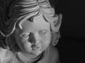
| 09/29/2003 11:20:49 AM | Deep in Thoughtby lentilComment: Nice lighting. Is it my monitor or are the tones a little flat - could the black be blacker? the face is nice but the cropping of the neck is awkward. Your negatice space is well balanced. Also I think all the leading lines lead OUT of the picture - when the viewers gaze is led to the edge of the frame, his mind says "Done, next picture". The longer you can get your audience to look at your image, the better your score will be. There are details that will be missed on a quick glance. That's why leading lines are especially important in a contest like this where most people are speed voting. The curl of haor on the left leads out. The statues gaze, if I follow it, leads off the bottom. There is an unattractive dirty line of her collar that strongly leads out. | | Photographer found comment helpful. |
|
Showing 1451 - 1460 of ~2517 |
Home -
Challenges -
Community -
League -
Photos -
Cameras -
Lenses -
Learn -
Help -
Terms of Use -
Privacy -
Top ^
DPChallenge, and website content and design, Copyright © 2001-2025 Challenging Technologies, LLC.
All digital photo copyrights belong to the photographers and may not be used without permission.
Current Server Time: 07/31/2025 05:06:53 AM EDT.
|