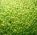
DPChallenge: A Digital Photography Contest You are not logged in. (log in or register
 
Browse Settings
Currently viewing:
Registered Useremorgan49

Show comments:

Per page:

Order:

Comments:


Comments Made by emorgan49
Pages:   ... [136] [137] [138] [139] [140] [141] [142] ... [252]
Showing 1381 - 1390 of ~2517
Image Comment
Still Waters
11/16/2003 09:43:25 AM
Still Waters
by amsmyth

Comment:
A perfect ten! This is abolutley gorgeoues. Maybe I love it because this is exactly the kind of place I would call sacred. These colors are the colors I grew up with. The water is so still and the reflection so perfect. A recent thread asked "when is it effective to break the rule of thirds?" This is a perfect example of when. When the symetry of an image is so powerful that it belongs dead center. But then you have the little house and the little reflected green tree in the thirds positions, balancing each other and creating a cross diagonal to counter the diagonal crack in the rock. Perfect emotion, perfect moment, perfect composition, perfect technical execution. perfect (did I say that already?)
Photographer found comment helpful.
Molecules
11/16/2003 09:32:58 AM
Molecules
by OneSweetSin

Comment:
Hello from the Critique Club-

Do you love this photo? For me is is a "not quite" picture. Technically it is not quite perfect. Compositionally it is not quite interesting. It meets the challenge, but not in a compelling way.

As your other commenters mentioned, the biggest technical flaw is the lighting. While it is viually nice that the top is light and the bottom is darker, giving some weight to the macro and emphasizing the round shape, the over exposed top is distracting. To my eye the exact center of the image is slightly less focused than the edges, is it my imagination? I like the color, the texture is great.

Your composition is straight-on-in-the-center. This approach is the most common but not always the most effective. It is a static, rather than dynamic composition. Even with a macro that fills the field a different arrangement might have been more effective. What if the closest point had been moved slightly off center to the left? Since we "read" a photo left to right, the molecules on one side would appear closer and larger, tapering off slightly to to right would lead the viewer that way and enhance the sense of infinity. I tried simply rotating the photo 90° clockwise and it creates a feeling of movement left to right, dark to light that is not present in the original orientation. Cropping in closer to cut out both the blown out area and the dark blemish that really attracts the eye might be explored.

My advice? Take some risks. Clearly (looking at your impressive portfolio) you have mastered your camera and are comfortable with the technical aspects of photography. Now explore how composition can improve a picture. Luckily the challenge is over and you can use your editing program to burn in the over exposed areas and add the fixed up image to your portfolio.

Please remember that these comments only represent one (far from expert) opinion.

Message edited by author 2003-11-16 10:07:41.
Black Corsett
11/14/2003 05:18:05 PM
Black Corsett
by Natator

Comment:
I like the sepia one better - though I love both
Photographer found comment helpful.
Stone Sanctuary
11/11/2003 11:05:30 AM
Stone Sanctuary
by rll07

Comment:
I wish the trees were upright, I think the tilt detracts rather than adds to to image - 9
Madonna
11/11/2003 10:53:04 AM
Madonna
by thelsel

Comment:
This is exquisite- I am generaly a "figurine hater" but you have done a wonderful job with this statue - I am also stingy with my ten but this has to be a ten. The lighting, the angle, the cropping, the colors, the background - all lovley.
Photographer found comment helpful.
Inner Sanctum
11/10/2003 04:26:23 PM
Inner Sanctum
by Flash

Comment:
ooohhh - rotate it a little and I'll give you a ten - 9
Photographer found comment helpful.
Mix of Church and State
11/10/2003 04:24:45 PM
Mix of Church and State
by roo

Comment:
straighten it
Positive Space
11/10/2003 02:02:50 PM
Positive Space3rd Place
by jjbeguin

Comment:
ten! This could be my favorite - let me finish voting.
Photographer found comment helpful.
pretty girl in pink....
11/10/2003 10:36:41 AM
pretty girl in pink....
by imagesloyola

Comment:
Oh I wish I had voted in this challenge just so I could give this a ten!!
late autumn
10/27/2003 10:09:31 AM
late autumn
by kenbo

Comment:
This is beautiful! I gave it a nine and I think it should have gotten a better score.
Photographer found comment helpful.
Pages:   ... [136] [137] [138] [139] [140] [141] [142] ... [252]
Showing 1381 - 1390 of ~2517


Home - Challenges - Community - League - Photos - Cameras - Lenses - Learn - Help - Terms of Use - Privacy - Top ^
DPChallenge, and website content and design, Copyright © 2001-2025 Challenging Technologies, LLC.
All digital photo copyrights belong to the photographers and may not be used without permission.
Current Server Time: 08/02/2025 05:17:33 AM EDT.