DPChallenge: A Digital Photography Contest You are not logged in. (log in or register
 
Browse Settings
Currently viewing:
Registered Useremorgan49

Show comments:

Per page:

Order:

Comments:


Comments Made by emorgan49
Pages:   ... [135] [136] [137] [138] [139] [140] [141] ... [252]
Showing 1371 - 1380 of ~2517
Image Comment
For good eyesight
12/01/2003 10:58:09 AM
For good eyesight
by train

Comment:
Lovely! - maybe a little powder for the shine.
Busting a Nut
11/17/2003 01:08:04 PM
Busting a Nut
by scrum8

Comment:
or "a tough nut to crack"
Photographer found comment helpful.
On the Cutting Edge
11/17/2003 01:07:17 PM
On the Cutting Edge
by karmat

Comment:
or "who cut the cheese"
Photographer found comment helpful.
Can of worms
11/17/2003 12:51:01 PM
Can of worms1st Place
by kiwiness

Comment:
oh gross - do I REALLY have to give a ten to this - guess so- ugh
Photographer found comment helpful.
My Window
11/17/2003 10:00:35 AM
My Window
by Emeraulde

Comment:
hello from the critique club-

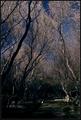
What a gorgeous sunset!! It looks like a storm is just passing and the skys have just cleared.

I like how you have framed the sunset with the silouetted trees. It gives the image depth. and I love those lower dowm clouds dipping into the trees - more depth. I like how you have created some tension/contrast with the horizontal lines of the clouds and the vertical shapes of the trees. Also weight, you have defined a sense of weight - the clouds are soft, without sharp outlines and bright, ie light. The earth is dark, has sharp shapes and is at the bottom of the frame - ie heavy.

Since the challenge is eternity I suppose the viewer could bring his own set of ideas about religion or about life/death or about confinement/freedom. Your picture gives us something to think about.

As for ways to improve it...perhaps if the silouette was more interesting in itself it would have an equal draw to the sky and pull the viewers eyes back and forth from one to the other. Like what? I don't know. a church spire, a large bird, a playground structure? I know that would change the purpose from "my window" to something all altogether. Also the tree on the right is a bit blobby and too dominant.

If you want a better score you need to figure out how to post a larger image. On my screen, yours is about four and a half inches, whereas the winners are a full seven inches. Remember that 640 pixels is the largest size allowed and it is a good idea to take advantage of it. Yours is only 420 x 285. A larger image is easier to see, details get lost in a thumbnail.

Is the image tilted ever so slightly? It feels like it dips to the left. Even if this is the way the scene actually was, it might help to rotate like one degree clockwise and see if it looks more natural.

Sunsets are considered and "over done" subject. Most DPC voters have scored dozens and dozens. Sometimes I think a sunset image doesn't get the attention or score it deserves as an individual photograph because it carries the baggage of all the other sunset shots. Yours scored very well and you should be proud of both the picture and it's score.

Please remember that this is just the opinion of one person who is far from expert.
PS. I like your soccer mom picture the best!

Message edited by author 2003-11-18 11:28:39.
Windmill at sunset
11/16/2003 10:33:13 AM
Windmill at sunset
by Azrifel

Comment:
Beautiful!!
Photographer found comment helpful.
Worship comes from the heart...  Church building is optional!
11/16/2003 10:26:32 AM
Worship comes from the heart... Church building is optional!
by smellyfish1002

Comment:
This study of light and shodow is so well done that it seems a shame you put it on a wood grain background. The wood is distracting, the wrong color and, in particular, obscures the shape of the cross on the curch. If you had shot this on a plain backbround I'm sure it would have placed in the top 20. Worth reshooting for your personal portfolio! giving a 6, wishing I could have given a 9 or 10.
Photographer found comment helpful.
Circle of Family
11/16/2003 10:22:22 AM
Circle of Family
by WILDBLUE

Comment:
Photographs of other peoples arrt tend not to score well. You have added your own creative stamp to this sculpture though. It bothers me that it feels slightly tilted. Also it is slightly ff center, not enough off center to make it seem like you deliberately place it to the side to make use of negative space. Such a slight placement looks like a mistake. try moving the figures over even more.
Photographer found comment helpful.
Sacred Grounds
11/16/2003 10:18:31 AM
Sacred Grounds
by heida

Comment:
On my monitor this image is very dark. Photos that are intended to be dark, for mood for example) do not score well because of the wide variety in monitor calibrations amoung voters. If it looks dark to you, you can be sure that it will look even darker to many others. If you want a better score, stick to a safer brightness. If you love the image dark, be satisfied with it and ignore the score. Try looking at this on several different monitors to be sure that it looks the way it did on yours. Have you recalibrated your monitor recently?
Photographer found comment helpful.
Church Window
11/16/2003 10:14:19 AM
Church Window
by Nukkta

Comment:
Many people, myself included, feel that to simply take a photo of someone elses art without putting your own creative stamp on it is akin to cheating. Perhaps you have selected this area from a larger window pane and perhaps it was challenging to get the correct exposure but that does not show in what your present. There is not much here to make this image yours. Perhaps a differnent angle?
Pages:   ... [135] [136] [137] [138] [139] [140] [141] ... [252]
Showing 1371 - 1380 of ~2517


Home - Challenges - Community - League - Photos - Cameras - Lenses - Learn - Help - Terms of Use - Privacy - Top ^
DPChallenge, and website content and design, Copyright © 2001-2025 Challenging Technologies, LLC.
All digital photo copyrights belong to the photographers and may not be used without permission.
Current Server Time: 08/04/2025 04:39:08 PM EDT.