| Image |
Comment |
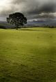
| 08/30/2005 09:35:05 AM |
Divine Leviathanby KitKatComment: nice concept but this picture doesn't really follow the rule of thirds and that makes it come across as a snapshot and not a photograph |
 Photographer found comment helpful. Photographer found comment helpful. |
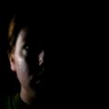
| 08/30/2005 09:31:09 AM |
Darkness and Lightby nordicComment: wow, stunning. nice use of line and shadow. I like the dof you chose to use and the clouds just bring the triangular comp together. I think this is going to take top three. Only thing I think will hold it back is there are 60 million other darkness and light entries...though this one is the best I have seen so far. great shot |
| Photographer found comment helpful. |
| 08/30/2005 09:29:26 AM |
Deflated & Loomingby CutterComment: lol, great pic and nice take on the d and l. I don't think this will be top three simply because it doesn't quite snap, but I like it and I'm giving it a 10 |
| Photographer found comment helpful. |
| 08/30/2005 09:28:43 AM |
Darkness & Lightby tryals15Comment: I like what your trying to do but the blur in combination with 80% of the frame being pure black just makes this not what it could be. Next time try a faster shutter speed or use a tripod |
| Photographer found comment helpful. |
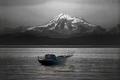
| 08/30/2005 09:23:52 AM |
Desaturate & Levelsby mpembertonComment: nice take on on the d and l concept. I'm sure you are going to get a lot of comments on how this cheating or something but whatever...
on the image itself I like it. It's a nice use of balance betwen forground and background though it's a little overproccessed and the boat and mount. is kinda dead in the center. make sure to follow the rule of thirds next time |
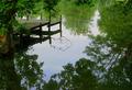
| 08/30/2005 08:59:44 AM |
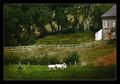
A Dock And Lakeby GolferDDSComment: this is a nice idea for d and l but this just looks like a snapshot. Get closer to the dock mabey and get rid of that tree on the left and the leaves and the branches all over the frame. |
| Photographer found comment helpful. |
| 08/30/2005 08:57:54 AM |
|
| Photographer found comment helpful. |
| 08/30/2005 08:55:15 AM |
Drugs & Liquorby ajschelComment: very dark and grainy, but the "drugs" are blown out. I like your idea but I think you should have gone farther with it. work on the lighting and get a polorizer filter to help with that nasty reflection in the left glass |
| Photographer found comment helpful. |
| 08/17/2005 11:36:21 PM |
|
| 08/14/2005 11:38:04 AM |
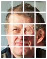
puslespillet corrigeret.jpgby visaksenComment: I have to admit, I love this compostion. I have been studing abstracts for about a month now and I just really like your compostion.
If you don't mind I would like to ask you a couple of questions
1. Why did you pick the squares, where every square is the same size accept one? Was this some sort of artistic expression?
2. How long did you work on this in photoshop? I have heard people say before that a good abstract takes either minutes or weeks, and I was wondering where this one feel into? |
| Photographer found comment helpful. |
Home -
Challenges -
Community -
League -
Photos -
Cameras -
Lenses -
Learn -
Help -
Terms of Use -
Privacy -
Top ^
DPChallenge, and website content and design, Copyright © 2001-2025 Challenging Technologies, LLC.
All digital photo copyrights belong to the photographers and may not be used without permission.
Current Server Time: 08/18/2025 04:30:52 PM EDT.