| Image |
Comment |
| 12/07/2006 09:19:33 AM |
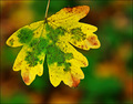
A Beautiful Deathby marboComment: I really do like this image. I think there is a lot going for it. I like the composition is in line with the rule of thirds. I like how the colors complament each other, I like that your shooting at a proper dof so as the background falls blurry. the only issue I have I guess is I don't know if some will feel it fits the challenge. I understand that the leaf is in the process of dieing but I don't know if everyone will.
all in all great image, I think with some minor lumonisty sharpening this would go farther though. |
 Photographer found comment helpful. Photographer found comment helpful. |
| 12/07/2006 09:16:41 AM |
|
| Photographer found comment helpful. |
| 12/07/2006 09:15:05 AM |
|
| Photographer found comment helpful. |
| 11/26/2006 07:01:15 PM |
|
| Photographer found comment helpful. |
| 11/26/2006 07:00:42 PM |
|
| Photographer found comment helpful. |
| 11/26/2006 06:58:53 PM |
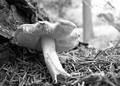
Shroomby RhettComment: weak composition, think rule of thirds. background is very distrating |
| 11/26/2006 06:58:03 PM |
|
| Photographer found comment helpful. |
| 11/26/2006 06:57:25 PM |
|
| 01/28/2006 10:33:52 AM |
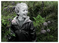
The Boy Who Giggled So Sweetby gsalComment: I really find this image to be visualy appealing accept one thing. the artistic statement made with the selective desaturation combined with the title is one that makes him sound dead. if that is the case such an image is bitter sweet, if that is not the case such an image is haunting. either way, I LOVE IT! |
| Photographer found comment helpful. |
| 01/27/2006 09:22:25 AM |
IMG_202dpc.jpgby AlexSaberiComment: this is another nice shot. though there is a little more here. the lighting ratio (the difference betwen the brightest bright and the darkist dark) is a little to big, that is it's to dark on the left. use a fill card or a second light to change that. the catch lights in his eyes are in the wrong place, catch lights should always be in the top part of the eye, when you put them in the bottom part it gives it a spooky lighting feel. never ever put a light that is lighting someones face with a light that is level or below the persons face. there are also reflections on the watch, again that is from incorrect lighting. when there is any shiny metal in a shot you have to, have to, use a diffusion screen and pull the light back from the model. if you don't do this you will get what you have here in this shot.
I do like the pose though. other than the hand everything looks great
the hand is distorting the face a little. The hair lighting on the hair does look great and the black and white conversion is beautiful (as always)
overall, I think this is the weakest shot out of the series, but overall the series is great.
p.s. sorry I can't spell anything |
| Photographer found comment helpful. |
Home -
Challenges -
Community -
League -
Photos -
Cameras -
Lenses -
Learn -
Help -
Terms of Use -
Privacy -
Top ^
DPChallenge, and website content and design, Copyright © 2001-2025 Challenging Technologies, LLC.
All digital photo copyrights belong to the photographers and may not be used without permission.
Current Server Time: 08/19/2025 04:05:29 PM EDT.