| Image |
Comment |
| 05/08/2007 01:56:14 PM |
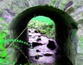
Stream House - Oakland, New Jersey USAby corinneComment: Sorry but something about the coloring in this image just seems wrong, the strong purple cast of the water and green on the stones. Whatever it is its not to my taste anyway. |
| 05/08/2007 01:55:25 PM |
|
 Photographer found comment helpful. Photographer found comment helpful. |
| 05/08/2007 01:55:01 PM |
|
| 05/08/2007 01:53:04 PM |
|
| 05/08/2007 01:52:28 PM |
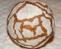
Dual Viewby AgaerisComment: Pretty nice, I am in a very minimalistic mood these days and this struck a tune. |
| Photographer found comment helpful. |
| 05/08/2007 01:51:42 PM |
|
| 05/08/2007 04:48:18 AM |
Bubbles of Funby JawnyRicoComment: You asked for my comment on what would make a shot like this more "ribbon likely" and here it is :)
I like this shot but on DPC some people seem to have something against photos of kids and vote lower because of that, probably since it seems you spent little effort on this shot, that would probably account for some of the 2, 3 and 4 votes. Personally I would have wanted to see the backround just a bit darker and more fill lighting on her but that´s just my taste, that would make the bubbles stand out more. Also the shot seems slanted down to right and anal people will knock off points for that.
I really like the moment you caught, seems very genuine and that sure is one cute little cousin :) Don´t know if this comment helps at all but best I could come up with :P |
| Photographer found comment helpful. |
| 04/30/2007 09:46:28 AM |
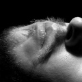
Cookie Dusterby _eugComment: Greetings from the Critique Club :)
I did not vote in this challenge but this is one of the images I would vote a 5.5 if it existed, wich means I think it´s above average but would probably most depend on how I thought it stacked up against the competition in the challenge.
Personally I think you made a good choice to have it b/w, I do think I would have liked it better with stronger contrast though, the whole shot just seems to "gray" for my taste. Lighting is not bad but could be better, seems a bit too harsh as it causes glare on the skin and also that harsh shadow from the nose, could you have used a bigger light source or perhaps put some powder on your skin to reduce that? That way you still would have had all that texture of the skin but more evenly lit.
I tend to not use my lenses at f16 or smaller as the image quality suffers a bit due to diffraction and while it´s hard to say from this web size version I think this shot would have been sharper taken at around f8-11.
I do like the framing/crop but I tried opening it in photoshop and rotated it 90 degrees counter clockwise and liked it a lot better that way, do like you are experimenting with different crops but this time I think normal would have been better. I also like the black backround, adds some mystery to the shot.
Kind regards from Iceland, Larus. |
| Photographer found comment helpful. |
| 04/30/2007 09:33:22 AM |
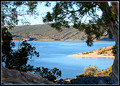
Glimpse of summerby ClayaComment: Greetings from the Critique Club :)
I did vote in this challenge and sorry, I was one of the people who gave this a score of 4, that means to me that it was below average but not horrible. There are a couple of things that would make this particular photo better in my opinion. First off, the out of focus branches are just distracting, I would opt for a smaller aperture to fix that problem. Secondly, the parts of the image that are in the sun are a bit too bright, the correct exposure according to the sunny 16 rule (send me a PM if you have never heard of it and I´ll try to explain it) is if you want to stay with the 1/200 shutterspeed f11 so it´s two stops too bright. The areas in the shadows would then be too dark of course so to get the best results you would have to take two photos and stitch them together to get both areas correctly exposed.
I also can´t really find any main subject, I mean the scene is nice but there is no spot in the picture that really draws the eye so mine wanders all over the frame.
I do like the framing of the landscape and I really encourage you to keep that aspect and work more with it since you like it.
Kind regards from Iceland, Larus. |
| Photographer found comment helpful. |
| 04/30/2007 09:14:29 AM |
minor thirds/ blue periodby tapcityComment: A bit too noisy in the darker areas of the photo for my taste, other than that, pretty good but I would have cropped off that dark thing in the right side of the frame. |
| Photographer found comment helpful. |
Home -
Challenges -
Community -
League -
Photos -
Cameras -
Lenses -
Learn -
Help -
Terms of Use -
Privacy -
Top ^
DPChallenge, and website content and design, Copyright © 2001-2025 Challenging Technologies, LLC.
All digital photo copyrights belong to the photographers and may not be used without permission.
Current Server Time: 08/14/2025 02:26:52 PM EDT.