|
|
|
Showing 861 - 870 of ~4457 |
| Image |
Comment |
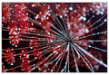
| 07/30/2007 06:09:05 AM | A Beat From Withinby JawnyRicoComment: Very nice dude, congrats on the new personal best. Don´t think it´s long before you ribbon if you just keep at it and do things your way, don´t wonder what other people like :) |  Photographer found comment helpful. Photographer found comment helpful. |
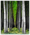
| 07/30/2007 06:02:45 AM | Archesby CitadelComment: Greetings from the critique club :)
Well I don´t have a lot to say about this image as I find it very pleasant to look at, it´s a good shot but I still think I would not have voted it higher than a 6 if I had voted, mostly cause even though it´s a pretty good image, it doesn´t really grab me either.
It´s well composed and exposed, the depth of the image is great and it meets the challenge head on. I am not sure I like the blue toning but it´s not bothering me much either, I would have to see the shot with a more neutral color cast to decide wich I would prefer, like I said, this is nothing that is bothering me much and I completely understand why you chose the blue cast.
Post processing is nice, only thing I would have done diffrently was to even out the lighting a bit, darken the areas that are the brightest and brigthen the darkest areas but not by much so the image doesn´t loose too much contrast.
I just think this image lack´s that certain something to make it really pop off the screen, maybe something extremely interesting at the end of that hall? Don´t know...
Anyway, congrats on your new personal best :) Kind regards from Iceland, Lárus. | | Photographer found comment helpful. |
| 07/30/2007 05:39:16 AM | | | Photographer found comment helpful. |
| 07/28/2007 09:13:01 AM | Natural bloomby zane1Comment: You asked for my comment so here it is :) This is not a bad shot and if this is only the 2nd time you take a real stab at portfolio photography I can´t wait to see more. However, there are a couple of things, her pose first. Having her knees like that in the frame kindof draw the attention there, I think sitting more straight and bending the knees to either side would have helped this photo. I don´t usually cut off the head like that when shooting a half body photo, sure it works sometimes but here I think I would have wanted to see her whole head and maybe what´s behind her, so also the slight looking downard at the model is not maybe the best way to go here, I don´t know what was behind her so maybe I am wrong but that´s just my impression of the photo.
The rest is pretty good, good lighting and focus/dof and all that is like I said, pretty good. | | Photographer found comment helpful. |
| 07/28/2007 09:08:06 AM | M by alexjackComment: Well you asked for my comment so here goes :) Pretty wife, pretty light and well exposed and I like the DOF. There is absolutely nothing wrong with this shot technically so my best guess is why it didn´t score better is maybe DPC is getting used to these technically good photos that you need a little more. I mean she is really pretty and has a lovely smile but it seems a bit like that´s all there is, she isn´t really portraying any deep emotion and you don´t really connect to her in the shot, who she is and that kind of stuff, she´s "just" a pretty lady with a pretty smile.
Also I guess a couple of those low votes were from anal people who think catchlights meant you didn´t use natural lighting from it so they DNMC voted it.
That´s my best guess :) | | Photographer found comment helpful. |
| 07/27/2007 10:25:59 AM | L A C K I N G by JawnyRicoComment: Greeitings from the critique club :)
Yo buddy, what´s up! I don´t have a whole lot to say about this image so I´ll keep this short. If I had voted I probably would have given this a 6, wich means above average but still not great for me. The image is well taken, well lit, good focus, DOF and sharpness, that part is all good. Bokeh maybe just a tad too busy for my taste, would have wanted it a bit smoother but nothing that is bothering me much.
I think you know why this didn´t score higher, this was done a lot in this challenge and while this is a good photo, it doesn´t really stand out from the rest like for example the red and yellow ribbon photos did that had a similar concept.
Kind regards from Iceland, Lárus. | | Photographer found comment helpful. |
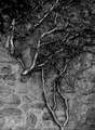
| 07/27/2007 07:25:51 AM | Between Life and Stoneby posthumousComment: Greetings from the critique club :)
First of all I just want to say Huh? I am sorry, I just don´t get this shot, or rather, I don´t get how it ties in with the challenge and thus I probably would have voted it a 4 if I had voted in this challenge, knocking off a couple of points for my own lack of vision on how it ties in with the challenge. At least I am honest :)
I guess you were going for that life (the branches) and dead objects (the stones) don´t have a link cause they are alive and dead? Best I can come up with, sorry dude... :P
Aaaaanyway I do like the shot, only gripe I have with it is the tie in with the challenge. It´s well exposed, got great b/w tones and I like the clay like texture you were able to bring out in the stones, whole shot looks like the branch and stones were covered in mud wich I like about it. I probably would have voted this shot a 6 if the challenge had simply been black and white. Composition is not what I would call good but not bad either, a little bit shot too much straight on the subject or an ordinary vantage point, maybe another angle would have appealed more to me personally but like I said, it´s not bad.
I don´t know what else to say buddy so I´ll just say kind regards from Iceland, Lárus. | | Photographer found comment helpful. |
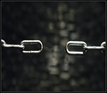
| 07/27/2007 06:45:47 AM | Suspended Disbeliefby freakin_hilariousComment: Greetings from the critique club :)
I didn´t vote in this challenge but would probably have given it a 6 or maybe a 7, I like this shot.
As for meeting the challenge, it obviously does but maybe not as obviously as you may think. The gap you created is prett small and I am sure at least a couple of voters didn´t really notice the gap or had to search for it, I would have reccomended you lose one or two chain links more or remove one that was flat on you so that the chain looked more like this instead of how it looks now.
I
O
O
I
O
I
That would just lead to the missing link being more visible, I think you get what I mean.
Lighting is pretty good, I know it´s not easy to take photos of silver objects on a black backround so well done. Composition is also pretty good and simple wich is also good for DPC. All in all I am surprised it didn´t do better in the challenge, think it deserves at least a 6+ score but I can also well understand why it didn´t score a top 10 placing since shot´s like this were done quite a bit in the challenge and if you compare this one to the red and yellow ribbon photos, those just look much more difficult and thought out than your entry.
Kind regards from Iceland, Lárus. | | Photographer found comment helpful. |
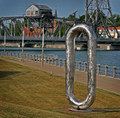
| 07/27/2007 06:18:15 AM | Found the Missing Linkby jessieComment: Greetings from the critique club :)
Well I didn´t vote in this challenge but truthfully, I would probably been one of those people who gave you a 5. Means I neither find this photo bad or good. It´s just that it seems a bit an easy way out for you, sure, that sculpture looks like a chain link so it definately meets the challenge. It´s the photography of that statue I don´t find very interesting, I mean it´s far from bad but it´s just taken from such an ordinary view. I personally would have wanted to see an unusual angle, like taken from up close and below the statue to emphasize the size or have someone stand there in an Indiana Jones or Superman costume like they were on a mission to actually find this oversize chain link for the sake of the human race. I just think it blends in too much with the surroundings, this photo would be excellent as a documentary photograph of the statue but as an artistic photograph supposed to please me aesthetically, it isn´t really appealing to me.
In short, I mostly agree with hywind, e301 and surfdabbler´s comments of the ones you got while the photo was in the voting stages.
Everything about the technicals is pretty good though, I don´t get what js797 is talking about it not being in focus, I can´t see better than it´s in excellent focus and it´s well exposed, no pitch black shadows or blown highlights. Colors are a bit muted for my taste, I would have loved to see a bright blue sky instead of that dull blue color it´s got but that´s just my personal taste, I completely understand why you chose this color scheme in the photo. I am not fond of the halo along the top of the photo but it´s not terrible either, I just would have preferred no haloing along the buildings and treeline.
Like I said, not a bad photo at all but not great either :)
Kind regards from Iceland, Lárus. | | Photographer found comment helpful. |
| 07/27/2007 06:01:32 AM | Encino Man 2: Missing The Links!by 777STANComment: Greetings from the critique club :)
Well I didn´t vote in this challenge but I would probably have given this a 5 or maybe a 4 depending on how I thought it stacked up in the challenge. I kindof think you met the challenge, I mean the model is I guess supposed to look like a caveman wich is what most people think of right away when you say missing link. However, that outfit is hardly convincing as a caveman, if you could have gotten your hands on some fur (fake or real) the costume would have been much more convincing and led you to a better score. I am not a golfer, have absolutely no insight or interest in the sport and first thing I thought when I saw the shot is what is that in his hand. I just saw a cane and not a golf club and I thought the golf bag was some sort of cape. It wasn´t till I read the other comments you got that I saw it was a golf club and a golf bag. The title didn´t help me either as I have no clue on who the Encino Man is or what "Missing The Links" stands for, I had to google that frase to know that links stands for golfing. That´s probably cause english is only my third language and I have never had the use for that word yet so at least I learned something from this picture :)
What I am trying to say is if I were voting, I would just have seen a guy with a cane in a goofy outfit and a cape and while I assume most native english people got it, maybe some like me who aren´t didn´t get it and voted lower.
Regarding the composition, I think that is the weakest part of the photograph. I do normally like slanted photos but in this one, the fence is just too prominent, it´s very much just eating up space and draws way way too much attention, it´s the first thing I see when looking at this photo. I would suggest you trying out other angles, go down lower or higher, take this in landscape instead of portrait orientation or whatever, maybe include that fence but not have it such a big part of the photo as the guy I assume was intended as the main subject.
Colors are not bad but a bit too cold WB wise for my taste, looks like you used the daylight setting when perhaps the shade or cloud setting would have left you with warmer and more pleasant tones. Regardless of what you used and what the conditions were, I still would have prefered a warmer WB than the one was used.
Also the shot is just a tad too flat contrast wise for my personal taste and could stand to be sharper, but that´s just me :)
Kind regards from Iceland, Lárus. | | Photographer found comment helpful. |
|
Showing 861 - 870 of ~4457 |
Home -
Challenges -
Community -
League -
Photos -
Cameras -
Lenses -
Learn -
Help -
Terms of Use -
Privacy -
Top ^
DPChallenge, and website content and design, Copyright © 2001-2025 Challenging Technologies, LLC.
All digital photo copyrights belong to the photographers and may not be used without permission.
Current Server Time: 08/14/2025 10:32:19 AM EDT.
|