| Image |
Comment |
| 09/05/2007 10:12:23 AM |
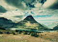
Hidden Lakeby aberrationComment: Sorry but the color scheme in this shot is not appealing to me, would want less acidic colors. 5 |
 Photographer found comment helpful. Photographer found comment helpful. |
| 09/05/2007 10:11:52 AM |
|
| Photographer found comment helpful. |
| 09/05/2007 10:11:36 AM |
Early Morning Fogby BugzeyeComment: Sorry the blurring is just not to my taste, if it´s supposed to look like fog you are not fooling me... |
| Photographer found comment helpful. |
| 09/05/2007 10:11:12 AM |
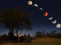
A Night to Remember by Shadowi6Comment: Not bad, I like the effort in this shot. I don´t like the model´s placement though, this shot would have appealed mor to me had they not been under the shadow so I could see them better. Maybe them both standing directly under the red moon, back turned to us, father having let hand on kid´s left shoulder and pointing up at the sky with the right? Also the colors seem a bit strong for a nightshot on the foreground, I would have desatted them somewhat. Sky looks great, ended up giving a 7. |
| Photographer found comment helpful. |
| 09/05/2007 10:09:06 AM |
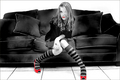
Rochelleby eyeduphotosComment: I usually detest selective desat but here I like it. Wish you hadn´t cut off the toe like that though and not really digging the halo around her either but other than that a pretty good shot, gave a 6. |
| Photographer found comment helpful. |
| 09/05/2007 10:08:17 AM |
Silvery Blewpby BeckyTComment: Although I have seen photos like this hundreds of times, this is still pretty well done, gave a 6. |
| Photographer found comment helpful. |
| 09/05/2007 10:07:53 AM |
Rajasthanby NatashaComment: Not bad but this image could have popped so much more with some strong contrast, reduced colors and vignetting, maybe brighten the eyes a bit. Just look at  librodo librodo´s work if you haven´t already and you should see what I mean. |
| Photographer found comment helpful. |
| 09/05/2007 10:06:58 AM |
Sadnessby MonicagdComment: Don´t get the title but that didn´t affect my vote |
| Photographer found comment helpful. |
| 09/05/2007 10:06:30 AM |
Spartacusby SJCarterComment: Sorry but I don´t really find this a very pleasant photo to look at aesthetically, editing is just way out there for my taste, makes it seem more like a cartoon drawing than a photograph. Gave a 4. |
| Photographer found comment helpful. |
| 09/05/2007 10:05:44 AM |
The Painted Fairwayby NuzzerComment: Sorry but don´t dig the filter effect on this shot at all, I want entries that look like photographs and not something made in paintbrush or illustrator. Just wanted to explain why I gave this a 2. |
| Photographer found comment helpful. |
Home -
Challenges -
Community -
League -
Photos -
Cameras -
Lenses -
Learn -
Help -
Terms of Use -
Privacy -
Top ^
DPChallenge, and website content and design, Copyright © 2001-2025 Challenging Technologies, LLC.
All digital photo copyrights belong to the photographers and may not be used without permission.
Current Server Time: 08/11/2025 01:41:54 PM EDT.