| Image |
Comment |
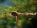
| 11/24/2004 06:42:07 AM |
Authority Over Her Domainby StangComment: Good idea and nice framing but the DOF is totally off here IMO. If you would have included the fly and her front part insted of her rear I am pretty sure it would have been a killer shot. Good colours and good composition. |
| 11/22/2004 01:25:45 PM |
Watching Paint Dryby bruskiComment: Great shot, nice use of negative space and the title ties it all together and makes it work. Only to nitpick though, and I know this is not for you to control but if it had been visible that he had been painting it would have been more effective. (9) |
 Photographer found comment helpful. Photographer found comment helpful. |
| 11/22/2004 01:17:28 PM |
|
| Photographer found comment helpful. |
| 11/22/2004 10:31:45 AM |
|
| Photographer found comment helpful. |
| 11/22/2004 10:24:52 AM |
old watch in new colors - forget about timeby claudia26Comment: Sorry but it horrifies me to see this cheezy photoshop filter or effect. I just can´t give this anything but a 1 but please feel free to ignore me, I have been known to be a little bit close minded. |
| Photographer found comment helpful. |
| 11/22/2004 10:22:41 AM |
Overpassby spydrComment: I would have removed that green glare to the left but other than that, a great shot, if only you would have had more cars on the left side but that is of course very hard to control. |
| Photographer found comment helpful. |
| 11/22/2004 10:20:03 AM |
like swiftly moving waterby ursulaComment: Great colours and contrast but what this photo is lacking IMHO is a focal point to focus your eyes on, there is nothing solid for the eye to rest on and my eye at least wanders all over the frame. (6) |
| Photographer found comment helpful. |
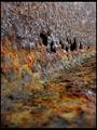
| 11/22/2004 10:11:42 AM |
Rust In Pieceby dpakohComment: Great shot of rust, but in itself not really interesting, that is why I "only" gave it a 7.
However, this would probably look very good on an album cover for a band, or a commercial, anything where you can put text on this and then print it. |
| 11/22/2004 10:09:54 AM |
Mother and Daughterby admart01Comment: Good idea and great execution. Normally I think selective desat is a bit cheezy although I have often used it myself but this is very tastefully done and doesn´t grab your attention but really makes the image work. Also love the lighting and tones in this image. First 10 I give this challenge. |
| Photographer found comment helpful. |
| 11/22/2004 08:30:58 AM |
Still A Little Girl At Heart (77 yrs)by dartompkinsComment: Great portrait, I love her expression, a little sad but she looks like she is really thinking back on some prank she did all those years ago. The beads in the hair add a nice touch and great choice of DOF. Only to nitpick though I think you should have boosted the contrast a little bit more, it looks a bit flat. |
| Photographer found comment helpful. |
Home -
Challenges -
Community -
League -
Photos -
Cameras -
Lenses -
Learn -
Help -
Terms of Use -
Privacy -
Top ^
DPChallenge, and website content and design, Copyright © 2001-2025 Challenging Technologies, LLC.
All digital photo copyrights belong to the photographers and may not be used without permission.
Current Server Time: 08/05/2025 06:25:17 PM EDT.