| Image |
Comment |
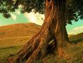
| 07/22/2005 01:26:11 PM |
Landed Gentryby ImagineerComment: I don´t know about this one, I both love it and hate it. I hate the sky, it is an odd mint green phenomenon that I have never seen myself so that is a big drawback in the shot for me personally. I love the rest of the shot though, the texture and colour on the tree is awesome and the shape is very interesting, looks like the tree has some history and it looks very peaceful, I wouldn´t mind having a picknick under that tree. The brown/green grass complements the tree perfectly and the brown hill in the backround ties it all together. I gave this shot an 8 and I would have given it a perfect 10 if the sky had been a deep blue colour. Great job! |
 Photographer found comment helpful. Photographer found comment helpful. |
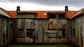
| 07/22/2005 01:22:23 PM |
Driftwoodby bulletheadComment: The white studio backround isn´t adding anything interesting to the shot IMHO, I think I would have preferred to see the piece of driftwood in it´s natural surroundings. The lighting is also a bit too harsh for my taste but other than that pretty good, technically it´s ok, very sharp and it works well to have this B/W. |
| Photographer found comment helpful. |
| 07/22/2005 01:20:15 PM |
The warm soft touch of a new born babyby aKiwiComment: Congratulations on what I presume is your new baby. The shot is very nice, high key works well here and very fitting for the challenge. I don´t get the composition though and it doesn´t appeal to me to have that much empty space on the right side and bottom and IMHO it decreases the impact of the shot but other than that, very nice. |
| Photographer found comment helpful. |
| 07/22/2005 01:17:28 PM |
L'Hôpital Françaisby russiComment: Nice, very fitting for the challenge and I get a real sense of history from the building. |
| Photographer found comment helpful. |
| 07/22/2005 08:58:38 AM |
Coneflowerby LedZeppelin588Comment: Not bad at all but it´s slightly underexposed and that causes it to be a bit flat and makes the colours a bit dull. If I may suggest on how to improve this it would be to expose about 1/2 to a full stop more and correct the WB to a warmer colour and I bet you would like the outcome more. |
| Photographer found comment helpful. |
| 07/22/2005 08:56:44 AM |
|
| Photographer found comment helpful. |
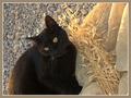
| 07/22/2005 08:55:18 AM |
The Cat destroyed my Textures III project..here's the proof!by XileboComment: Hmmm... Is that Obelix? Good photo but not great. On the plus side it´s got good colours contrast/sharpness. On the minus side it´s shot at a wierd angle so it causes slilght vertigo when I view it, I am not sure if I am looking down on the cat or up at it or if he is sitting up on a wall and it just confuses me.
6 from me. |
| Photographer found comment helpful. |
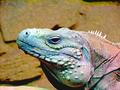
| 07/22/2005 08:53:31 AM |
I got it all, how about a kissyby Prime_TimeComment: Good effort but 2 things that stop this from being more than average IMHO.
1. Lighting is too harsh to really let the texture of the lizards skin stand out more.
2. The noise in the image is too much for my taste, especially combined with the harsh lighting.
5 from me. |
| Photographer found comment helpful. |
| 07/22/2005 06:36:31 AM |
|
| Photographer found comment helpful. |
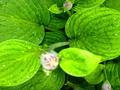
| 07/22/2005 06:04:55 AM |
Flowerby JaniePants4Comment: IMHO the flower that reaches up and is in front and out of focus draws way too much attention and I find it irritatingly and I just want to squint my eyes to see it better. Other than that its good, nicely lit and on topic. |
| Photographer found comment helpful. |
Home -
Challenges -
Community -
League -
Photos -
Cameras -
Lenses -
Learn -
Help -
Terms of Use -
Privacy -
Top ^
DPChallenge, and website content and design, Copyright © 2001-2025 Challenging Technologies, LLC.
All digital photo copyrights belong to the photographers and may not be used without permission.
Current Server Time: 08/11/2025 08:36:01 PM EDT.