| Image |
Comment |
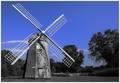
| 07/28/2005 11:17:20 AM |
Weatheredby JayWalkComment: If I may be honest I think I would have liked it more if the whole shot had been b/w or in colour, this selective desaturation doesn´t appeal to me personally and also draws the attention to the sky instead of the windmill wich is presumably the connection to the theme "wooden". Having said that though I still think this is above average in this challenge, I like the composition. |
 Photographer found comment helpful. Photographer found comment helpful. |
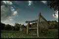
| 07/28/2005 11:10:07 AM |
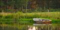
Lonely Park Benchby deapeeComment: Nice scene, I like the composition but this shot has too much halo for my taste, in particular around the bench and also it´s a bit dark for my taste but I like everything else about it, 7 from me. |
| Photographer found comment helpful. |
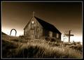
| 07/28/2005 10:18:53 AM |
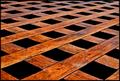
All made from woodby JohannesFrankComment: Nice, good choice to make this sepia toned and I like the composition and the fact that it tilts down to the right. However, I don´t think it´s sharp enough, did something happen when you downsized it or is it just out of focus or did you forget to sharpen it after resizing it?
�áááfram �sland.
|
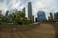
| 07/28/2005 10:13:12 AM |
Welcome To My Dream Spaceby flip89Comment: Clever use of a fisheye, I like the composition. It looks a bit flat though, maybe some more contrast would improve it? |
| Photographer found comment helpful. |
| 07/28/2005 10:12:25 AM |
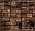
Stack 'em High, 9 Storey packing casesby tasha4pawsComment: Nice shot, only thing I want to suggest to make it better is that even though you have the fence at the bottom it´s pretty hard for me to get a sense of scale to this picture and therefore I don´t think it has a strong visual impact as it could have had if you had a person or something that you could relate to more in the shot. Nice work, I gave it a 7. |
| 07/28/2005 10:10:02 AM |
Water Loggedby spydrComment: Nice, I like the framing, the 2:1 panorama crop works well here. |
| Photographer found comment helpful. |
| 07/28/2005 10:08:53 AM |
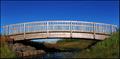
Two bridgesby hjolliComment: Is this Ellidardalur? I like the composition and although it´s almost too much saturation for my taste the colours are nice and pleasing and this is pretty good. I don´t think it´s as interesting as it could have been though, there is nothing that makes me wonder about this picture, it´s "merely" pleasing to the eye (wich is good, don´t get me wrong) Maybe someone standing on the bridge or walking over it would have made it more interesting. Anyway, one of the better shots in the challenge, hope you do well. |
| 07/28/2005 10:06:32 AM |
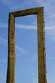
portalby visaksenComment: I for one would have liked to see the surroundings about this portal, as it is not very interesting as it is right now. Also I believe this shot would improve if you had used a polarizer to make the sky more dramatic and there is a small dust spot almost in the dead center of the frame. In short I like this shot but due to all the reasons I just named it´s only an average shot in this challenge for me, 5 from me. |
| Photographer found comment helpful. |
| 07/28/2005 10:04:14 AM |
|
| Photographer found comment helpful. |
| 07/27/2005 06:05:20 AM |
|
| Photographer found comment helpful. |
Home -
Challenges -
Community -
League -
Photos -
Cameras -
Lenses -
Learn -
Help -
Terms of Use -
Privacy -
Top ^
DPChallenge, and website content and design, Copyright © 2001-2025 Challenging Technologies, LLC.
All digital photo copyrights belong to the photographers and may not be used without permission.
Current Server Time: 08/11/2025 10:55:13 PM EDT.