|
|
|
Showing 3051 - 3060 of ~4457 |
| Image |
Comment |
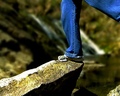
| 04/21/2006 01:31:42 PM | Balanceby SJCarterComment: Greetings from the critique club :)
Let me start off by saying for me it doesn´t really meet the challenge, the photo itself has no action going on, for me the challenge meant to take a photo of some kind of jump where something or someone was in mid air and also the title doesn´t help in this regard since balance really implies that the person in the photo isn´t about to jump but rather standing still and not trying to fall down, a jump the farthest thing from his mind.
Technically it´s a nice photo, well lit with the expection of the slight blown out highlights on the stone you are standing on. Composition is nice also, I like that you can just see the legs and you cut off the right leg just above the knee. The left leg though bothers me a bit, think I would have liked it better if it were either totally out of the frame or more in it, the foot being there too. I like the backround and the shallow DOF, I see you did that in the post processing and you could have fooled me, I am usually quick to spot fake lens blur but here it didn´t even occur to me till I saw the camera used and the photographers comments. I like the colours, contrast and sharpening and think you did a nice job with the post processing.
Mainly because of the non jump factor in this challenge I can honestly say I would have voted it a 4. If this was a balance challenge I would have given it a 6 since it´s technically nice but doesn´t have that wow factor, 6 is something I give to above average photos that miss that certain "wow factor". I can at least certainly understand the low score but I think it´s solely because of DNMC votes.
Kind regards from Iceland, Larus. |  Photographer found comment helpful. Photographer found comment helpful. |
| 04/21/2006 12:13:20 PM | Supersonic Jumpby madcrabberComment: Greetings from the critique club :)
Sorry but this is a going to be a bit short, can´t really think of much to say about this picture.
I didn´t vote in this challenge but I think I would have given this a 6, a rating I give out to photos that are above average in the challenge but don´t really have that extra "umpfh" or wow factor that make me wanna give it a higher score.
Technically this is a nice photo. The players are in focus and the motion is pretty well stopped. However, this shot would have worked so much better with a bigger aperture, like a 2.8. I assume you used your 18-55 for this shot since you didn´t put that info there. I know guys here in Iceland that use the 50mm 1.8 lens for indoor sports so getting a lens with useable 2.8 aperture doesn´t have to cost you thousands of dollars, I would suggest you look into this lens if you wanna do more indoor sports work. It would have made it possible for you to get the same shot with iso 800 and 1/250 of a second shutter time and also leading to a shallower DOF wich is the main fault with this image as far as I am concerned, the deep DOF isn´t isolating the players from the crowd and as a result my eye is drawn to the crowd as much as the players, wandering around the frame instead of being drawn to the action. I am not sure about the b/w conversion, I think personally I would have liked this better in color but making it b/w makes it more artsy, I am not sure and would have to see the original to make up my mind. I just think that in colour, the players wouldn´t blend in as much with the crowd. The contrast and sharpness are good in this photo.
I have never used a gradient map to make b/w, I use the channel mixer in photoshop to do b/w conversion as it gives me control over how much of each channel I use to make the photo black and white, I suggest you try it out. I´m not saying it´s a better method, just saying you should experiment and see what you like better, I am gonna try the gradient map and see how I like it.
As for meeting the challenge, no question there. All in all a pretty good shot, like I said, I don´t hand out 6´s unless the photo is above average and this has a lot of potential. Wish I could go to NBA games and take photos... Sigh, maybe sometime :)
Kind regards from Iceland, Larus. | | Photographer found comment helpful. |
| 04/21/2006 11:47:33 AM | Silby messerschmittComment: I have told a lot of people in this challenge that wide angle lenses are a big no no for portrait photography, unless of course you know how to use them and this is a good example of how it should be done if you want to use a wide angle, you obviously know enough about photography that you can break the rules and still make it work. Nice lighting. | | Photographer found comment helpful. |
| 04/21/2006 11:45:59 AM | |
| 04/21/2006 10:05:25 AM | Killing Me Softlyby ShannonLeeComment: If only the eye were in focus, this would be a very good image. However it is not so this really crashes and burns with that... Shame, I like the composition and colorization of this. | | Photographer found comment helpful. |
| 04/21/2006 10:04:36 AM | NOOOooooooby PainielComment: Sorry but the rough post processing method you used is a little bit over the top for me, I like the style but just too much, I think I would have liked this method if you had stopped halfway there if you catch my drift. | | Photographer found comment helpful. |
| 04/21/2006 10:01:50 AM | The Oneby bravo sixComment: Wow, that is a pretty cool bikini, love that you added the diamonds (or whatevery they are) on her stomach. Lighting is top notch and I like the expression on the model. I like this shot, very edgy and I gave it an 8. |
| 04/21/2006 09:59:27 AM | The Pleasure is All Mineby LoraComment: Main problem I have with this shot is the lighting, or the lack of it in his face. That, boost some cotrast and you would have a pretty good image on your hands, I like the composition and his expression. |
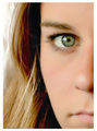
| 04/19/2006 12:11:53 PM | Silenceby EnnilComment: Love those catchlights, almost done with the voting and been waiting to se a ring catchlight, love those. Not really loving the post processing as it comes to skintones though, too white/purple somehow for my taste, also composed a little bit too tightly or not tight enough somehow, what I mean is either compose tighter and lose the fingers and just concentrate on her eyes and that area or a slightly wider composition that has all of the left hand in the shot and most of the right one too and show more of her hair, this is somewhere in between and it just doesn´t seem to fit somehow, well to my taste anyway :)
Like this photo, gave it a 7. | | Photographer found comment helpful. |
| 04/19/2006 12:09:09 PM | Colour in Shadowby mocabelaComment: Nice job, I really like the lighting in this one and her expression, feel like it tells me a bit about the girl in the photo. Only to nitpick though, I don´t like the way her glasses, in specific the top rim is cutting through her eye like that, I would have adjusted them so either they are either lower on her nose so that her eyes are above the rim or the total opposite. Got a 7 from me. | | Photographer found comment helpful. |
|
Showing 3051 - 3060 of ~4457 |
Home -
Challenges -
Community -
League -
Photos -
Cameras -
Lenses -
Learn -
Help -
Terms of Use -
Privacy -
Top ^
DPChallenge, and website content and design, Copyright © 2001-2025 Challenging Technologies, LLC.
All digital photo copyrights belong to the photographers and may not be used without permission.
Current Server Time: 08/18/2025 05:17:25 PM EDT.
|