| Image |
Comment |
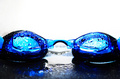
| 06/23/2006 12:41:40 PM |
Swimby Mal37Comment: Cool shot, I like the strong contrast and colors, not as fond of the WHITE backround, think if the backround would have been the same as the mirror the glasses are lying on, this would have been a killer shot :) Still good and got a 7 from me. |
 Photographer found comment helpful. Photographer found comment helpful. |
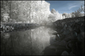
| 06/23/2006 12:40:33 PM |
Frozenby ChikaZAWaComment: Nice IR, reminds me of Marbo´s shots but this one isn´t as crystal clear as his usually are, nice work nevertheless. |
| Photographer found comment helpful. |
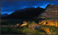
| 06/23/2006 08:40:56 AM |
Yellowstone Nightby steffyldComment: Pretty cool shot, too bad they don´t make flashlights powerful enough to light up that dark mountain in the backround, now THAT would have been a ribbon shot :) |
| Photographer found comment helpful. |
| 06/23/2006 08:40:14 AM |
The Grand Riverby KGregoryComment: Nice shot, gave it a 6, feel as there is something missing in the shot, like the main part of this photo is the river according to the composition and it´s just too dark and has nothing on it of interest. |
| Photographer found comment helpful. |
| 06/23/2006 08:33:06 AM |
City Glowby mhpnzComment: This shot I like, really like. Normally I hate blurry photos but this one just really speaks to me, something with the mix of coloring, composition and most definately the mood in it really gets to me. I don´t think you are scoring well though as this is not a typical "do well on dpc" photo, I hope you are though but for what it´s worth, it got a 10 from me and wound up on my favorites list. |
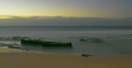
| 06/23/2006 08:30:42 AM |
Sea Mistby FirstyComment: I would have suggested a wider angle lens used and getting closer to eliminate the sand part of the photo and put more of an emphasis on the stone(s). |
| Photographer found comment helpful. |
| 06/23/2006 08:29:16 AM |
My Father was a Painterby TitiaComment: Sorry but the subject choice here is not to my taste, the subject is way too busy and abstract, my eye sees nothing interesting here and I just found myself wanting to click that "5" button to see the next shot. |
| 06/23/2006 08:27:44 AM |
30 seconds of IKEA sunriseby Haukur JoComment: I would suggest you using the full 640 pixles next time, it will surely lead to a better score, that and avoting blown out highlights as a big part of the photo. |
| Photographer found comment helpful. |
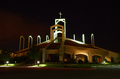
| 06/22/2006 11:18:59 AM |
Churchby rlinn3Comment: This would have been more spectacular if it were taken closer to sunset or before sunrise, with a tint of blue in the sky but still dark but not bad at all. |
| Photographer found comment helpful. |
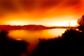
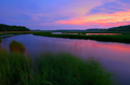
| 06/22/2006 11:17:48 AM |
Flood Tide at Twilightby Bear_MusicComment: I have a feeling this is not Roberts shot (Bear Music) but very similar. His shots normally have better image quality, the sky in particular is a bit close to blowing out the red channel in spots and seems almost oversaturated (well for my taste anyway). I really do like the composition though, nice job on that and in that regard it´s as good as Robert´s work, just need slightly better image quality and a skiff and your all set :) |
| Photographer found comment helpful. |
Home -
Challenges -
Community -
League -
Photos -
Cameras -
Lenses -
Learn -
Help -
Terms of Use -
Privacy -
Top ^
DPChallenge, and website content and design, Copyright © 2001-2025 Challenging Technologies, LLC.
All digital photo copyrights belong to the photographers and may not be used without permission.
Current Server Time: 08/28/2025 08:07:47 AM EDT.