| Image |
Comment |
| 01/04/2007 06:43:53 PM |
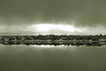
Heaven's Winterby PhantomEWOComment: I really dig this shot, very minimalistic and "clean". Should most definately have put it up in 700 pixles though, that would have hurt your score and you are probably aware of this but just in case you are new here blown highlights doesn´t do well with DPC voters here. They don´t bother me in the least in this shot though, I actually like the strong light coming from the center. 8 from me. |
 Photographer found comment helpful. Photographer found comment helpful. |
| 01/04/2007 06:41:30 PM |
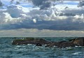
The Living Seaby JunieMoonComment: Well not a bad shot but kindof flat contrast wise for my taste and not really anything I haven´t seen before but that´s just me and I live by the sea so I need more than that to be impressed. Voted a 5. |
| Photographer found comment helpful. |
| 01/04/2007 06:35:41 PM |
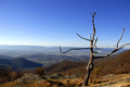
Shrinking Natural Environment -- harsh for wildlifeby JuliBocComment: Sorry but since you went this way and did a shot like this I can´t help but compare it to the two similar shot´s that finished in the top 10 of the sky challenge and frankly this is not nearly as well done. Mostly what bothers me is the fuzzyness of the trees, the fact that they are cut off on the right and left side and the lackof detail and texture in it. You probably think I voted 1 with that comment but well it´s not bad at all though, just not good either so I voted 5 :) |
| Photographer found comment helpful. |
| 01/04/2007 06:34:18 PM |
The Burning Bushby SherwinJamesComment: I never really pay much attention to titles and I needed it to figure out what the deal was with this picture, that there was a flame there, I just thought it was a bush in red autum colors. Anyway, that portion of the shot is too small a part of the shot and doesn´t draw enough of my attention to it, for my taste anyway. Honestly my eye more wanders to the red grass or plants in the bottom of the middle of the shot. I would have framed it more tightly around the flames and composed it on the rule of thirds point in the upper left corner. 5 from me. |
| Photographer found comment helpful. |
| 01/04/2007 06:30:40 PM |
Fern in Caveby rod1Comment: Well sure, meets the challenge, no doubt. However, the lighting is what´s bothers me most, the obvious and harsh flash lighting to be specific. I see it´s shot in a cave (wich I find hard to believe, fern´s need sunlight to survive but whatever...) but that´s no excuse since your subject is stationary. A tripod, longer shutter and softer lighting coming from some angle than on camera would dramatically have improved this shot :) 4 from me. |
| Photographer found comment helpful. |
| 01/04/2007 06:28:39 PM |
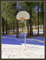
Got Game?!by elizadebComment: Well this is a shot that I say is neither bad nor good but two things dragged it a bit under 5. Usually I don´t really mind blown out highlights but here it kindof steals attention from the main subject, the basket. Secondly, the composition is hardly horrible but too centered for my taste, a shot wich had placed it better in the frame, perhaps according to the rule of thirds would have appealed more to me. 4 from me. |
| Photographer found comment helpful. |
| 01/04/2007 06:26:43 PM |
|
| Photographer found comment helpful. |
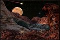
| 01/04/2007 06:20:48 PM |
The Red Planetby BradComment: Well this is good, nice job with the processing. Two things though that bother me. First is the lighting on the foreground, it comes from a wrong direction on the red rocks that are in the front part of the photo and I would suggest darkening them. The other is the very slight movement of the stars, I either want them stationary or with very definitive startrails and this is somewhere in between but that´s just my personal preference. I like this outcome though and gave it a 7. |
| Photographer found comment helpful. |
| 01/04/2007 06:16:47 PM |
Declaration of Warby StrikeslipComment: Nice shot, lighting is ok and the backround is kindof cool, wish you had done a bit better job with the masking though as the top of their heads hairlines give it away but that´s just nitpicking :) |
| Photographer found comment helpful. |
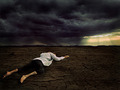
| 01/04/2007 06:13:20 PM |
Limits by JudiComment: Well this is nice, I almost want to guess this is Gary´s work but processing not quite up to his usual level so if it is your´s, you got a little sloppy this time. Mainly the shadows and burning around the man give it away and the "a little over the top" sky and sunlight also not quite 100% to my taste. I still like this image a lot and gave it a 7 so don´t get me wrong and if this isn´t Gary, then at least I compared you to Kiwiness and that can´t be all bad :) |
| Photographer found comment helpful. |
Home -
Challenges -
Community -
League -
Photos -
Cameras -
Lenses -
Learn -
Help -
Terms of Use -
Privacy -
Top ^
DPChallenge, and website content and design, Copyright © 2001-2025 Challenging Technologies, LLC.
All digital photo copyrights belong to the photographers and may not be used without permission.
Current Server Time: 08/24/2025 01:25:15 PM EDT.