| Image |
Comment |
| 11/22/2004 11:21:00 PM |
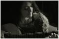
Strummingby rscorpComment: I would move the camera to the right, about 1/4th of the frame. Would make it a less of a symmetric composition and will help get rid of the hand on the left that looks alien as it is. Otherwise excellent. |
 Photographer found comment helpful. Photographer found comment helpful. |
| 11/22/2004 11:19:00 PM |
I Hope He Shows Upby leteneleComment: Ah, very nice, but in my opinion shots like this should leave some space for the person's look... so i'd move the camera to the right, about 1/3 the width of the frame. |
| Photographer found comment helpful. |
| 11/22/2004 11:17:41 PM |
Graceby hanlombaComment: I would either zoom in or zoom out here. Seems a little bit too tight on 3 out of 4 sides. Probably zoom in. Otherwise excellent. |
| 11/22/2004 11:15:53 PM |
|
| Photographer found comment helpful. |
| 11/22/2004 09:27:22 PM |
|
| Photographer found comment helpful. |
| 11/22/2004 09:25:48 PM |
B&W Intentional Blur - Drive Homeby dugparkComment: Too bad you have to explain to folks that the blur is intentional. I'm gonna give you a 10 here, even though i only like the reflection of the trees in the mirror, just to compensate for the fact that my own pic is getting screwed because of a few intentional features in it. |
| 11/22/2004 09:23:25 PM |
Self Portraitby mecfcostaComment: What i like: awesome composition, the not-too much contrast goes here well. What i don't like: definitely the chain, it harshly removes all tenderness that's supposed to associate with the female body; placement of the head: i'd much rather see the eyes as opposed to the inside of the nose. And lastly, i think it would look more appealing in high key, not hard contrasty high key, but also soft, yet bright high key. |
| Photographer found comment helpful. |
| 11/22/2004 09:19:35 PM |
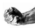
Fisticus Rectusby lwkimagesComment: Good technique, but the subject has no appeal... I guess the composition could be a little more interesting as well. |
| 11/22/2004 09:18:19 PM |
|
| 11/22/2004 09:12:38 PM |
B&Wby LongComment: A still life composition should have some kind of a point to it, not just a set of random objects; an immaculate light, especially in b/w; and well thought out composition. Unfrotunately, i don't see any of that here. |
| Photographer found comment helpful. |
Home -
Challenges -
Community -
League -
Photos -
Cameras -
Lenses -
Learn -
Help -
Terms of Use -
Privacy -
Top ^
DPChallenge, and website content and design, Copyright © 2001-2025 Challenging Technologies, LLC.
All digital photo copyrights belong to the photographers and may not be used without permission.
Current Server Time: 08/27/2025 10:54:09 AM EDT.