| Image |
Comment |
| 05/10/2006 12:28:06 PM |
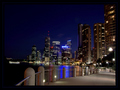
R I V E R W A L Kby manic35Comment: The colours and lighting are beautiful. The only thing that spoils it for me is the horizon. Either more skewed or straight works for me. That being said you still have captured a great shot |
| 05/10/2006 03:56:00 AM |
Keep Your Chin Upby SandyPComment: Congratulations on a great image, and on advancing to the Final of the MS Tourny.
|
 Photographer found comment helpful. Photographer found comment helpful. |
| 05/05/2006 09:13:34 AM |
|
| Photographer found comment helpful. |
| 05/04/2006 05:07:22 AM |
Siblingsby bucketComment: This is a great shot the balance between the children is excellent. I do however find that the background is a little distracting. I would try toning this down a little, to relly bring out the faces of the children |
| Photographer found comment helpful. |
| 05/04/2006 05:03:59 AM |
K2by mahobbesComment: I like the thought process which you havegone through. I feel that there are one area that would help next time you try this is Slightly more motion blur for the background through either a longer shutter speed or post processing. |
| Photographer found comment helpful. |
| 05/04/2006 03:56:26 AM |
Missing Man Formationby MelethiaComment: Congratulations with the to 20 result with this.
I notice the feedback you received from DanSig. I would agree with the idea about the wide lens and stormy clouds, however I feel the sky does work very well in the negative and adds to the feel of this picture.
I disagree with his view about direct representation of art. If this had been in the “positive” that would be a fair comment, but by reversing the colours I feel that you have moved away from an art representation and into an abstract.
|
| Photographer found comment helpful. |
| 05/03/2006 06:13:37 AM |
|
| Photographer found comment helpful. |
| 04/19/2006 05:45:00 AM |
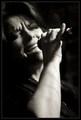
The Jazz Singerby jmsetzlerComment: John
I would not feel bad about this photo. It may not have scored highly but it is a great image. I feel the general tonal qualities and softness of the face help carry the emotion of the subject.
I also like this quite a bit... |
| 04/06/2006 04:20:30 AM |
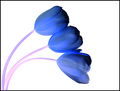
1-2-manyby messerschmittComment: I love how you have achieved an impressionist feel to this shot. The simplicity of pastel colours and the deformed lines give a semi surreal feeling which result in a delightful image to look at.
Compositionally I feel that there is just a little too much of the blue at the bottom of the image. Cropping to half way between the mauve/blue transition, and the bottom would I feel produce a stronger result.
That being said this is a wonderful image, and completely different in approach and style to the others I have seen to date. – Well done with this great idea. |
| Photographer found comment helpful. |
| 04/06/2006 04:06:51 AM |
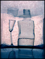
quasi chiaroby tateComment: The effect with the glass and the vase on the right hand side works really well. I am not sure about the inverted glass on the left. For me compositionally it does not seem to add anything to this shot. I accept that it does balance the set up you have here, however removing it from the shot and a having a more central image with the other two elements would I feel have more visual strengths.
I like the fact that you have gone for a monotone approach, which means that your image is structured around line and form rather than colour. As a concept this works well, and overall, I feel that you have a good image here. I hope it does well for youâ€Â¦ |
| Photographer found comment helpful. |
Home -
Challenges -
Community -
League -
Photos -
Cameras -
Lenses -
Learn -
Help -
Terms of Use -
Privacy -
Top ^
DPChallenge, and website content and design, Copyright © 2001-2025 Challenging Technologies, LLC.
All digital photo copyrights belong to the photographers and may not be used without permission.
Current Server Time: 09/01/2025 06:20:56 AM EDT.