| Image |
Comment |
| 07/26/2004 05:16:18 PM |
The First Bite Is The Sweetest.by CuriousComment: Excellect shot!
Very nice composition. The look in the eye creates a nice conflict with the candy isolated on the right which leave the viewer looking between the two. The reflection also adds some interest. Just a little more light on the fight of the face might have helped, but just maybe. One of my top two for the challenge. |
 Photographer found comment helpful. Photographer found comment helpful. |
| 07/26/2004 05:11:50 PM |
The sweetest thing.by p_johnsComment: One of my favorites from the competition, and not just because of the subject matter. The lighting is warm and soft which adds a nice look to the skin and creates a nice contrast to the dark and shiny chocolate. I also like the composition because of how the chocolate starts on the top right and works it way down into the frame. The only improvement might be to reduce the hightlights in the chocolate. I think you could maintain the shiny look without letting it go all the way white. Definitely one of the more creative of the challenge! |
| Photographer found comment helpful. |
| 07/26/2004 10:53:20 AM |
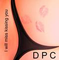
DOCILE PIECES of CEDARby timganierComment: Fantastic concept!!! I don't know that I would be overwhelmed with the photo as a standalone piece of work, but it is perfect for drawing attention to the album and supporting the title. Your creativity on the title is what puts this over the top.... you managed to connect DPC back to one of the more interesting themes from the site. |
| Photographer found comment helpful. |
| 07/26/2004 10:46:41 AM |
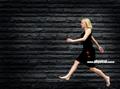
Devine Physical Controlby arnitComment: Almost perfect! If you could have frozen the motion for at least her head this would have been an 11 and one of my all time DPC favorites. It's good... but I'm frustrated because it was so close to amazing.... |
| Photographer found comment helpful. |
| 07/26/2004 10:41:44 AM |
Dangerously Polite Citizensby artvetComment: Perhaps the slight overexposure in the top right was intentional, but from my perspective the light area grabs too much attention. |
| Photographer found comment helpful. |
| 07/08/2004 01:20:02 AM |
A carpenters handsby JC_HomolaComment: Originally posted by jmsetzler:
This photo is severely underrated IMO. Great work :) |
I couldn't agree more. This was one of three 10s that I gave for this challenge. |
| Photographer found comment helpful. |
| 07/07/2004 04:22:11 PM |
Midsummer Sceptivitiesby DonatienComment: The background is a bit distracting, but I cannot get by her eyes and the colors. So warm and human... it's makes me smile every time I look. |
| Photographer found comment helpful. |
| 07/07/2004 04:21:53 PM |
Poppy foreverby pcodyComment: Wonderful view of a poppy. I love the lighting and the way you have layered the petals. Only point that I might discuss would be to show less of the center (forget what that's called). All I would need to see is the very edge to help identify the subject and then just let the user flow up through the layered petals. |
| Photographer found comment helpful. |
| 07/07/2004 04:17:35 PM |
The Brideby albeckComment: I wish I could see more of her eyes, but the composition and color work very well. |
| Photographer found comment helpful. |
| 07/07/2004 04:13:08 PM |
Sailing At Duskby MWittComment: I am going to go with an 8 because you able to affectly incorporate so many layers.. boats, shore, buildings, mountaints, and clouds... wow! |
| Photographer found comment helpful. |
Home -
Challenges -
Community -
League -
Photos -
Cameras -
Lenses -
Learn -
Help -
Terms of Use -
Privacy -
Top ^
DPChallenge, and website content and design, Copyright © 2001-2025 Challenging Technologies, LLC.
All digital photo copyrights belong to the photographers and may not be used without permission.
Current Server Time: 08/26/2025 07:17:35 AM EDT.