| Image |
Comment |
| 07/29/2002 03:10:00 AM |
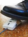
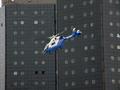
Reality Vs Dot-Comsby ManicComment: Don't quite see how the title fits in but what's in a title? Nice image. Like that blue highlight on the shoe. Don't care for the washed out area in the top of the image. |
| 07/29/2002 01:02:00 AM |
CRASHby MartinComment: Wonder about the authenticity of the license plate??? The image sure fits the current mood on Wall Street about the corporate world. Would have preferred if the other car and the background trees would have been blurred to keep all attention on the crashed car but overall: good image |
| 07/29/2002 03:08:00 AM |
|
| 07/29/2002 04:23:00 PM |
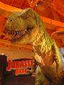
Corporate Giantby mikeysbistroComment: Ad for theme parks? Corporations are not dinosaurs by any stretch of the imagination. So, I find your title and presentation stretching. |
| 07/29/2002 04:03:00 PM |
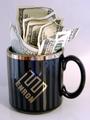
Got Money?by MeggieComment: Cool image. Effective. The variations on the Got Milk? slogans are getting to be a bit stale though. Don't care about the reflections on the mug. Otherwise, it would have been great. How did you get that E mug? Hope that it isn't because you worked for them :( |
 Photographer found comment helpful. Photographer found comment helpful. |
| 07/29/2002 01:06:00 AM |
|
| 07/29/2002 03:45:00 PM |
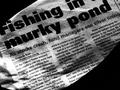
Sell Phoneby LanSnakeComment: Even though the telecom ind is in the dumps their pillars are still standing tall. Nice image. Excellent composition. Like the sinister look those two claw-y things give to the image. |
| 07/29/2002 04:05:00 PM |
|
| 07/29/2002 02:45:00 AM |
Life in the Fast Laneby tee tahComment: The picture tells the story and the title only underscores it in an ironic fashion. This picture is actually horribly depressing but only because it is so true! If you had cropped it out right above the mountains instead of showing all that sky, the picture would have been much more effective because then it becomes almost claustrophobic!! Don't know exactly why but that empty space on the right lane somehow bothers me; perhaps because it defies the bumper-to-bumper idea. This is not the greatest technical picture because it is an opportunity shot but I find it effective for the challenge. |
| 07/29/2002 01:43:00 AM |
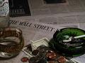
Wall Street Stressby psychephylaxComment: You are effective in getting your message across here but you are not doing it in a particularly beautiful way. Don't care for the composition, particularly the top two pages of the WSJ and all that change. The change is in the foreground and too dark and out of focus. With fewer objects and a better arrangement of them you would have had a much better picture. Good idea though. |
| Photographer found comment helpful. |
Home -
Challenges -
Community -
League -
Photos -
Cameras -
Lenses -
Learn -
Help -
Terms of Use -
Privacy -
Top ^
DPChallenge, and website content and design, Copyright © 2001-2025 Challenging Technologies, LLC.
All digital photo copyrights belong to the photographers and may not be used without permission.
Current Server Time: 08/24/2025 02:17:18 PM EDT.