DPChallenge: A Digital Photography Contest You are not logged in. (log in or register
 
Browse Settings
Currently viewing:
Registered Userpidge

Show comments:

Per page:

Order:

Comments:


Comments Made by pidge
Pages:   ... [65] [66] [67] [68] [69] [70] [71] ... [95]
Showing 671 - 680 of ~943
Image Comment
Ski Jumper - 1
11/24/2005 09:32:33 PM
Ski Jumper - 1
by alfresco

Comment:
Fantastic capture!

Only comment is the light areas of his suit seem to border on blown out. It may be due to sharpening a bit to much.

Colors and sky are great!
Photographer found comment helpful.
Happy
11/24/2005 09:29:48 PM
Happy
by alfresco

Comment:
Hehe
Love the expression, especially since the girls seems to be in a more somber mood :)
Photographer found comment helpful.
Horseface's Eye, edited.
11/24/2005 09:28:12 PM
Horseface's Eye, edited.
by alfresco

Comment:
Like the edited version, though seeing the photographer as a reflection could have been cool if you'd had your whole body in

Great clarity and colours in this one
Photographer found comment helpful.
Floatation Device
11/04/2005 06:46:41 PM
Floatation Device
by sacs

Comment:
Salut from the critique club!

Hmmm, a couple of things strike me right away.

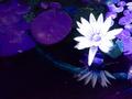
One is focus. It seems as though the reflection of the flower and the pipe in the water is more in focus than the actual flower itself. I feel that this was not the intent of the picture, so it is a bit distracting. Since you were going for an homage to Claude, having something in focus detracts from the softness of the main subject

I like the idea that it's a tribute to Monet, but for my tastes, it doesn't quite work. One is the colors. I think of Monet and I think of soft spring colors. The white of the flower is a bit harsh compared to the rest of the picture. I also find Monet's use of color is what gives it that fabulous soft sense (along with his painting techniques). The purple I find is a bit unnatural looking.

The composition is quite nice. Using the rule of thirds is always a nice way to give dimension to your photograph.

A couple of people commented on the blown highlights of the flowers. I find that it is so white, it almost makes me want to put some sunglasses on :D Actually, having that much white sometimes work, but I think in this particular situation, it worked against you as opposed to for you.

A word about the title. Everyone has a different view on how important a title is. For me, it's about the photo first, and the title second. However, I often find a well-done title will give me a peek into what the photographer is capturing/conveying/portraying/etc. Some will say the photo shuold stand for itself, but hey, Monet's paintings have titles, right? So, my point is I think thinking about a nicer title would create a better sense for the picture. With your title, it makes me think of flotation devices (lifesavers in boats and such) and then i notice the pipe in the water.

I see this was your first challenge. You took a very daring approach for a first timer, and I applaud you for that. I am glad you are here to learn, and I look forward to your future entries.

You may want to consider becoming a member. The member challanges allow you a bit more post processing freedom which may help you in your graphical design class.

happy shooting!
If you have any question, feel free to pm me
Cheers!
pidge
Little Women
11/03/2005 11:32:53 PM
Little Women
by CalliopeKel

Comment:
Excellent capture, great use of b&w and the contrast is great
Photographer found comment helpful.
Silenced Noise
10/29/2005 02:36:12 PM
Silenced Noise
by Yellowpeep

Comment:
Very nice. Great subject, well captured, excellent use of light, and good use of grain.
Photographer found comment helpful.
Rebel
10/29/2005 02:35:22 PM
Rebel3rd Place
by gaurawa

Comment:
Excellent portrait and great use of the challenge topic. His expression is so intense, it makes you wonder what he's thinking. Good luck
Photographer found comment helpful.
Inner Strength
10/29/2005 02:34:10 PM
Inner Strength
by Bud

Comment:
I really like this picture. Great capture, great expression, but my only critique is it seems a bit stagnant. I'm not sure why, but I think it might be that it is so centered and symmetrical. Maybe having the slat a little bit more off center, or having your subject slightly off center would change that. I know composition is subjective, so this is only a suggestion and a humble opinion.
Photographer found comment helpful.
Despair
10/29/2005 02:31:57 PM
Despair
by Rikki

Comment:
Nice portrait. I can't decide if I like the shaodw in the back though. And I feel while the light is ncie and adds to the character of the picture, I wish the darks ide of his face was just a bit lighter. It may also just be my monitor. Good job
Photographer found comment helpful.
Howdy!
10/29/2005 02:30:33 PM
Howdy!
by parrothead

Comment:
One of the few color protrataits I've seen where the grain enhances as opposed to distracts. Great expression and use of light
Photographer found comment helpful.
Pages:   ... [65] [66] [67] [68] [69] [70] [71] ... [95]
Showing 671 - 680 of ~943


Home - Challenges - Community - League - Photos - Cameras - Lenses - Learn - Help - Terms of Use - Privacy - Top ^
DPChallenge, and website content and design, Copyright © 2001-2025 Challenging Technologies, LLC.
All digital photo copyrights belong to the photographers and may not be used without permission.
Current Server Time: 08/08/2025 08:11:25 AM EDT.