| Image |
Comment |
| 05/23/2007 12:59:29 PM |
Hooked !by alexzenComment: Oooh Jeez! This really oozes appeal of all sorts! I absolutely love the pose the desat, the lighting, in fact I think it's flawless, very well captured. Without a doubt my highest scorer, in fact one of my very rare 10s, you must win or at least ribbon with this. Good luck |
 Photographer found comment helpful. Photographer found comment helpful. |
| 05/23/2007 12:52:58 PM |
Lifelineby alexjackComment: A good capture, the rope's shape and position makes it. Good composition and a good range of tones throughout. Good luck |
| Photographer found comment helpful. |
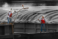
| 05/23/2007 12:50:11 PM |
Sailing on the Hudsonby ladpupmoeComment: Nice vibrant sail against the mono background. I think a lower viewpoint and more OOF background would have given it more impact. Would it benefit from straightening, or perhaps it's just my weary old lamps. Good luck |
| Photographer found comment helpful. |
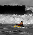
| 05/23/2007 12:43:35 PM |
Now...Where's that Wave?by owenComment: I like this, good caption! The mono is very effective and good capture of the waves with good composition. Good luck |
| Photographer found comment helpful. |
| 05/23/2007 12:40:59 PM |
Catholic Girlby ElliottjmsComment: Until I scrolled down I thought too posed and rigid and then I saw those lovely crossed legs, they really make it for me! I'm not sure about the door for me it competes too strongly with the model my eyes keep getting drawn away from her to the door. The frontal lighting doesn't help either. Just my opinion, good luck |
| 05/23/2007 12:35:51 PM |
373by hopperComment: I like this. Nice composition and mono gradation, I love the tree frame. A personal thing that does not in any way affect my score but I would have preferred a strong red colour for the door. Good luck |
| Photographer found comment helpful. |
| 05/23/2007 12:31:23 PM |
Orange Jewelby ArpeggioAngelComment: This is a good macro but on my screen I'm sorry, but it looks a little over-sharpened. I wonder if cropping a chunk off the left may have given it a bit better composition? I actually like the OOF of the wing tips. Good luck |
| Photographer found comment helpful. |
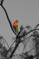
| 05/23/2007 12:25:49 PM |
Lorikeetby andrewroxanComment: The bird has very vibrant colours especially against a mono background, but, if I may be constructively critical it lacks sharp focus, it is too near the centre for any impact and the featureless sky adds nothing. Perhaps a crop of that long branch to the top left pushing the bird higher, nearer to the thirds intersection would have improved it compositionally. Good luck |
| Photographer found comment helpful. |
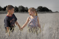
| 05/23/2007 12:16:36 PM |
Friendsby just_meComment: An appealing and effective shot very naturally caught. The mono background isolates the subjects well but a little more care with the selection of the foreground wheat was needed, unfortunately it lets it down. A good effort, good luck |
| Photographer found comment helpful. |
| 05/22/2007 11:04:10 AM |
A Touch of Colorby scarbrdComment: Nice idea and well executed. Perhaps a smaller brush may have been a little more convincing but it's still a good shot. Good luck |
| Photographer found comment helpful. |
Home -
Challenges -
Community -
League -
Photos -
Cameras -
Lenses -
Learn -
Help -
Terms of Use -
Privacy -
Top ^
DPChallenge, and website content and design, Copyright © 2001-2025 Challenging Technologies, LLC.
All digital photo copyrights belong to the photographers and may not be used without permission.
Current Server Time: 06/22/2025 01:13:10 PM EDT.