| Image |
Comment |
| 08/18/2004 01:06:54 AM |
Neon Roseby sgauriaComment: cool, love the softness and the mood... the pattern from the lighting is a great addition |
 Photographer found comment helpful. Photographer found comment helpful. |
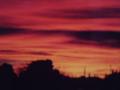
| 08/18/2004 01:02:22 AM |
My El Paso Sunriseby lg4u16Comment: agreed with skiprow!
everything is a learning experience and sometimes some are a bit harder than others. Dont quit! and dont be afraid to ask for help!
keep going strong and one day you can look back at your progression from 0% to 100% and laugh it off. best of luck! :-) |
| 08/18/2004 12:50:14 AM |
moonlightby nickstyleComment: a bit on the over contrast-ed side. great colors nevertheless |
| 08/18/2004 12:49:38 AM |
shreckby TLL061Comment: shrek seems to be floating, a stronger shadow would have fixed that |
| Photographer found comment helpful. |
| 08/18/2004 12:48:00 AM |
|
| 08/18/2004 12:33:27 AM |
Finally finishedby TuckersmomComment: a bit over saturated especially in the parts the the light blue is beginning to get dark blue outlines. but overall the image is very fitting for the challenge. |
| Photographer found comment helpful. |
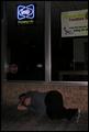
| 08/18/2004 12:31:35 AM |
Good Night, Sleep Tight, Don't Let The Muggers Biteby drgsoellComment: the composition is a bit akward with the main focus being at near the very bottom and near the very top. Compositionally there is a vast 'desert' between these two focus points and its not working very well. Great idea, exectution could have been stronger. |
| Photographer found comment helpful. |
| 08/18/2004 12:29:39 AM |
|
| 08/18/2004 12:29:21 AM |
Trailer Havenby JamieRComment: this may sound harsh but i mean it in the nicest way possible...
Its just a photo of a sign! there is no mood or feeling conveyed in the photo. the little thing between the v and e in heaven looks like an arch for a doorway. What if the doorway was the main focus of the picture and the trailer heaven sign was being used more of a descriptory tool which adds to the mood of a mysterious door with red highlighs and this sign above it. just my 2 cents... |
| 08/18/2004 12:25:42 AM |
sliding smoothiesby slingshotComment: the white railing is taking up too much space in the picture and imo detracts rather than adds |
| Photographer found comment helpful. |
Home -
Challenges -
Community -
League -
Photos -
Cameras -
Lenses -
Learn -
Help -
Terms of Use -
Privacy -
Top ^
DPChallenge, and website content and design, Copyright © 2001-2025 Challenging Technologies, LLC.
All digital photo copyrights belong to the photographers and may not be used without permission.
Current Server Time: 06/20/2025 06:33:07 AM EDT.