| Image |
Comment |
| 06/18/2008 06:29:36 PM |
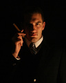
Money to burnby ClayaComment: A very fitting entry. And I gave it a really good score. Things that would have made it better for me.
1. Adjustment levels - the man is VERY red, even if this is natural I would have used CMY adjustments on this pic to tone it down.
2. Composition - love the smoke just not in his face - the little triangle in the top right very distracting - I would have liked to see the top of his hair and more of the hand too - The $100 looks a little funny but I'm Canadian!
3. Lighting - seems to be just coming from a pot light above to me it needs more from either side
Things that are great - the chair, the Cigar, the clothes, the basics of the setup, and the flame. Please feel free to contact me for questions comments or concerns. I mean no disrespect with my comments itΟΔÄôs a good pic that I feel could have been great. Best of luck. Scott. |
 Photographer found comment helpful. Photographer found comment helpful. |
| 06/18/2008 05:44:11 PM |
CEOby brumer0Comment: You nailed this one. All around great. Some smoke and a heater would have been awesome. I'll be upset if your not 1st or 2nd. Good luck! |
| Photographer found comment helpful. |
| 06/18/2008 05:40:23 PM |
|
| Photographer found comment helpful. |
| 06/18/2008 05:38:00 PM |
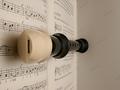
Successful Flat Spinby ZeusComment: Great shot one of my favs. Would like to see what if any you cropped out after voting. |
| Photographer found comment helpful. |
| 06/18/2008 05:35:12 PM |
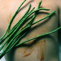
Finding Your Perfect Matchby scarbrdComment: Awesome pic. Love everything about it and sharp as a tac. Just something funny with the blur on the end of the branch(left side)its too blurry for how crisp everthing else is I cant tell if its editing or DOF |
| Photographer found comment helpful. |
| 06/07/2005 07:44:48 PM |
Blowby danderson107Comment: Hi David, Scott here from the CC. I had a good look over all your work submitted so far and over all I like it.. Your Blow submission is by far my favorite...awesome lighting (still my downfall) and very appealing all around. I think that some of the comments about DOF and subject focus were correct but I dont thing the pic would have worked as nice with the changed to the Grains/Powder. Tough call when trying to guess what voters will like. BEST advice I can give take comments and just try to see how others are feeling about your work. The overall perception. Dont let the narrow minded thinkers get to you, and if you like the pic and you took it for you then dont worry about the others. If your trying to please the masses then thats a differnet story. I take pics for me and me alone. If it feels good then keep clickn. |
| Photographer found comment helpful. |
| 10/21/2004 09:59:13 PM |
|
| 10/21/2004 09:47:52 PM |
|
| 10/21/2004 09:39:09 PM |
|
| Photographer found comment helpful. |
| 10/11/2004 09:10:16 PM |
Cat O' Nine Beansby GeneralEComment: Hi Paul,
Scott here from the Critique Club.
I spent a lot of time looking over this photo your portfolio. (hours to be exact). There is a TON of your work there and it was very interesting to study.
I found this pic to be a little too sloppy to catch my attention. I was turned away from the harsh light, shadow, and brushed over mess of the (blood) ketchup. I would have found a more distinct impact marking more effective. With a little motion blur in the "Beans" I could have easily related to the "flogging" concept. As is I see more of a bean brushed ketchup theme. When viewing challenge entries I always decide on a score before reading the title of the entry. I personally donΟΔÄôt care for titles to clarify a photo but more look for titles the compliment a photo. So with your title I was able to understand your entry. But I did not find your title very complimentary to the photo.
With that said, I must now tell you how much respect for your work I have gained looking over your portfolio. I feel that you like to make entries that boarder on or like to expand the boundaries of the challenges. You often show great emotion and/or feeling in them and often try to make a statement. Through the many entries you have submitted you hold true to your eye and vision. Even though others and I may not fully appreciate your work there is obviously a dedicated following to it. You receive many positive comments on the artistic quality of your work and I know that reviewing your portfolio had defiantly widened my perspective of photographic art.
I have to say that I think your landscapes/skyscapes are absolutely great. Defiantly your photographic niche. I very much enjoyed reviewing them and have added you to my favorites because of them.
I donΟΔÄôt know if this critique has helped you as much as it helped me. But if you have any questions or comments please feel free to PM me.
Scott.
|
| Photographer found comment helpful. |
Home -
Challenges -
Community -
League -
Photos -
Cameras -
Lenses -
Learn -
Help -
Terms of Use -
Privacy -
Top ^
DPChallenge, and website content and design, Copyright © 2001-2025 Challenging Technologies, LLC.
All digital photo copyrights belong to the photographers and may not be used without permission.
Current Server Time: 08/05/2025 05:34:14 AM EDT.