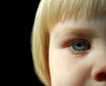
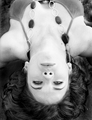
Mesmerizing Eyesby
JaimeVinasComment: First I would have voted 7 and probable bumped to 8 (but I can't vote in members challenges YET!)
Just going to lay things out here from my opinion so please don�t take offence to them. I hope you can get 1 or 2 bits of useful info.
The photo is kinda flat. For B&W I like to see a little more shadow to add some depth. And the shadows that are on top of the shoulders are a little grainy.
When I first looked at the photo all I seen was nostrils. Not a great focal point for me.
The eyes are in perfect focus and have a nice reflection but they are a little too closed to really make that feature pop (add your title and that probably did not help).
The hair on the forehead is a little messy and the rest needs some dodge and burn to really make it flow. (part of the flat feeling)
Her lips look between a kiss and a pout. Maybe a smile would work better for me. (and again kinda flat could use some more contrast (darker) for the B&W to pop)
And little things to help the symmetry. Her earrings don�t match, the freckles/moles on her arms, neck and chest (please don�t take offence - she is beautiful and unique because of these features) but this is advanced editing and you are trying to please the masses as I call it.
The cleavage. It�s just a little too cut off. Either take it all out of the composition or have it all in. I personally like the bottom portion of the pic in a square crop.
In summery. A little less tilt on the head would fix the nostril problem for me and let her eyes open some more. The rest is just more attention to details before and in PP. Hope this helps if you have any questions or comments please PM me. Scott