| Image |
Comment |
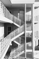
| 12/08/2016 06:48:41 PM |
Linesby bjoernComment: Strong lines and tones, excellent alignment and control - one of my favourites in this challenge. |
 Photographer found comment helpful. Photographer found comment helpful. |
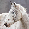
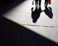
| 12/07/2016 09:03:31 PM |
The stareby sarampoComment: The centered subject leaves this composition feeling a little unbalanced, relative to the asymmetrical background. |
| Photographer found comment helpful. |
| 12/07/2016 09:02:11 PM |
existences III by TiberiusComment: Nice follow-up, very Gursky-esque. Excellent work keeping the verticals aligned so cleanly. My only complaint is that the image overall could benefit from just a bit more critical sharpness - it's hard to tell given the subject matter, but it may be that some fine detail in the windows was lost due to slightly over-sharpening. One of my favourites in this challenge. |
| Photographer found comment helpful. |
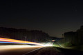
| 12/07/2016 09:00:07 PM |
Into The Nightby SEGComment: Good composition and concept. The highlights on the road are just a bit blown out - a smaller aperture and consequently longer exposure might have helped that (but of course then you run the risk of ending up with star trails). |
| Photographer found comment helpful. |
| 12/07/2016 08:58:59 PM |
Yesterdayby snafflesComment: you have some odd lines running through the centre of the image there, where perhaps something has been cloned out carelessly? |
| Photographer found comment helpful. |
| 12/07/2016 08:58:08 PM |
hanging by a threadby grahamgatorComment: Good use of background texture, and strong composition and colours. I find myself wishing the subject were a little sharper throughout, but still one of my favourite images in this free study. |
| Photographer found comment helpful. |
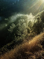
| 12/07/2016 08:57:12 PM |
In The Woodby rooumComment: I'm not a fan of the raise-the-shadows postprocessing here; done subtly it can make thigns look cinematic, but overdone clumsily it does the image no favours. |
| Photographer found comment helpful. |
| 12/07/2016 08:56:24 PM |
Weekendersby instepsComment: Quite Ray-Metzker-ish, good tone and composition. Shame people don't dress quite so well as in his photos anymore. |
| Photographer found comment helpful. |
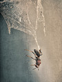
| 12/07/2016 08:54:50 PM |
house flyby martinkulikComment: If you do need to stoop to a dead bug as your macro subject, it's best to at least make some effort to make it look less dead.
You also have a very clear line / squiggle / cutout shape especially visible in the upper right differentiating between the sharp and blurry portions of the image - a failed focus stacking effort perhaps? |
| Photographer found comment helpful. |
| 12/07/2016 08:53:17 PM |
Auburn foothillsby 2mccsComment: Good colours and composition, the flare has a pleasant vintage feel to it. I would have cloned out the slightly incongruous power lines at the top right of the image. |
| Photographer found comment helpful. |
Home -
Challenges -
Community -
League -
Photos -
Cameras -
Lenses -
Learn -
Help -
Terms of Use -
Privacy -
Top ^
DPChallenge, and website content and design, Copyright © 2001-2025 Challenging Technologies, LLC.
All digital photo copyrights belong to the photographers and may not be used without permission.
Current Server Time: 05/13/2025 12:02:50 AM EDT.