| Image |
Comment |
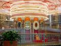
| 04/10/2002 11:59:00 AM |
Chin-y, chin, chinby DigiteyesComment: That is one curvy baby! The background is a little blown out, a different angle might be called for to help reduce this, since the baby's face could use an even lighter exposure. |
| 04/11/2002 12:55:00 PM |
|
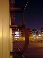
| 04/11/2002 01:04:00 PM |
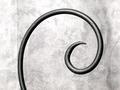
Urban Curvesby pdb209Comment: crazy composition! I wish the background were more in focus. |
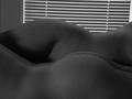
| 04/10/2002 12:36:00 PM |
His and Hersby ngoudyComment: It's a shame the exposure is so dark, it could have used some more dramatic lighting. |
| 04/10/2002 12:19:00 PM |
vasesby aeli2468Comment: there appears to be a hair or something on the middle vase, get rid of that thing! :) Nice composition. |
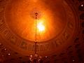
| 04/10/2002 12:41:00 PM |
High-Class Decadenceby dequinixComment: the chandelier is awkwardly resting on the edge of the photo, and is not hanging vertically, making this feel out of balance. |
| 04/10/2002 12:43:00 PM |
|
| 04/11/2002 12:37:00 PM |
Between a Rock and ... Another Rockby zymaraComment: did you try taking this shot with the circle smack dab in the middle of the frame? I'd try to darken the exposre as well, overcast skies are a pain to work with. |
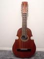
| 04/10/2002 12:17:00 PM |
The Guitarby ElCarniceroComment: the wall is not perfectly square with the camera, and it detracts from what could be a very nice formal presentation. I would also try moving the guitar away from the bottom edge of the picture just a bit. the lighting could be made more dramatic if it weren't directly above the guitar, but hit it at a 45 degree angle so it cast a shadow on the wall. |
| 04/11/2002 12:51:00 PM |
|
 Photographer found comment helpful. Photographer found comment helpful. |
Home -
Challenges -
Community -
League -
Photos -
Cameras -
Lenses -
Learn -
Help -
Terms of Use -
Privacy -
Top ^
DPChallenge, and website content and design, Copyright © 2001-2025 Challenging Technologies, LLC.
All digital photo copyrights belong to the photographers and may not be used without permission.
Current Server Time: 08/05/2025 01:52:57 AM EDT.