| Image |
Comment |
| 09/01/2004 03:15:08 AM |
View from a Castleby BobsterLobsterComment: I love the shot. The frame here unfortunatelly messes more than adds. It's way to blurry, but I understand it wouldn't be easy to make it sharper. The same pic without the frame and with the light house more towards left bottom corner would be a BEAUTIFUL shot (I mean as stand alone, this challenge was frame and there it is). Well done 7 |
 Photographer found comment helpful. Photographer found comment helpful. |
| 09/01/2004 03:12:40 AM |
|
| Photographer found comment helpful. |
| 09/01/2004 03:11:15 AM |
|
| Photographer found comment helpful. |
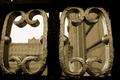
| 09/01/2004 03:10:32 AM |
Le Châteauby darixComment: Great picture. In most of the cases I would be ready to see two 'black-blocks' on left and right, but spreading a bit of light on the walls and making them visible makes the pic really great. High score from me |
| Photographer found comment helpful. |
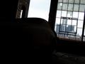
| 09/01/2004 03:07:51 AM |
Historical Perspectiveby ehowardComment: The object in the front takes most of the space on this pic, and I can't even see what it is. Frame seems to be a minor element here. |
| Photographer found comment helpful. |
| 09/01/2004 03:06:27 AM |
sky frameby undieyatchComment: This picture I simply love. For being so simple.
Did you try taking the photo from different angles? I would try closer towards left with around 45deg anlge so that the frame spreads from left-bottom to right-top. Just a suggestion. Maybe making it brownish instead of just B&W would give better feeling. Still 7 |
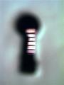
| 09/01/2004 03:03:43 AM |
Key to the closetby groggyfroggyComment: I get the idea in a way, but the keyhole is barely recognizable and whatever is behind it, it's impossible to tell. Good idea, but not the picture |
| Photographer found comment helpful. |
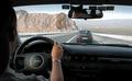
| 09/01/2004 02:56:15 AM |
Travellingby qwerty_314Comment: you could have worked on colours a bit to make the pic more lively. (imho).
I would like the pic better without the car in front |
| 09/01/2004 02:54:29 AM |
Old Bridgeby LongComment: You could make the colours a bit more vivid. And in general I would recommend submitting bigger picture (max size in 640pix). Go through other pics and you will see that looking at bigger pics makes better impression and feeling. |
| Photographer found comment helpful. |
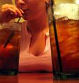
| 09/01/2004 02:52:34 AM |
...by LoulouNoireComment: A bit out of focus and the colours are too red in general. I would suggest playing with levels a bit to remove the reds and make it more natural colours.
Nevertheless I love the idea and your model is great for that shot. |
| Photographer found comment helpful. |
Home -
Challenges -
Community -
League -
Photos -
Cameras -
Lenses -
Learn -
Help -
Terms of Use -
Privacy -
Top ^
DPChallenge, and website content and design, Copyright © 2001-2025 Challenging Technologies, LLC.
All digital photo copyrights belong to the photographers and may not be used without permission.
Current Server Time: 08/19/2025 11:11:53 PM EDT.