| Image |
Comment |
| 01/23/2005 10:44:16 PM |
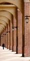
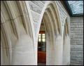
Franklin Field Archesby jmleliiComment: i wish the person was not in this image it would make it very clean and very surrieal.
as it is it is a great pic. GL |
 Photographer found comment helpful. Photographer found comment helpful. |
| 01/23/2005 10:40:40 PM |
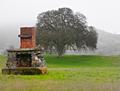
What Once Wasby TDCollinsComment: this would be awsome in B&W its to bad it was not submitted that way.... but it is great in color too and the colors are very vivid so that is all the better with the bleakness of the sky and the tree.
1 thing i noticed is that the bottom half of the (brick on the) chimnie seems alittle unnaturaly red as does some of the greenpatches of grass (not that they r red) they appear overaly green.
was this images saturation messed with or am i just seeing thing diffrent.
if u did do some sponging nextime try to blend it more and more till u tapor off, instead of just stopping.
GL |
| Photographer found comment helpful. |
| 01/23/2005 10:35:03 PM |
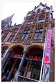
Post Plazzaby rhipsterComment: great prospective i wish in someways that this was just the origional old building and did not have the banners and irridesant sign. |
| Photographer found comment helpful. |
| 01/23/2005 10:33:16 PM |
|
| 01/23/2005 10:31:52 PM |
|
| Photographer found comment helpful. |
| 01/23/2005 10:29:55 PM |
Atlantisby speaseComment: creative but noisy and not very intrusting.....after a glance over the whole shot |
| 01/23/2005 10:28:05 PM |
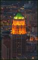
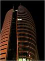
San Antonio History -- The Tower Life Buildingby SandyPComment: the boarder does not help this image as a well done boarder can also the image is full of noise from it being a poor night shot.
the building is very nice but the image overall (IMO) is lacking there could be better composer to the entire thing and the framing should be thought over also. |
| Photographer found comment helpful. |
| 01/23/2005 10:24:03 PM |
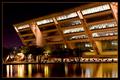
City Hall Dallas Texasby RHoldenSrComment: great choice of boarder if u ever have to boarder an image u did this 1 right.
it is a great pic. with lovely color. i would like it to be a little more leading however, it seems to me that the intent (of corse) was the building as the subject but at frist glance my eye see the entire thng as the subject a composed whole.
normaly that would be great and this is a very nice post card shot but IMO there sould be more pop to the buildingit should take over in the image alittle more than it is now....all IMO...
GL nice color if i did not mention that |
| Photographer found comment helpful. |
| 01/23/2005 10:04:47 PM |
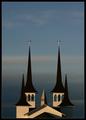
Towersby arngrimurComment: WOW....WOW.....(picking up my jaw)....ok ummmm.....WOW
i lov the framing of this image just wounderful....gorges......GL and what a great shot wouldn't change a thing |
| Photographer found comment helpful. |
| 01/23/2005 10:02:02 PM |
Modern Architectureby s4nd3r99Comment: nice shot would desire a diff. angle but i like the arch. its self so that gets u through....+ not sure if there is another angle looking at it alittle deeper.
Great job wonderful display of modern design and form |
| Photographer found comment helpful. |
Home -
Challenges -
Community -
League -
Photos -
Cameras -
Lenses -
Learn -
Help -
Terms of Use -
Privacy -
Top ^
DPChallenge, and website content and design, Copyright © 2001-2025 Challenging Technologies, LLC.
All digital photo copyrights belong to the photographers and may not be used without permission.
Current Server Time: 06/21/2025 06:18:07 AM EDT.