| Image |
Comment |
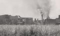
| 10/27/2005 02:01:18 AM |
Sugar Millby PhotoRynoComment: u need to add some contrast to this to help it compleete the grayscale and really pop...as it is it is just a wash of grain with and image somewhere bhind it.....really nothing shows through strong enough for there to be a complette composition. |
 Photographer found comment helpful. Photographer found comment helpful. |
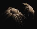
| 10/27/2005 01:59:00 AM |
Forlornby banmornComment: this image would be sooooooooo great, but the color noise was a major- No,No.....
i think u should've added grain instead of noise to this and it would be a winner in my book, as it is it gets a far lower score than i would have dubed it, b/c of that wrong move in edit.
(the sepia was the right was to go tho.... :O) thumbs up on that, gives u another point back) |
| Photographer found comment helpful. |
| 10/27/2005 01:56:05 AM |
A Different Walk of Lifeby CutterComment: wounderful contrast, great shot...even better the use of grain in it is not too strong or over powering, as some in this challenge have been |
| Photographer found comment helpful. |
| 10/27/2005 01:54:09 AM |
Vertical skyby bpickardComment: this is a great reflection capture. i think this building is in chicago, but i don't want to be wrong if its not. at least we have 1 verry much like it just northwest of navy pear...ah well...great shot and great, but semi artifical, tones in the reflection |
| Photographer found comment helpful. |
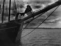
| 10/27/2005 01:51:23 AM |
Kajamaby StrikeslipComment: this is a great shot well framed, but the burning in the sky is very aparent...also as far as the older photo look goes u did well, but i think as with many shots in this challenge the grain level is just higher than it could really ever be or should be....its just foggy with grain, takes away from the image more than adds a key helping element |
| Photographer found comment helpful. |
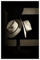
| 10/27/2005 01:47:47 AM |
Borsalinoby joezlComment: very nice classic still life the grain here is used well and the image benifits from its pressence-GL |
| Photographer found comment helpful. |
| 10/27/2005 01:46:20 AM |
Houston Mausoleumby mpembertonComment: i wish there was more pop to this...i think it would be very striking with some lighter tones to it and the polor darks and shadows it has, +the grain.....needs a reshoot but is a very plesent image that makes the viewer think...but it doesn't floor u like i think it could... |
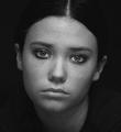
| 10/27/2005 01:43:26 AM |
Molly Noyes - vintageby MontereykiddoComment: framing of the head is alittle odd, but i can live with it, the hair here is very pretty and i wish the it was a horz. orientation and the face was far left only half showing and the hair taking up the rest of the frame....inother words, great lighting and start but a different framing is required here...IMO, Good luck |
| Photographer found comment helpful. |
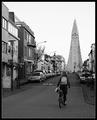
| 10/27/2005 01:39:56 AM |
Cycling to Churchby marvinComment: i like this, u have the right amount of grain for the image, without distracting it quietly adds and lets u see a different more grabing shot that otherwise would be presented, i hope this at least gets regonized as being timeless composition and a very well taken image in B&W-good luck |
| Photographer found comment helpful. |
| 10/27/2005 01:37:20 AM |
Sad Eyed Ladyby ColeyComment: this is a great shot, i feel however that grain should add to the photo without being the subject of, or the main thing, in the photo....
it is really sad but this image even as good as it is, looks like it has fog of grain over it, instead (as it is with true grain in film) the grain being on the same plan as the subject...i have shot alot with film and alot with grain and using it as part of the composition, and i feel that this is just over kill even to ASA 1600 film and if i push it @ 800 it just doesn't do that to the photo....i think u really could've had a truly classicly great looking shot if u had only cut through it with some contrast, or just have backed it off alittle......
i really hate to do this to such a great image but its too far, would be a 7/8 instead i have to give it a 6, b/c your use of grain is distracting and not an adition to your overall image |
| Photographer found comment helpful. |
Home -
Challenges -
Community -
League -
Photos -
Cameras -
Lenses -
Learn -
Help -
Terms of Use -
Privacy -
Top ^
DPChallenge, and website content and design, Copyright © 2001-2025 Challenging Technologies, LLC.
All digital photo copyrights belong to the photographers and may not be used without permission.
Current Server Time: 06/23/2025 10:38:26 PM EDT.