| Image |
Comment |
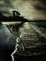
| 03/29/2006 08:45:55 PM |
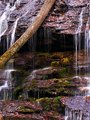
Torn Ocean Beachby Sunshine86Comment: I like it. The colors are nice and soothing and I like the choice of texture overlay, it fits well with the original image. Great first attempt, layers are overwhelming, I try to stay away from them :) |
 Photographer found comment helpful. Photographer found comment helpful. |
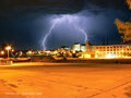
| 03/22/2006 09:24:30 PM |
Double Strikeby SamDoe1Comment: Wow, one of my favorite of your portfolio. Love, love, love the color (I'm a color person).... Nice detail on the lightening. One suggestion would be crop a little more to the right to get rid of the branches or get rid of them somehow. nice job |
| Photographer found comment helpful. |
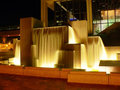
| 03/22/2006 09:22:22 PM |
|
| Photographer found comment helpful. |
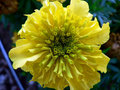
| 03/22/2006 09:21:36 PM |
P1010580.jpgby SamDoe1Comment: Nice detail and depth of field on the flower. I would get rid of the straight line in the lower left corner, it draws my eye to it. |
| Photographer found comment helpful. |
| 03/22/2006 09:20:25 PM |
P1020086_filteredwm.jpgby SamDoe1Comment: I like this a lot - the water drops are not overdone. and I like the silver (metal?) background, make a very simple, clean shot. great capture |
| Photographer found comment helpful. |
| 03/14/2006 09:11:19 PM |
A Quiet Momentby SJCarterComment: I like the canoe's lines and how they lead the eye through the shot. The reflection does kind of overpower it though. I like the colors and the things in the canoe, gives it visual interest. |
| Photographer found comment helpful. |
| 03/14/2006 08:34:36 PM |
|
| Photographer found comment helpful. |
| 03/14/2006 08:33:29 PM |
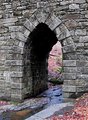
Poinsett Bridge Archby saracatComment: I can see what you're going for and it does work. The leaves look just a little too pinkish (may be my monitor). Would like to see this with the graffiti and maybe all black and white. I do like the composition and the detail on the stone |
| Photographer found comment helpful. |
| 02/24/2006 01:56:35 PM |
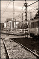
Way to the stationby alexgarciaComment: I like the fact that you went with a more sepia like tone on this one, I think it helps with the feel of the shot. Maybe it's my eyes or an optical illusion, but it looks just a big unhorizontal? Good composition and detail. |
| Photographer found comment helpful. |
| 02/24/2006 01:54:42 PM |
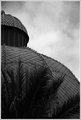
Market domeby alexgarciaComment: Nice tones on this one. I like how the sky is not overdramatically done, it looks very natural which I like. The one thing I don't care for is the palm fronds. The building looks very cool and they kind of detract from it. Maybe shooting from a different angle? Good job |
| Photographer found comment helpful. |
Home -
Challenges -
Community -
League -
Photos -
Cameras -
Lenses -
Learn -
Help -
Terms of Use -
Privacy -
Top ^
DPChallenge, and website content and design, Copyright © 2001-2025 Challenging Technologies, LLC.
All digital photo copyrights belong to the photographers and may not be used without permission.
Current Server Time: 08/11/2025 03:10:25 AM EDT.