| Image |
Comment |
| 11/11/2002 08:36:00 AM |
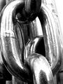
Chains of Steelby byetkoComment: Interesting choice of subject matter. A big problem with macros is that people tend to crop them in too tightly... as is the case here. Good attempt though! |
| 11/11/2002 08:36:00 AM |
|
| 11/11/2002 08:30:00 AM |
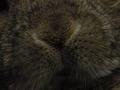
Let me look too..by bunniesComment: Fuzzy animals have the "awwe" factor that people really go for. Shame you didn't include some eyes or somethign else that would have made it obvious what animal this actually is. I'm assuming it's a rabbit |
| 11/24/2002 06:52:00 PM |
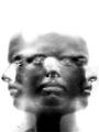
Individualityby JeBComment: Composition: It is obvious there is one person's face repeated 3 times. The focal point is the eyes although the noses seem to draw attention to them because of the higher contrast created by the little white dots. The rule of thirds is not used in this image and it looks fine the way it is. There is added space at the top that is left there to accomodate the longer thinner composition. The space at the top is more important than say cropping out part of the noses. The black and white of this image add to the starkness/expressionlessness of the person's face. I'm not sure what the harsher areas near the left eye and a bit under the right eye of the center face. This image works well with each face with the same expression. Did you try using 3 different expressions? I think 3 different expressions would have improved the impact slightly because it would have given extra meaning to the photograph. Each person has more than 1 emotion and the image would have helped portray that. Technical. The image is quite soft... and it is evident that the softness was intentional. I would have liked to see a little more detail in the face. I like the fact that the hair is not visible. Each of the side faces blends fairly well with the blank background. I do find the grey area around the right nose distracting because it's not part of the image. It's just grey. Also the left nose is much more transparent than the right nose.. why? I personally would have boosted the contrast a little bit more.. Overall I think this is a very neat photo and I agree that it should have done better. Well thought out and reasonably well executed. Good job! |
| 10/29/2002 08:46:00 AM |
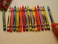
16 or 6 Crayonsby SwashbucklerComment: I apologize in advance but I really dont get it. That's probably going to upset you but I stared at this image for a little while and i still dont get it. Sorry. BigSmiles |
| 11/04/2002 07:39:00 AM |
body illuXionby adixionComment: It's a shame more people didnt get your image. I really liked it... should have done better!! |
| 10/28/2002 07:55:00 AM |
body illuXionby adixionComment: Very nice! If it weren't for that nipple in there I"d still be guessing which bodyparts it is.. |
| 09/23/2002 11:23:00 AM |
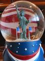
Global Americaby YomiComment: The first challenge since the negative space challenge and you're crowding the edges of your frame. leave a little space!!!!!!!!!!!!!!! 5 |
| 09/16/2002 04:40:00 PM |
|
| 09/16/2002 04:19:00 PM |
|
Home -
Challenges -
Community -
League -
Photos -
Cameras -
Lenses -
Learn -
Help -
Terms of Use -
Privacy -
Top ^
DPChallenge, and website content and design, Copyright © 2001-2025 Challenging Technologies, LLC.
All digital photo copyrights belong to the photographers and may not be used without permission.
Current Server Time: 08/21/2025 08:03:39 AM EDT.