| Image |
Comment |
| 08/29/2005 01:52:06 AM |
The true meaning of 'curves'by eckoeComment: Thanks to all that made comments. A few responses if any of you check back.
First, yeah, the light is a bit flat. Something I actually tend to be drawn to. I think I need to figure out what's desired, so that I can hit it a bit more.
Catlord and DrAchoo mentioned the curve is a bit odd. Quite honestly, they are being held up by her hands. It's the only way to get the curve I wanted with the "assets" I had, as they're larger than average and her natural curve didn't work as well as this curve did, and I really didn't want to get the "she's got clothes on" drop in the votes that some of her bra's could have created for a slightly more natural look. If I retake, I'll keep that in mind however.
To explain that, what I was looking for, was the viewers eyes to move from the tendril of hair down from the cleavage to the lower right corner and off the page. I think I accomplished that with a couple people comenting as such. |
| 08/29/2005 01:22:46 AM |
|
 Photographer found comment helpful. Photographer found comment helpful. |
| 08/25/2005 12:12:38 AM |
birth of venus (in-action redux)by tateComment: I think that the image may be slightly over sharpened. I also don't like the general color, it's a bit red, I think a straight black and white may have done this a bit better justice. Great idea however, very origional. |
| 08/25/2005 12:11:11 AM |
BLING BLINGby mandyturnerComment: I think that to pull this off, those diamonds and the metal attached to them need to pop out a bit more. That's a tricky statement, so maybe just a slightly different angle to show it off a bit better. |
| Photographer found comment helpful. |
| 08/25/2005 12:06:49 AM |
Glorious Momentby ApeeComment: Very interesting choice of angle. It's a bit odd to me the angle. I don't like the lighting here, I don't know how to fix it, but I think what looks like the on camera flash is the right thing here. Good Luck. |
| Photographer found comment helpful. |
| 08/25/2005 12:04:51 AM |
Self-Oppressionby StephenJamesComment: This is a slightly odd angle for this pose. I'm wondering if it'd do better in portrait orientation than in landscape. I probably would have liked it better. I think the light falloff from her arms onto her back may be a bit too much, a very small fill and elevating her a bit farther off of her apparent background might have created a bit higher score. |
| 08/24/2005 11:58:14 PM |
Lusciousby inspir8tionComment: very nice shot, the static in the hair, as well as the loops of what looks like hair on the other side of her chin are distracing. OI can barely tell that it's not, but I'd guess that the areas where her arms dissappear into probably a robe or a towel looks a bit edited, and a bit odd in it's context. Good luck. |
| Photographer found comment helpful. |
| 08/24/2005 11:54:02 PM |
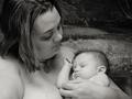
Naturalby Mal37Comment: Very lovely shot of a mother and child. I think the background is a bit distracting, as that dark corner keeps pulling my eyes up to it. |
| Photographer found comment helpful. |
| 08/24/2005 11:52:04 PM |
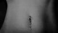
From a Crysallidby mpembertonComment: Very lovely shot, however in my opinion, the detail in that excellent tatoo is not nearly visible enough to do it justice. I do however love the colors. The pose also is a bit distracting, as it looks like she's been "caught" candidly, and not posed. That's OK I suppose, but it's a bit distracting. |
| Photographer found comment helpful. |
| 08/24/2005 11:02:41 PM |
veiledby les0910Comment: very interesting image. I think the image is a bit dark, and a bit more detail in the hair would only help. |
| Photographer found comment helpful. |
Home -
Challenges -
Community -
League -
Photos -
Cameras -
Lenses -
Learn -
Help -
Terms of Use -
Privacy -
Top ^
DPChallenge, and website content and design, Copyright © 2001-2025 Challenging Technologies, LLC.
All digital photo copyrights belong to the photographers and may not be used without permission.
Current Server Time: 07/30/2025 07:35:00 PM EDT.