| Image |
Comment |
| 08/22/2005 08:59:50 PM |
Blue Light Districtby SJCarterComment: I really like the Idea here, but this image looks overly processed, and heavily photoshopped, and doesn't give me much that makes me really get anything from this. |
 Photographer found comment helpful. Photographer found comment helpful. |
| 08/22/2005 12:27:06 AM |
Simply Irresistibleby NaldComment: I love this angle, and the composition, but the light is too bright. Toning it down would have brought me to a higher score. |
| Photographer found comment helpful. |
| 08/17/2005 11:58:15 AM |
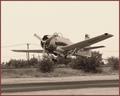
air power c. 1945by nomad469Comment: In response to your forum request...
I didn't vote on this at all, so didn't vote it a 1, but I would have scored it down because the plane blends into the background very well. I might have wanted to see a bit more separation between the plane and the bushes/trees behind it. The sepia looks awesome, but also amplifies the lack of contrast there. Great shot compositionally though. Nice work. |
| Photographer found comment helpful. |
| 06/01/2005 06:36:16 PM |
Withering Beautyby ZapperzacComment: What's lost on me, is that with the green staalks, and the relative bland background, why this was turned into a selective desat. I think the red/yellow would have stood out a bit more elaving it fully colored. It just seems a bit too drastic. |
| Photographer found comment helpful. |
| 06/01/2005 06:32:49 PM |
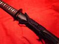
Iaitoby NovaTigerComment: I gave this a 6. I'm a big fan of swords in general, and this is a lovely example, but I might have considered sliding the sheath out about 3 inches. I think this would have given it a bit more pop, The shadows are also a slight bit harsh, elevating it 3-4 inches and decreasing the DOF as much as possible might have helped that, as well as caused the detail in the background to show less, while still keeping the braiding on the grip and cording. |
| Photographer found comment helpful. |
| 05/31/2005 06:10:25 PM |
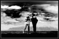
S U P E R N A T U R A Lby ahazeComment: I didn't get a chance to vote on this challenge, but after seeing the black and white, I'm glad that you chose to enter the color. THis is a great image with some emotion behind it. They're sisters, but for a minute there, you wonder (hope?) if they're truly blood sisters, or just call each other that to get looks.
I think your title may have done you some harm. I also think in Beauty you might have gone up several more places in rank.
I love the lighting, and the eyes on both girls. I think what many people are missing is the mood the picture looses without the color. Again, good choice in bringing in the color.
If I was voting, would have been a 9. Better might have been less stray hair, and a better background. The color changes are slightly distracting. |
| Photographer found comment helpful. |
| 04/27/2005 12:51:09 PM |
Rising Moonby LadeeMComment: I really like the shot, the only thing that bothers me is the upper left hand corner. I might even say it's distracting. A crop to eliminate that might have improved it. |
| Photographer found comment helpful. |
| 04/24/2005 07:16:08 PM |
|
| 04/24/2005 07:10:42 PM |
framedby chuck50124Comment: I didn't like the double image of the reflection. Likely caused by the double pane windows. |
| 04/24/2005 06:56:52 PM |
Submitting an Angelby dreamstateComment: Beautiful light, and model. The very slight traces of movement on the model make me rate this a 6 instead of higher. I'd be very interested to see other shots taken the same day in comparison. |
Home -
Challenges -
Community -
League -
Photos -
Cameras -
Lenses -
Learn -
Help -
Terms of Use -
Privacy -
Top ^
DPChallenge, and website content and design, Copyright © 2001-2025 Challenging Technologies, LLC.
All digital photo copyrights belong to the photographers and may not be used without permission.
Current Server Time: 07/31/2025 02:23:48 PM EDT.