| Image |
Comment |
| 12/19/2004 02:44:31 AM |
cold electrical windby skankitupComment: I like the composition and mood created by this image. The connection to the challenge theme is not really evident to me though. Having said that I do like the model's pose and expression. The style of the image makes the model look a little bit alien in the environment which I think adds to the impact. |
| 12/19/2004 02:33:57 AM |
Hairby rmtm333Comment: I love the composition. There's also a grittiness about this image that is very appealing. Its one of those image that defies explaination to a certain degree yet makes its way straight into my favourites. Nice work. Good luck. |
 Photographer found comment helpful. Photographer found comment helpful. |
| 12/19/2004 02:30:28 AM |
Blownby riotspyneComment: Do you mean blown highlights or blown by the wind. I'm a sucker for a double meaning and I also love experimentation with overexposure. Your technique certainly creates a dramatic effect. |
| Photographer found comment helpful. |
| 12/19/2004 02:27:36 AM |
Wind + Pole = Beetle ÷ 2by helgihelgiComment: Great image. I think the connection to "wind" is a little loose. However would have got a 9 from me for the yellow challenge. I love the drab colours of the background contrasted withe the main subject. The composition is excellent. The images gives me a feeling of desolation. |
| 12/16/2004 03:34:40 AM |
Stroboscopic Autumnby myceliumComment: I love the colours and tones of this image. The composition is well balanced in a random way. The textures and colours make it almost touchable. The blur, if thats what it is, works well to represent the challenge theme. Its a beautiful and balanced image with a touch of drama. |
| Photographer found comment helpful. |
| 12/16/2004 03:31:25 AM |
december sunsetby officerwhiteComment: Its a lovely image however it does not represent the concept of wind to me all that well. I'm trying to make a connection between the shape of the clouds and the idea of wind but its not that strong. Its a beautiful image all the same. |
| 12/16/2004 03:29:38 AM |
Democrazyby umbrisComment: I really like the composition and the motion blur. The title adds to the impact of the image also. I feel the image could be enhanced by some level adjustments, increased saturation and perhaps a curves adjustment to give the tones and colours more impact. Basically to make what is already there stand out more. This would also make an interesting black and white image. This is one of the better examples of motion blur. Good Luck. |
| Photographer found comment helpful. |
| 12/16/2004 03:26:10 AM |
Flag in the Windby pumaComment: The image itself is quite dramatic. The saturation works well. I think the bottom flag pole is a little distracting. I know you probably couldn't do much about that but it draws my eye quite a bit. Also in all honesty I feel that the border detracts from the image quite alot. A think a plain white border would elegantly enhance the image which is already good. Good Luck. |
| Photographer found comment helpful. |
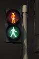
| 11/06/2004 01:16:20 AM |
Walk Don't Walkby ImagineerComment: This image takes the theme and represents it in its basic form. Two opposing choices presented at the same time. It really presents a sense of tension. The composition works well to highlight the choices. |
| Photographer found comment helpful. |
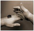
| 11/06/2004 01:09:54 AM |
Drats !by JackoComment: Very nice image. Expert use of lighting and Black and White. The composition works well including the square format. The dark patch in the top left is a little distracting but does not detract enough from the image to make any real impact. Its a quirky and suprisingly powerful image. Good Luck. |
| Photographer found comment helpful. |
Home -
Challenges -
Community -
League -
Photos -
Cameras -
Lenses -
Learn -
Help -
Terms of Use -
Privacy -
Top ^
DPChallenge, and website content and design, Copyright © 2001-2025 Challenging Technologies, LLC.
All digital photo copyrights belong to the photographers and may not be used without permission.
Current Server Time: 08/21/2025 02:17:21 AM EDT.