| Image |
Comment |
| 04/29/2005 01:23:03 PM |
|
| 04/29/2005 10:36:07 AM |
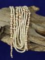
Natural pearlsby aKiwiComment: As something that I have fallen victim to myself, I have to wonder about your background color. In the Wacky Foods challenge, my shot had a bright green background that was probably a mistake. I think the background has a false look to it, and could have been better in a different, less dominate color. I like the wood, but I think a different set up of the pearls could have been more pleasing, say if they were more spread out like vines on a log. |
 Photographer found comment helpful. Photographer found comment helpful. |
| 04/29/2005 10:30:34 AM |
|
| Photographer found comment helpful. |
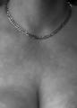
| 04/29/2005 10:20:16 AM |
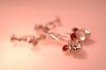
L'amour Éternelby fotodudeComment: I like the range of colors in the shot from red to white and most everything in between, but I would like to see more of the jewelry in focus (honstly, I am not sure what these are, but I am a man so that can be explained via stereotypes). |
| Photographer found comment helpful. |
| 04/29/2005 10:17:03 AM |
|
| Photographer found comment helpful. |
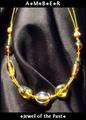
| 04/29/2005 10:15:47 AM |
All You Need Is Goldby Mr_PantsComment: I like the blur in this image to help accentuate the necklace, even though its almost too soft. I do wonder why you chose to desaturate the gold as well as the model. Something tells me this entry is getting a lot of views. |
| Photographer found comment helpful. |
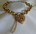
| 04/29/2005 10:10:25 AM |
9 ct Gold Braceletby kirtiebuComment: While I like the overall set up here, I don't like the bit of chain being out of focus in the foreground. I like the lighting, despite the occasional hot spots, and, again, the composition is very interesting. |
| Photographer found comment helpful. |
| 04/29/2005 10:07:57 AM |
Amberby DustDevilComment: The fold in the fabric is distracting to me, as it seems as though it is hiding something. Perhaps if this necklace were photographed around someone's neck, it would have been more pleasing. The amber looks a bit washed out to me, but overall, it has a nice color. Also, it appears to be glowing - nice touch. |
| Photographer found comment helpful. |
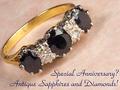
| 04/29/2005 10:05:37 AM |
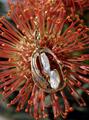
Sapphires and Diamondsby hughletherenComment: For me, the rotation of the ring is not fitting for the ring itself. Something about this piece of jewelry, in my eyes, calls for a basic horizontal orientation. Other than that, I would like to see the sapphires a bit lighter. I like your choice of background surface, though. |
| Photographer found comment helpful. |
| 04/29/2005 10:00:58 AM |
Iceby bruskiComment: Wonderfully professional. Great depth of field. Nice color choice for the font - mirrors the stone and doesn't distract the eye. This should do well. |
| Photographer found comment helpful. |
Home -
Challenges -
Community -
League -
Photos -
Cameras -
Lenses -
Learn -
Help -
Terms of Use -
Privacy -
Top ^
DPChallenge, and website content and design, Copyright © 2001-2025 Challenging Technologies, LLC.
All digital photo copyrights belong to the photographers and may not be used without permission.
Current Server Time: 08/05/2025 02:28:54 AM EDT.