| Image |
Comment |
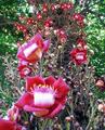
| 11/06/2004 12:00:24 AM |
Flower Treeby LuxvichComment: Very interesting! The focus looks a little soft on the first flower, and I would have liked to have seen that one in focus first and foremost... so for that, I'm knocking off one whole point to give you a 9. :) The perspective and angle are great, and the complimentary colors work perfectly. |
 Photographer found comment helpful. Photographer found comment helpful. |
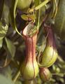
| 11/05/2004 11:58:46 PM |
Help, Help! I'm Being Eatenby ajschmidtComment: I've never seen anything like this, and the colors and shape of it are so pleasing to the eye that I can't help but give it a 10. This fits the challenge perfectly, and also stands alone as a nice photograph. |
| Photographer found comment helpful. |
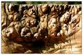
| 11/05/2004 11:57:23 PM |
How many figures can u see?by alithenakeComment: What a great, knotty piece of wood! At first, I was thinking you should have cropped out the background at the top, but now, I definitely like it there, and I think it adds som depth. Neat shot... for meeting the challenge with a nice shot, I give you a 10. |
| Photographer found comment helpful. |
| 11/05/2004 11:55:56 PM |
|
| 11/03/2004 11:47:05 PM |
Americaby RebAlComment: This looks a tad out-of-focus to me, and I'm not sure I'm crazy about the crop (although I assume you're making a statement about Americans and their perceived materialism or focus on money). I also don't think the stark white background helps this photo... maybe a shadow would have helped? Or maybe not, that's probably just a matter of preference. :) |
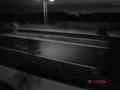
| 11/03/2004 11:44:18 PM |
lonelyby Pictar500Comment: First, I think you should remove the date from being stamped on the photo... that just screams "snapshot." I'm not really sure what the title is referring to... is there a person in the background somewhere? If that's what that spec is, it really should be focused on more. Also, I think you should have either cropped out the lamp at the top completely, or included it completely. Cutting it in half just draws your attention up there and there's nothing else in the picture that pulls my eye away (except the datestamp). Lastly, I don't know if you should have used a tripod or if you were going for some sort of motion look. To me, and it's just my silly opinion, this just doesn't work well. I think it has potential, though, with a clear, in-focus subject. |
| Photographer found comment helpful. |
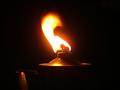
| 11/03/2004 11:40:29 PM |
What burns your flameby Prime_TimeComment: I think this could be improved if it were either centered completely or pushed definitively off-center into one of the power points (in the rule of thirds). The subject doesn't wow me, either. It's a nice, saturated flame, though. :) |
| Photographer found comment helpful. |
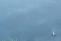
| 11/03/2004 11:38:17 PM |
Splashby BudComment: I'm sorry, but this isn't one of my favorites in the challenge. I'm not sure why you chose to keep the grass spriggs in the shot, and it's taking an awful lot of eye strain to see what that splash subject actually is. |
| Photographer found comment helpful. |
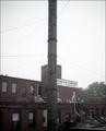
| 11/03/2004 11:35:48 PM |
October Moodby dimitriiComment: I'm not sure where the visual interest is in this shot, I'm sorry. I don't like the pole right in the center, and I wish I could read all of the sign. A polarizer would have helped with the sky, too. If you don't have one of those, I highly recommend one, it's really helped with my outdoor shots! These are just my opinions. If you're happy, just be happy. :) |
| Photographer found comment helpful. |
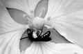
| 11/03/2004 11:32:54 PM |
Stippled Primroseby vtruanComment: I know you're going for a stippling effect, but it just looks pixelated to me. I'm sorry. I'd be interested to see the original, maybe in color... I just feel like this is lacking something. |
| Photographer found comment helpful. |
Home -
Challenges -
Community -
League -
Photos -
Cameras -
Lenses -
Learn -
Help -
Terms of Use -
Privacy -
Top ^
DPChallenge, and website content and design, Copyright © 2001-2025 Challenging Technologies, LLC.
All digital photo copyrights belong to the photographers and may not be used without permission.
Current Server Time: 08/27/2025 01:48:48 AM EDT.