| Image |
Comment |
| 04/27/2005 11:00:33 AM |
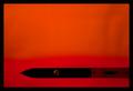
When Less is Moreby DianaBComment: Nice shot with good balance. Focus seems a bit soft but not bad, could be from jpg compression. Good job. |
 Photographer found comment helpful. Photographer found comment helpful. |
| 04/27/2005 10:58:41 AM |
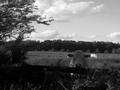
baselineby zenelfComment: This could of been a great photo but I find you subject a little dark. I would of liked to see it stand out more. Some may not even know what what the subject is because of the lack of detail. Still a good shot. |
| Photographer found comment helpful. |
| 04/27/2005 10:47:46 AM |
What Are You Looking Atby shadesofgrayComment: Very little contrast between the background and your subject. It does not pop out at me. Your subject should be the strong point. I don't know if B&W was a good choice in this case. You picture is tilted to the right, A crop to adjust would of helped. Wish you the best in the challenge. |
| 04/27/2005 10:44:46 AM |
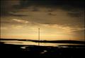
Only one lamppostby THMBComment: I find that your subject to centered within the picture and is not very strong. The nice sunset seems to overpower it. If it was not for the title I would find it hard to see the lamp as the subject. The lake seem to be a stronger subject in your picture. However you did capture a nice photograph and good lighting. Maybe a slight crop to tilt the horizon to left so it would be straight would of improved. I wish you well in the challenge. |
| Photographer found comment helpful. |
| 04/26/2005 02:54:59 AM |
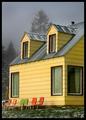
The Yellow Houseby Art RoflmaoComment: To Me, Absolutely stunning, I love it. Your photograph has great range, the lighting is spot on and not one blown highlight. But it goes beyond that. You are showing us were they sit to see a wonderful view instead of showing us the view itself. Very inviting to see a photograph such meaning. And the colors, I cannot say how much I love the contrast between the chairs themselves and the house. If I would of got to this photograph during voting I would of given it a 8. If I could have had the access to what the chairs were there for and the view one could see from them it would of scored a 10. I wish it would of scored higher because there is more in this picture than meets the eye. IMO you picked the right photograph. Congratulations and get a print of this one.
Scott W.
|
| Photographer found comment helpful. |
| 04/26/2005 12:21:39 AM |
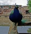
On Displayby KylieComment: I love the variation in color on this. A great reason to use a large DOF. The peacock with its blues and greens against then brown/reddish tone building. I do agree the peacock seems to be slightly soft focused compared to the building but that can be fixed by using the extraction tool on the peacock while you have him extracted do a focus adjustment with emboss or USM the re-insert him back in the picture. That way you will be only working on the focus of the peacock not the already sharp building. Great shot! Message edited by author 2005-04-26 00:25:28. |
| Photographer found comment helpful. |
| 04/26/2005 12:15:53 AM |
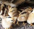
Who Let You In?by KylieComment: Once again a very nice job. Love the focus and the crop. Looks like they are having a conversation, maybe a sibling rivalry, to see who is going to be the dominating one of the bunch. |
| Photographer found comment helpful. |
| 04/26/2005 12:13:50 AM |
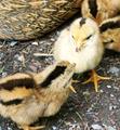
And I Don't Share!by KylieComment: Very nicely done. Wish I could of pulled as good of a shot off in my Free study with these chicks as you did. Amazing how they look alike.
Great Capture. |
| Photographer found comment helpful. |
| 04/20/2005 02:02:16 PM |
Wet and Wild by SammieComment: Congratulations on your blue ribbon. What a wonderful shot that fit the challenge perfectly. Great capture.
Scott W. |
| Photographer found comment helpful. |
| 04/13/2005 03:44:50 PM |
Last Lightby BudComment: Nice composition but the hue shift it a bit overwhelming to my eyes. Seems to be to much of a purplish hue to the picture. |
| Photographer found comment helpful. |
Home -
Challenges -
Community -
League -
Photos -
Cameras -
Lenses -
Learn -
Help -
Terms of Use -
Privacy -
Top ^
DPChallenge, and website content and design, Copyright © 2001-2025 Challenging Technologies, LLC.
All digital photo copyrights belong to the photographers and may not be used without permission.
Current Server Time: 08/18/2025 06:01:47 AM EDT.