| Image |
Comment |
| 08/20/2005 09:15:46 PM |
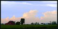
After the Stormby Buckeye_FanComment: I have to agree with rex the sky looks out of place. Did you use PS and the highlight/shadow function. I know when I use it sometimes I get this type of look.
It's a very nice photograph and one worthy of keeping. I would try a re-edit. I love the green field/grass with the bright red barn house against the golden clouds on the blue sky.
Could you post the original unedited version? I would love to see what it looks like.
-SDW |
 Photographer found comment helpful. Photographer found comment helpful. |
| 08/20/2005 05:04:43 PM |
Fruitlessby SDWComment: Originally posted by smilebig4me1x:
I love the darkness of this. gives a spooky feeling :o) i think the grass blur is perfect for this photo. sky and clouds are great. did u use a filter? |
Hi,
Thanks for the comment. As for a filter, there was none used. Just an average shot in the middle of the day and a lot of PS work. I know most people don't like a lot of PS work but I liked this picture and felt something was there and I worked on it until I felt I achieved what my vision was of the tree.
-SDW |
| 08/20/2005 01:09:01 AM |
Smiling Dragonflyby kenskidComment: Nice capture. The only thing I would of liked to of seen would be a deeper DOF to pull the wings into focus. Other than that Great Job! |
| Photographer found comment helpful. |
| 08/20/2005 12:54:02 AM |
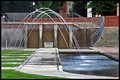
Immense Reflectionsby SDWComment: Originally posted by phinbob:
I like it. How did you do it?..The 4 sec exposure, I mean. |
I set my camera to TV @4 sec to get the flow of the water. Had to set the amp. to f/32 to keep from overexposing the photograph. It was still day light when I took the picture. You can see the sun set colors on the columns of the buildings at the right top. |
| 08/17/2005 10:57:08 AM |
1836by res0m50rComment: Originally posted by Dreamerdoll:
I didn't score pics highly that had dates, such as yours, but the clothing or objects in the picture were clearly from this year. |
Uhhh!?!?!?
Review:
Challenge: Time Capsule
Details: Take a shot that depicts an era in time. Your title should be the year that you are trying to capture for future generations.
|
| Photographer found comment helpful. |
| 08/16/2005 12:11:50 AM |
|
| Photographer found comment helpful. |
| 08/14/2005 01:20:00 AM |
Greatest Action Shot EVER!by ph223048Comment: Nice capture making a good shot for the wedding album.
I would try to make the right column vertical if possible. Maybe with a perspective change. Other than that, great capture.
-SDW |
| 08/13/2005 01:07:15 AM |
The Way it Wasby bcobleComment: Good job. I agree about the blue hue in the fence. Other than that I like it. The picture is busy and by leaving some saturation it makes the subject stand out. Again Good job! |
| Photographer found comment helpful. |
| 08/11/2005 11:49:59 PM |
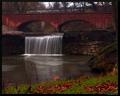
Trist Fallsby JeremyFleuryComment: Color looks good here. Some may think its over saturated but I don't think so. I think what is happening is the foreground is over powering the subject (bridge/waterfall). I would of like to seen the top of the bridge down a little more and not as much or any of the grass. I think this would balance the saturation. Hope that helps. With all that said I still think it's a good shot. Again I love the scene.
Nice use of ss, I like the water fall. Message edited by author 2005-08-11 23:51:35. |
| Photographer found comment helpful. |
| 08/11/2005 11:46:28 PM |
Trist Fallsby JeremyFleuryComment: Very nice site to take a picture. I feel the horizon needs to be straight as well. Looks to me like the picture has a haze over it, kind of like the contrast is off. Like you would see if taken through a car window or lens fogged up. Other than that looks good. I think it could use a little more processing. Good composition. |
| Photographer found comment helpful. |
Home -
Challenges -
Community -
League -
Photos -
Cameras -
Lenses -
Learn -
Help -
Terms of Use -
Privacy -
Top ^
DPChallenge, and website content and design, Copyright © 2001-2025 Challenging Technologies, LLC.
All digital photo copyrights belong to the photographers and may not be used without permission.
Current Server Time: 08/17/2025 09:39:51 PM EDT.