| Image |
Comment |
| 02/13/2006 04:20:38 PM |
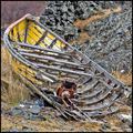
Ballpaintby abuckComment: A good stock shot. I do find the bright blue line distracting and maybe a deeper dof would of worked a little better. Seems to be a bit noisy. |
 Photographer found comment helpful. Photographer found comment helpful. |
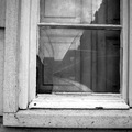
| 02/13/2006 04:02:21 PM |
Is someone at home?by AntoninoComment: Interesting reflections within the broken window pain. I wonder if a colored version would of brought out more detail. I think a boost in contrast would of helped and instead of aligning the right side level I think it would of been better (balance) if you would of leveled the bottom of the photograph. Good focus and lighting. I also would of like to have seen the full window not cropped at top. |
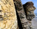
| 02/13/2006 03:58:52 PM |
Break Awayby Canadian_ehComment: I'm looking around your picture trying to find a focus point but I can't. I feel the focus is off on your subject. Lighting is good but it could of benefited with a little contrast boost. As far as broken, you standing there have no problem seeing the broken in this shot but as a voter your composition makes it had for me to understand where broken fall within this photograph. Maybe a different POV would of helped. Good luck in the challenge. |
| Photographer found comment helpful. |
| 02/13/2006 03:55:03 PM |
Broken Innocenceby sarimiliComment: I'm not going to say it DNMC but I do think you went way out of the box on this one. With that said the focus is not where I feel it should be and soft overall. Here face should be sharp focus since you are using here as your subject in this photograph. |
| Photographer found comment helpful. |
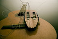
| 02/13/2006 03:52:24 PM |
Guitar parts :-(by HeidieComment: A good stock photograph but seems a little flat. I think it could of benefited with a little more contrast. Good job |
| Photographer found comment helpful. |
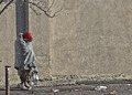
| 02/13/2006 03:49:19 PM |
Broken and Homelessby dleachComment: I think you had a good concept but the picture is just bland. Not enough detail in the subject to show broken. Looks like noise was added to the picture and it makes it look flat. |
| Photographer found comment helpful. |
| 02/13/2006 03:46:55 PM |
Abandonedby OdieComment: Very nice subject but my eyes are having a hard time finding a focus point. May to much of neat image? I don't know but everything seems smoothened out and detail taken away. |
| Photographer found comment helpful. |
| 02/02/2006 12:14:59 AM |
Hanging around to watch the sunsetby theSajComment: From the Critique Club
This is a very interesting shot and captured well. It shows how good the lens is and the photographer handling it. I like the colors of the sunset and the silhouette. The silhouette has very defined lines but I feel it is a bit busy with the harness. I feel that may have contributed to a lower score that you would of like to have. Also the tree at the bottom is distracting in this kind of image. The photograph would have been great it you could of captured a clean background (without the tree) along with the silhouette not being as busy.
Really I think those are the only two thinks that hurt the photograph. I wonder if you could of cloned some of the wires out and still be legal in advanced editing. It may have helped. Great eye and good capture along with a fitting title. Keep up the good work. And I wish you the best in future challenges.
-SDW
|
| Photographer found comment helpful. |
| 01/06/2006 11:51:50 PM |
Ooops! What did I see!by nagymelisComment: From the Critique Club
Hi,
Nice macro capture and the focus is good on the face of the cat. To me it appears the best focus area is on the nose and fades into softness from there. However I feel that you photograph is a little busy and cropped a little to tight. The exposure is ok even though the burned out sky is a little bit distracting. The colors are nice with the exception that I would of downed down the reds a little.
You picture has nice balance to it and the arrangements are good. The cat is a strong center of interest but with the few distracting elements mentioned above, it over powers the viewer.
Your subject does grab my attention and I find it to be appealing. But it doesn't show strong emotion or much creativity - IMO only the title ties it to the challenge and even then loosely. I feel your picture would of scored higher if related to the challenge a little clearer. I am not say you did not meet the challenge, just out of the box. We all suffer from that from time to time.
I hope you find this critique helpful. Keep up the good work and this is a good macro shot. Keep shooting and I wish you well in future challenges.
-SDW |
| Photographer found comment helpful. |
| 01/06/2006 03:53:30 PM |
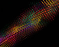
wavelengthby banmornComment: From the Critique Club
I think you did a great job on this photograph. The lights are out of focus intentionally and it was successful. You photograph is very clean, meaning that the background is nice and smooth behind your subject. I feel the exposure to be good and the colors to be great adding a 'wow' factor to the photograph.
You image IMO is balanced to a degree but could of been a little more aliened to show a wave length. I believe even with the balance issue your visual elements are effective and show a strong interest, pattern, and design. I give you props on a simple yet complete without distracting elements in your photograph.
I find your photograph to keep my attention, again showing some 'wow' factor. It also is creative and you used an unusual subject in an effective way.
Great job and continue the good work. IMO if the wave lengths would of been more fluent than random I feel your score would of surpassed the 6 mark.
-SDW |
| Photographer found comment helpful. |
Home -
Challenges -
Community -
League -
Photos -
Cameras -
Lenses -
Learn -
Help -
Terms of Use -
Privacy -
Top ^
DPChallenge, and website content and design, Copyright © 2001-2025 Challenging Technologies, LLC.
All digital photo copyrights belong to the photographers and may not be used without permission.
Current Server Time: 08/17/2025 02:49:38 AM EDT.