| Image |
Comment |
| 06/30/2004 04:47:48 PM |
Sun E Trikeby FrostyPawsComment: I guess if I knew what this was, it might be more extraordinary. Kind of a boring image, composition is broken up, colors look odd, did you desaturate for some reason? |
 Photographer found comment helpful. Photographer found comment helpful. |
| 06/30/2004 04:46:02 PM |
|
| 06/30/2004 04:44:57 PM |
shark attackby nordicComment: Are you in the midwest? Looks like tornado damage :) Very nice and very lucky picture, though an unlucky house. Hope it wasn't yours! |
| Photographer found comment helpful. |
| 06/30/2004 04:12:44 PM |
|
| 06/30/2004 04:11:59 PM |
extraordinaryby igfischComment: While the rock is large, I had to look at the picture several times to figure out what was extraordinary in it. I know you're trying to give perspective, but it looks like you mean the car. Still a reasonable entry, if a bit of a thinker. |
| Photographer found comment helpful. |
| 06/30/2004 04:10:26 PM |
|
| Photographer found comment helpful. |
| 06/29/2004 01:27:03 PM |
CBS announces new 'Survivor' castby BKerrComment: This is one of the best uses of a casual photograph ever. You were able to not only see the humor yourself, but show it to your audience, a major feat on a site that frowns on "snapshot"-like images. Great Job! |
| Photographer found comment helpful. |
| 06/28/2004 12:32:23 PM |
Her eyesby MiinervaComment: I like it. Maybe a tad sharper focus around the fingers, and it would really pop. |
| Photographer found comment helpful. |
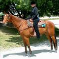
| 06/28/2004 12:30:51 PM |
Samantha's Challengeby NeuferlandComment: While this would look nice on the mantle or in a family album, it's not a great studio portrait. The bright daylight washes out areas of the image, while her blak hat disappears into the dark foliage behind her. The focus is sharpest on the horse rather than the girl, where it should be the opposite. There are many areas where dark colors slide into black and light colors into white, making the image look flat. Her eyes are shaded by her hat as well. If you could have reflected some light on the girl from just above her in front, the image would have looked nicer, but it doesn't really fit this challenge anyway. |
| Photographer found comment helpful. |
| 06/28/2004 12:25:18 PM |
All Aboardby pumaComment: This looks like an unplanned image. The lighting is washing out her sleeve and the windowsill, and her face and hair are too dark. The train is distracting, if you had to have it there, it should be out of focus, let her be the subject of the portrait. This could have been a nice shot in controlled conditions, right now it's just a snapshot. |
Home -
Challenges -
Community -
League -
Photos -
Cameras -
Lenses -
Learn -
Help -
Terms of Use -
Privacy -
Top ^
DPChallenge, and website content and design, Copyright © 2001-2025 Challenging Technologies, LLC.
All digital photo copyrights belong to the photographers and may not be used without permission.
Current Server Time: 08/05/2025 11:54:17 AM EDT.