|
|
|
Showing 231 - 240 of ~531 |
| Image |
Comment |
| 07/20/2004 01:36:05 PM | Fast!by aKiwiComment: No idea how this was accomplished, look forward to seeing your comments. nice image, a little bit too dark for my taste, very unique shot. |  Photographer found comment helpful. Photographer found comment helpful. |
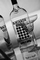
| 07/20/2004 11:47:44 AM | It's clear, choose Bacardi: El Highball Unico!by tony927Comment: Aloha from the Critique Club!
You clearly have a strong image and idea here. The B&W flatters the glass subjects, and the soft light lends a late-night club aura to the image.
I'm a little distracted by the dusty table and the blurred line in the left forground. Maybe a tighter crop would get that distracting line out, although you'd lose the bottom of the martini glass. I would also use a smaller ISO (100 or even 50) to get rid of all the noise.
Challenge-wise, you really should have the whole logo readable, or at least a sharper focus on the "Bacardi Bat" if you want that to identify your ad. Having an actual drink prepared would also add to the image, perhaps with a curl of citrus to contrast the stark setup? If you don't actually have full bottles, it's worth it to substitute some other liquid so they don't look empty. The empty bottles with the empty glass seem kind of bland, when you are trying to evoke excitement.
Your focus is quite good, and your DOF looks correct. The shot angle is nice, it makes the eye want to look a bit longer at the image. from your comment, I'm guessing this was your first entry, and you didn't realize the text wouldn't show up with the image. It happens to everyone, and your ad stood up quite well on its own. |
| 07/20/2004 11:36:00 AM | IBM Thinkpad T40by kghoshalComment: Aloha from the Critique Club!
This is definitely a tough subject to capture. Keyboards are difficult to light properly, and DOF is tricky as well. It looks like you have the right idea with the angle of the shot, just deepen the DOF to bring more of the image into focus. A little more ambient light would make this image sharper, since it is very dark right now.
I think as far as meeting the challenge, this image needs a little bit more relevance. Keep in mind that the image should suggest or identify your specific product, and at the moment this could be any computer. It would also help if you cleaned the touch-mouse since it looks very dirty in the image, and not appealling as a product feature.
Your composition is well thought out, and you have a strong image here with a few tweaks, but this is more of a nice stock photo rather than a branded advertisement. |
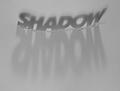
| 07/16/2004 04:19:18 PM | Shadow's shadowby paha_lComment: Would work better with harder light, so the shadows were darker and sharper. Nice image, though. | | Photographer found comment helpful. |
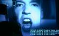
| 07/16/2004 04:15:15 PM | Two Minute Hateby bledfordComment: Not sure where I'm supposed to focus here. The words on the bottom right are cut off, and the top left words are very far from center. Not sure what you are getting at with this image. | | Photographer found comment helpful. |
| 07/16/2004 04:13:39 PM | bibliyaby potogComment: Needs a bit more focus and light, nice old-fashioned look though. | | Photographer found comment helpful. |
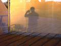
| 07/16/2004 04:12:35 PM | Fieryby DoMoreiraComment: If that is sign language, it is too blurry to read. not sure what the image is supposed to focus on, there are lines and angles in several directions. The sunset color is nice and your general focus is good, but the shadow is not sharp enough to see. |
| 07/16/2004 04:10:36 PM | Bird Seedsby dinotechComment: I like your idea here, the image is sharp and appealing, my only complaint is that the white is too bright, it hurts my eyes, and makes it hard to read. Tone down the white a bit and this will be a nice image. | | Photographer found comment helpful. |
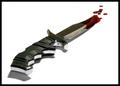
| 07/16/2004 11:17:42 AM | a Killing Toolby NazgulComment: Nice, I don't see how you could have gotten 1's. I'd give it an 8 at least. The handle does seem a bit oof, though. | | Photographer found comment helpful. |
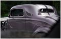
| 07/16/2004 11:06:02 AM | '34 Fordby jmleliiComment: Aloha from the Critque Club!
Congratualations on making a spur-of-the-moment shot look like a studio set print!
The color here is very nice, just purple enought to make you aware of the color, but not glaring. The shine on the vehicle is also very nice, and gives it a showroom look. Despite the hasty nature, the composition is nicely arranged and the lines are sharp. DOF is almost perfect for the subject.
I do have a few issues about the focus here, mainly the letters on the left edge of the image, which aren't in focus (which I know you couldn't affect in that situation) and distract alot from the sleek image of the car. Since I am also distracted by the dark patch along the right edge, meybe a solution would be to halo the left and right edges both with dark.
The burn marks along the bottom are a little too visible, try a softer burn, so the edges aren't so obvious. The cloud in the rear window and the two fingers on the steering wheel are also a little distracting, since they stand out in the dark windows.
Overall, this is an excellent capture that could be print-ready with a few minor edits. | | Photographer found comment helpful. |
|
Showing 231 - 240 of ~531 |
Home -
Challenges -
Community -
League -
Photos -
Cameras -
Lenses -
Learn -
Help -
Terms of Use -
Privacy -
Top ^
DPChallenge, and website content and design, Copyright © 2001-2025 Challenging Technologies, LLC.
All digital photo copyrights belong to the photographers and may not be used without permission.
Current Server Time: 08/08/2025 06:49:07 AM EDT.
|