| Image |
Comment |
| 02/25/2003 11:00:47 PM |
|
 Photographer found comment helpful. Photographer found comment helpful. |
| 02/22/2003 04:02:35 PM |
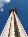
Looking up to the skiesby xertionComment: Critique Club Critique:
Composition: I think the centered tower works great for this shot although another approach you could try would be having the tower start at one of the bottom corners and maybe cut across the shot at an angle. There is a lot of empty space in this picture so the cloud really does help a lot.
Technical: Not much to say here. Lighting is great, focus is nice and sharp.
Overall: Well you met the challenge and did a really good job with the shot. Maybe just a little tighter crop would have raised your score a few points. |
| Photographer found comment helpful. |
| 02/21/2003 09:50:26 PM |
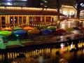
It's All Just a Blur Now...by kretsComment: Greetings from the critique club.
Composition: Seems like a simple straight forward snapshot like composition. The bright light at the top left of the photo is a bit distracting, I think cropping that top section of the photo would help a bit. The colored umbrellas add a nice touch of color as does the reflections in the water.
Technical: On the technical side I wish your Waldo wasn't blurred so much. I know using a faster shutter speed would have greatly darkened your photo but you know from your comments how many people couldn't see your Waldo.
Overall: Great night shot and great colors. With the Waldo in focus maybe behind one of the umbrellas might have helped, but its looks as if theres actually two Waldos in your shot and thats why you blurred it. |
| 02/21/2003 08:36:16 PM |
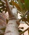
This Could Take All Day...Up Ya Go!by anggComment: Greetings from the critique club.
Composition: This is a very centered photo but I think it works in this case. I think if you removed the two leaves near the top center it would have shown more of the tree and more importantly the perspective of the tree. The brick background is a little distracting but you might not have had any other choice.
Technical: The bottom of the tree seems out of focus. Using a wider depth of field would have fixed that. Also the colors seem a little drab. Maybe in your photo editor you could have bumped up the contrast or levels a bit.
Overall: This is a good perspective shot and with a little pre-shot grooming of the tree and a little photo editing would have helped place this shot higher. |
| 02/21/2003 05:19:58 PM |
A Bugs Lifeby Fibre OptixComment: Greetings from the critique club.
Composition: I really like the angle for this shot. The three colors you chose for this work well too. Including the sun in this was also another added bonus. The blue sky for a background is nice because there are no distractions to take your eyes away from the subject. I think repositioning the shot so the sun was still there but there wasnt so much negative space at the top would have really centered the attention on the main subject.
Technical: The focus is great. The lens flare is a really big distraction though.
Overall: Great picture and great composition and colors with the only really big distraction being the lens flare. |
| 02/21/2003 05:01:34 PM |
Beware of Dogby ladpupmoeComment: Greetings from the critique club.
Composition: It seems to me that you have two subjects fighting for attention. Of course the chihuahua is the main subject but the REALLY BRIGHT sign distracts me from the dog.
Technical: The entire shot is out of focus. I think you would have been better off if you either used a tripod or a faster shutter speed and maybe overexpose it a bit.
Overall: I think this would have done much better if the shot was brighter and you got rid of the sign. Message edited by author 2003-02-21 17:03:41. |
| Photographer found comment helpful. |
| 02/21/2003 04:35:39 PM |
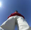
return of the ghostby billyComment: Greetings from the critique club.
First Im sure you already know about having 2 people in the shot so Im not gonna go into it.
Composition: Everything seems a little centered to me. Having the main subject off to the left side may have improved the composition slightly. Maybe getting rid of some of the empty space at the top also may have helped.
Technical: The shot overall looks out of focus. I know the light blurs are intentional but the main subject seems a little blurred. The lighting seems just fine for the subject and I can definatly see the hidden waldo.
Overall: Original idea but having two people in the shot knocked your score down tremendiously. |
| 02/17/2003 12:09:43 AM |
|
| 02/10/2003 03:36:59 PM |
Oh, my!by gogaComment: Great shot but I don't see anyone hiding in this picture. |
| 02/08/2003 03:37:55 PM |
Popcornby MajorChaosComment: I think the focus if off a bit but the colors and lighting are beautiful. |
| Photographer found comment helpful. |
Home -
Challenges -
Community -
League -
Photos -
Cameras -
Lenses -
Learn -
Help -
Terms of Use -
Privacy -
Top ^
DPChallenge, and website content and design, Copyright © 2001-2025 Challenging Technologies, LLC.
All digital photo copyrights belong to the photographers and may not be used without permission.
Current Server Time: 08/24/2025 01:28:05 PM EDT.