| Image |
Comment |
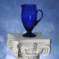
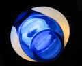
| 08/05/2004 05:27:28 AM |
Cobalt Blueby lwkimagesComment: The lighting is pretty nice, good and even, but the big highlight in the pitcher is distracting. Also the pedestal is a little to bright compared to the pitcher, which seems to be the focal point of the composition and the pedestal is trying to steal its thunder. We can't let that happen... :) |
 Photographer found comment helpful. Photographer found comment helpful. |
| 08/05/2004 05:25:08 AM |
Lost Soulsby peeteComment: The feel of the photo is a little dark and seems to fit well with the title. The patterns are interesting but I think a different angle on them might make the image more eye-catching. |
| Photographer found comment helpful. |
| 08/05/2004 05:19:09 AM |
The Blue Streakby BigSmilesComment: Nicely done shot. It's sharp, clean, and the background is nice and white. It doesn't catch my interest that much, though. I think some indication of motion or action would help, maybe some motion blur or even a panning shot? Also I find that getting down really low on shots like this sometimes gives a more exciting perspective. |
| Photographer found comment helpful. |
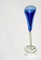
| 08/05/2004 05:17:04 AM |
Blue Shadowsby wetlandComment: Nice idea. It looks like a mirror is set up behind the glass and tilted forward. Nice color. There's some weird refracted light pattern in front of the base that is distracting though. Also the lighting is very flat (seems to be in line with the camera) maybe some more interesting lighting would define some more shape and help make the image 'pop' a little more. |
| Photographer found comment helpful. |
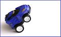
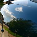
| 08/05/2004 05:14:07 AM |
Blue Carby DyslexicComment: Interesting. Is it blue? Maybe. The sky makes part of it look blue. Looks like the antenna is waving in the wind. :) It's nice and smooth but I think I need more lines to help my eyes know where to look, or maybe more things of interest in the reflection to look at? |
| Photographer found comment helpful. |
| 08/05/2004 05:10:52 AM |
Blues and Cloudsby banmornComment: One of the best pattern shots I've seen in the challenge. Nice angles and interesting lighting make for interesting geometry. I wish the blue was more saturated and deep though, it's a bit too whitish. |
| Photographer found comment helpful. |
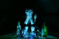
| 08/05/2004 05:09:40 AM |
Booze Bluesby duncesComment: Nice, original, moody, well done shot. The lighting is great. I wish the green bottle on the right weren't there though, it's too much green and only in that one part of the picture and throws off the balance a little to me... more blue bottles and cans would be better. |
| 08/05/2004 05:07:12 AM |
|
| Photographer found comment helpful. |
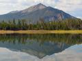
| 08/05/2004 05:06:45 AM |
Two Blueby larryarComment: Good reflection shot. But, it's a bit blurry and blocky, probably mainly because you used such high JPEG compression. This image is 29K, you have 150K to use! If you use a higher quality setting when saving to the JPEG file, it will look a hundred times better.
Also I would recommend a polarizing filter on shots like this, it will make the sky a deeper blue. You could help a little by bumping up the blue in Photoshop with the curves dialog. Especially since this is the BLUE challenge... :) It could use a tiny bit more "kick" to the blue since it's kind of overpowered by the rich greens. |
| 08/05/2004 05:00:55 AM |
Jones Blueby metoecusComment: Cool. Super sharp shot. Great focus. Excellent color and contrast. Nice textures. Interesting perspective and framing. |
Home -
Challenges -
Community -
League -
Photos -
Cameras -
Lenses -
Learn -
Help -
Terms of Use -
Privacy -
Top ^
DPChallenge, and website content and design, Copyright © 2001-2025 Challenging Technologies, LLC.
All digital photo copyrights belong to the photographers and may not be used without permission.
Current Server Time: 08/22/2025 10:24:28 AM EDT.