DPChallenge: A Digital Photography Contest You are not logged in. (log in or register
 
Browse Settings
Currently viewing:
Registered Userstephan

Show comments:

Per page:

Order:

Comments:


Comments Made by stephan
Pages:   ... ... [53]
Showing 81 - 90 of ~528
Image Comment
Shadow of a square
02/02/2003 09:35:13 PM
Shadow of a square
by dimitrii

Comment:
Wow, I really like the colours and the fuzzy look of the square. The dark area in the upper right corner is a bit distracting because it disturbs the clear segmentation of light and dark areas. Same with the reflection on the lower side (although much less distracting). Nice texture on the wood and (again) the colouring is very nice because it fits to the wood.
Photographer found comment helpful.
"OCB:  Obsessive Compulsive Breakfast"
02/02/2003 09:29:54 PM
"OCB: Obsessive Compulsive Breakfast"1st Place
by KickDrum5150

Comment:
Great concept! Very creative. The lighting is a bit too harsh. I wonder how this would look with top lighting. The depth created by the shadows are more unpleasing here than helpful in my opinion.
I mostly don't like borders, but I think it fits very nicely in this case. Good job!
The Adult Side
02/02/2003 09:25:25 PM
The Adult Side
by jimmythefish

Comment:
I like the concept and the composition but a uniform backgound wouldn't distract so much. I also don't like the long shadow on the table although that kind of lighting makes the nice texture coming out nicely. Still, I think a top lighting would be better. Also you could have easily removed the crumbs. The focus is good, very crisp!
Photographer found comment helpful.
Look At Me!
01/27/2003 09:10:34 AM
Look At Me!
by stephan

Comment:
Ok, my own opinion about this photo changed a little during the week. I still like the colours and the abstract look. However, the composition is really bad. Like scroosloose said, the lines lead your eyes to the background on the right side, but there is nothing!
This photo is a good prove that a bad original photo can't be improved by digital postprocessing ;-) Now I regret that I didn't take the time to go back to the location and tried another angle. I only made 3 shots of this subject and they all were done in a hurry. I also don't like the way how I cropped the photo.

Anyway, many thanks for your comments. I really also appreciate the negative feedback, because I currently have a strange liking for very abstract/colourful/contrast images and I'm unsure if that's really the path to follow ;-)

Regarding the questions about the glow: It was night and the sign was illuminated. Because I increased the contrast in postprocessing the glow, which was only very faint in the original, was amplified.

Message edited by author 2003-01-27 09:12:59.
Dead Of Winter
01/26/2003 02:20:29 PM
Dead Of Winter
by jmsetzler

Comment:
Hello John, greetings from the Critique Club (I guess you heard about it ;-))

Composition:
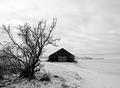
A bit uneasy. There are lotss of details to see. Outdoor photos can be very cluttered sometimes but you did a good job to handle it. There are three elements: the tombstones, the house and the tree. The house gets a bit more attention because of the lighting but generally all three elements seem to play an equal role. So your composition was used well to capture the overall mood of the while scene.
My personal preference is that I like simple photos more and I think the photo would still look good without either the tree or the house. But I'm unsure if it would look better, because house and tree balance each other well.
Two "mergers" distract a little bit. First, the tree does not contrast very much against the trees in the background. The colour tones are the same and because if the wide DOF both have the same level of detail. Second there are two tombstones which merge because they're both black and there is no edge.

Lighting:
I like the infrared lighting and the high contrast very much. It's very stange and interesting. Black and white suits the overall theme.
Unfortunately the lighting looks a bit too sunny and happy, which does not fit to the theme "dead of winter". The blown out wall of the house, the high contrast and the bright grass makes you think it's sunny and you expect shadows. But there are none (at least I can't see them) and this makes you think it's (a hot summer) noon.
What I like most in this photo is the gradient in the sky. It's has such an awesome eerie feeling! Very moody and dark. This really "makes" the photo in my opinion.

Focus:
I like the DOF. Good decision to use the narrow aperture and accept the resulting slow shutter speed. The focus is great especially for such a slow shutter speed.

Postprocessing:
I removed the border in my image editor and I like it better without it. It "constricts" (warning: looked word up in dictionary, hope it fits) the photo and without it the photo is more "open" which fits much more to an outdoor landscape photo. But I'm no broder-expert and very rarely like borders.

Art:
Not a typical landscape photo (which is a plus!), but in my opinion you met the challenge topic. Creative use of infrared lighting. It transports an interesting mood and has an appealing strangeness. The title fits although the "winter" part is not very visible (as explained above).


Ok, that's it. I hope I was able to express my thoughts about your photo correctly (which is a bit difficult sometimes, especially because English is not my native language). If you have questions, please don't hesitate to email me.

Stephan

Message edited by author 2003-01-26 14:22:59.
Solitude
01/20/2003 01:34:43 PM
Solitude
by stephan

Comment:
Thank you for your comments. Actually I'm pleased with the score. It's an average photo and personally I thik that the tree in the foreground could be a bit sharper. I rotated the image a little bit in postprocessing and I thing that made it a bit blurry overall.

I don't really agree about the centered barn. What I liked about the photo are the three different "layers" depth-wise. From left to right the tree, barn and horizon. So to me it made sense to crop the photo so that the tree fills the left side, the barn is centered and the little trees in the background on the right side.

hbunch7187: Yes, your eyes were playing tricks on you ;-) The photo is just black & white.

Thanks again,
Until next week.
Untitled
01/20/2003 01:07:33 PM
Untitled
by Kaneda

Comment:
Should have placed better in my opinion. I was one of the two tens ;-)
A Lunar Landscape
01/19/2003 09:39:54 PM
A Lunar Landscape
by Fibre Optix

Comment:
Wow. Great focus for such a shot. I like your creative take on this challenge theme.
Untitled
01/19/2003 09:37:19 PM
Untitled
by Kaneda

Comment:
Good composition. I like how the background vanishes in the mist.
Beach Stability
01/19/2003 09:30:01 PM
Beach Stability
by arnit

Comment:
Great use of DOF. A bit too shallow for mytaste, I would have liked to see foregound in focus, too. Creative cropping. Normally people would have used landscape format. But I really like the format you chose. The border is a bit too wide. Making the actual photo a bit bigger would be a better use for that space.
Pages:   ... ... [53]
Showing 81 - 90 of ~528


Home - Challenges - Community - League - Photos - Cameras - Lenses - Learn - Help - Terms of Use - Privacy - Top ^
DPChallenge, and website content and design, Copyright © 2001-2025 Challenging Technologies, LLC.
All digital photo copyrights belong to the photographers and may not be used without permission.
Current Server Time: 08/12/2025 06:39:48 AM EDT.