DPChallenge: A Digital Photography Contest You are not logged in. (log in or register
 
Browse Settings
Currently viewing:
Registered Userstephan

Show comments:

Per page:

Order:

Comments:


Comments Made by stephan
Pages:   ... [53]
Showing 41 - 50 of ~528
Image Comment
Red Shouldered Hawk
04/29/2003 02:16:28 PM
Red Shouldered Hawk
by jitams

Comment:
It probably was a difficult photo and a candid opportunity but to me the tree in the background is very distracting. With a fully green (blurred) background the bird would "stick out" much more. Apart from that the composition is good. The focus is also good.
Rain Drops on Cherry Blossom
04/27/2003 07:45:13 PM
Rain Drops on Cherry Blossom
by bgmorris

Comment:
Greetings from the Critique Club, Ben :)

Compositon: You did a very good job regarding the background. It's nicely blurred and doesn't distract from your subject. The horizontal orientation of the twig looks a bit boring. A diagonal orientation can be more dynamic in my opinion. Especially when the twig would point to the viewer, the DOF would give a better impression of depth.

Lighting: Exposure is good but personally I would have inceased the contrast a little bit in postprocessing. It looks a bit bland now. But it's good that you didn't wait until sun came out again. The cloudy sky made an uniform lighting with almost no shadows. I think sharp shadows wouldn't fit to your subject.

Focus: As I said above: good DOF, but personally I would prefer a different angle of the twig using this DOF better and giving the photo more depth. I'm unsure whether the photo would look better when all the flowers and twig would be in focus and not only the middle part. But I think not.

Challenge: I don't think it conveys the challenge theme very good. The rain drops almost aren't visible. Without the title one wouldn't have noticed them. Thus the photo looks more like a classic flower photo.

Creativity: Please don't take it as an offense, but to me the photo is not very inspiring. It has nothing special on it. I liked your previous entry to the Cliche challenge much more.

Good luck for your future submissions!
Photographer found comment helpful.
Weather: Summer in Sahara
04/21/2003 06:22:08 AM
Weather: Summer in Sahara
by SharQ

Comment:
The workshop seems to have pid off ;-) Good job!
Blue Skies
04/21/2003 06:04:01 AM
Blue Skies
by keone

Comment:
I like that photo very much. Way too much underrated. It's very basic but that's enough to get the message. It certainly fits the challenge. The unique idea alone would have ensured a high score from me. Unfortunately I hadn't time voting.

And Journey's comment probably says more about her intelligence than yours ;-)
It's interesting how most people expect to see "something" and don't accept a blue sky as a subject.

Message edited by author 2003-04-21 06:07:22.
Photographer found comment helpful.
Colored Calla
04/15/2003 11:48:08 AM
Colored Calla
by stephan

Comment:
Thank you very much for your nice comments. I'm _very_ happy about the placement and the score. Actually I'm surprised that it scored that high, because I thought that the problems with grain and sharpness would ensure me a low score. I'll never understand voting here on DPC ;-)

I have an outtake of the series and personally I like it more than the one I submitted. But eventually I decided that way, because it fits better to the Color theme.

Special thanks to Gary for his great CC critique. I totally agree about the issues you found to "mecker" about ;-)

Oh, and btw.: this was the first time I used a border. After a long time of being sceptical about that, now I think it's a good thing.

Message edited by author 2003-04-15 12:00:42.
Are you colour-blind?
04/15/2003 11:35:03 AM
Are you colour-blind?
by Parentx

Comment:
Hi Lili, just wanted to tell you that I really like your photo. I love the colours and abstract look of it and I have no problem with the digital manipulation. -Stephan
Photographer found comment helpful.
Colorblind?
04/13/2003 07:45:36 AM
Colorblind?
by sjp28

Comment:
I would be interested in how you did this photo? Unfortunately your photographer's comments is empty :-/
Pin
04/12/2003 09:44:06 PM
Pin
by kosmikkreeper

Comment:
Greetings from the CC Club, Yanik! :)

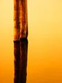
Composition: The first thing one notices is the unusual angle. I like unusual things, but I looked at the photo for quite a while and couldn't see any purpose why you did that. Unfortunately your "photographer's comments" were empty, too. Well, in fact I think the photo would look better when you would have used a normal angle and didn't rotate it. The subject is very banal and the photo looks more like a "study" of the pin. The unusual angle distracts and takes the viewers interest away from the pin. I think a banal angle would fit to the banal subject more. Otherwise a good simplistic photo.

Lighting: I like the lighting on the pin itself, it shows the nice metallic texture very good. I also like the different shades of light and the shadow in the front of the photo. However, I think that the lighting streak in the background is distracting from your subject. It's even worse because it goes right through the pin and cuts it.
Personally I think the photo would look better if you would add more contrast. Then also the colour would come out a bit "warmer", more golden.

Focus: A very narrow depth of field. I know macros have a narrow DOF but for f/4.9 that's very little. I see the lower part of the pin in focus and the upper part out of focus. Both I like. But the very bottom part of the pin is out of focus, too. That's the point where the pin pierces through the paper. I think that's a special point of interest and that also should be in focus.

Challenge: It fits to the challenge well.

Creativity: Interesting choice of subject. Trying to photograph something ordinary in an interesting way. Unfortunately the angle (in my opinion) destroys the ordinary look of the pin but doesn't make it more interesting.

I put a modified version of the photo here. I rotated it, cropped it and increased the contrast. Feel free to send me an Email if you want to discuss your photo more.

Stephan
Photographer found comment helpful.
The Sea Won't Rage Today
04/12/2003 09:07:05 AM
The Sea Won't Rage Today
by stephan

Comment:
Hi all,

first let me say that I'm sorry that I couldn't respond sooner this week. But I'm very happy about the comments. All were very nice and I'm mostly happy about the photo. What disturbed me personally most was the little white spot in the middle of the reflection. The more I looked at the photo the more it made me angry, but I couldn't do something about that without spot editing.

Anyway, sharpness really seems to be an issue here on DPC ;-)
I see the "clarity in water" => "clarity in photo" connection, but I don't want to sharpen it more because this would only increase the grain. Personally I think the grain is a much tougher issue for that photo.

I was especially flattered by the comment from Jeileen, who said she would buy the photo. Well, photography is a hobby for me and I do not sell my work. If you like my photo then I'm more than happy to share it with you.

So I made a large scale version (1680 x 2240 pixels) of the photo and you can download it here (Warning: this is a 2.2 MB file). The white spot is fixed there, too ;-) If you want a print then print it. If you want to use it as a wallpaper then use it. Do with it whatever you want.

There is only one thing: the photo is licensed under the Free Art License. It's not complicated. Basically it means that the photo is free to use for everything you want as long as it stays free (free as in freedom not free as in beer ;-) You can sell the photo if you think it can make you rich, I have no problem with that). Only the photo must remain licensed under the FAL and my Copyright remains, too (meaning you aren't allowed to pretend that it is your photo). Read the text on the linked website, it's very easy and I really like the concept.

Thanks again! Until next week...
Stephan
The Flatiron Building
04/06/2003 09:03:20 PM
The Flatiron Building
by tomzinho

Comment:
Maybe a different angle where less of the buildings in the background are seen would have been more effective. Also more contrast would help. The photo looks a bit pale.
Photographer found comment helpful.
Pages:   ... [53]
Showing 41 - 50 of ~528


Home - Challenges - Community - League - Photos - Cameras - Lenses - Learn - Help - Terms of Use - Privacy - Top ^
DPChallenge, and website content and design, Copyright © 2001-2025 Challenging Technologies, LLC.
All digital photo copyrights belong to the photographers and may not be used without permission.
Current Server Time: 08/12/2025 06:40:32 AM EDT.