| Image |
Comment |
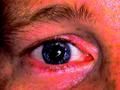
| 07/13/2002 08:23:00 PM |
Fear in your Eyeby MartinComment: ugh. very very reddish. somehoe this photo looks like one of these pictures in learning books for doctors. i would have done the following: in your photo editor desaturate all reddish tones and only leave the blue ones (blue, cyan). this would have the interesting effect of having the nice blue pupill without the strong red tones, ephasizing the eye more. |
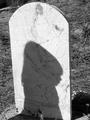
| 07/13/2002 08:57:00 PM |
Worst Fearby kevinswopeComment: good photo. to me the shadow looks like a little girl. really must be a fear for parents to loose her child. maybe a less DOF would be better. that way the background would be more blurred and wouldn't distract from the main object. |
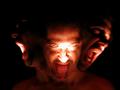
| 07/13/2002 10:14:00 PM |
Devil Inside by lmhrComment: cool photo. nice effect! the light in the front is a bit too much but that's only a trifle. |
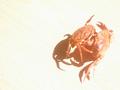
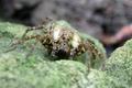
| 07/13/2002 09:58:00 PM |
Fear of ownby logihelguComment: very good composition. i like the crabs being off-centered. nice background, too. nothing wich would distract. IMHO also nit overexposured. i like it in this case. |
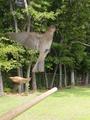
| 07/09/2002 12:10:00 PM |
Don't be afraid ...by pnichollsComment: nice idea of showing an animals natural fear of humans (or other animals). i don't know but maybe decided to leave the focus on the background so that the motion of the bird "fleeing" is captured. but actually i think the other way around would have looked better. the bid in focus and the background blurred. the bird is your primary object so it should be in focus. also the lawn is much brighter than the bird which distracts from the bird, too. the other bird in the background is distracting but that's how wildlife shots are. you can't set them up for posing perfectly ;-) |
| 07/13/2002 09:20:00 PM |
wayward sonby LanSnakeComment: nice shot! nice lighting and contrast. but IMHO the face is distracting. i think the photo would be really cool without it. (nothing personal to the person ;-) |
 Photographer found comment helpful. Photographer found comment helpful. |
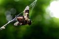
| 07/11/2002 08:41:00 AM |
too lateby olyaComment: Very nice macro. I like the thaw drops in the spider net. I think the photo would look better when the bee (flea?) and the whole spidernet would be in focus. A smaller aperture could have helped to get more DOF. The white spot on the right side distracts from the main object. |
| 07/13/2002 09:30:00 PM |
|
| Photographer found comment helpful. |
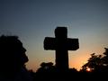
| 07/13/2002 08:35:00 PM |
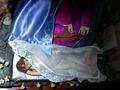
mask the fearby censuraComment: i thought about it while but i don't get the "fear" part. does the photo wants to express jesus who has fear of being crucified? well... ok. a bit dark on the top and on the right side but maybe that was intended by you to make up some "divine light" on jesus' head? |
| 07/13/2002 09:05:00 PM |
Examination Fear...by wenyaoComment: interesting photo, takes some time to see that it's a book or a folder on the bottom of the photo. maybe if you would have shown more of it, it would be clearer. i don't think this color inverting effect really adds something to the photo. makes it weird and abstract which does not really fit to the "message" of the photo. |
Home -
Challenges -
Community -
League -
Photos -
Cameras -
Lenses -
Learn -
Help -
Terms of Use -
Privacy -
Top ^
DPChallenge, and website content and design, Copyright © 2001-2025 Challenging Technologies, LLC.
All digital photo copyrights belong to the photographers and may not be used without permission.
Current Server Time: 08/12/2025 10:44:22 AM EDT.